

Una vez vi a un equipo de finanzas presentar una revisión trimestral a una junta directiva. Cuarenta y cinco minutos de preparación, doce diapositivas, una hoja de cálculo cuidadosamente formateada exportada a PowerPoint.
La primera pregunta del presidente del consejo: "¿Puede mostrarme dónde se fue el dinero?"
Los datos estaban todos ahí. Solo estaban enterrados en filas y columnas que requirieron un título en finanzas y veinte minutos de concentración para decodificarlos. Los números eran exactos. La presentación falló.
Ese es el problema central con visualización de datos financieros - o más bien, la falta de ella. Los equipos de finanzas son meticulosos sobre la precisión de los datos y casi completamente sin entrenamiento en comunicación visual. Esta guía cubre qué tipos de gráficos funcionan mejor para preguntas financieras específicas, cómo construir un tablero de informes financieros y cómo los generadores de gráficos financieros de IA han cambiado el flujo de trabajo para equipos sin recursos de diseño dedicados.
¿Qué hace que los datos financieros sean diferentes?
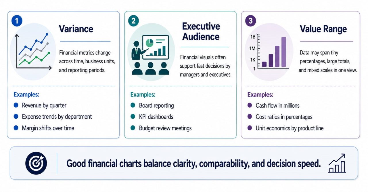
Antes de elegir un tipo de gráfico, ayuda a comprender por qué los datos financieros tienen su propia visualización lógica.
La varianza es a menudo más importante que el valor absoluto. Si los ingresos están por encima o por debajo del objetivo presupuestario con frecuencia importa más que el número de ingresos en sí. La mayoría de los tipos de gráficos de propósito general están diseñados para mostrar valores, no diferencias. Los informes financieros necesitan gráficos que hagan que la varianza sea inmediatamente legible sin requerir aritmética mental.
La audiencia tiene una alta autoridad para tomar decisiones y poca paciencia para la complejidad. Los miembros de la junta y los ejecutivos no son analistas de datos. Las visualizaciones financieras necesitan responder a su pregunta en menos de treinta segundos, o el gráfico ha fallado, independientemente de cuán precisos sean los datos subyacentes.
Los valores abarcan rangos enormes. Una sola declaración de P & L puede mostrar elementos de línea que van desde $1.200 a $48 millones. Los valores predeterminados de los gráficos estándar harán que los elementos de línea pequeños pero críticos sean invisibles junto a los grandes.
These three characteristics — variance, audience, and range — determine which charts belong in financial reporting and which don't.
The 5 Financial Charts That Actually Work
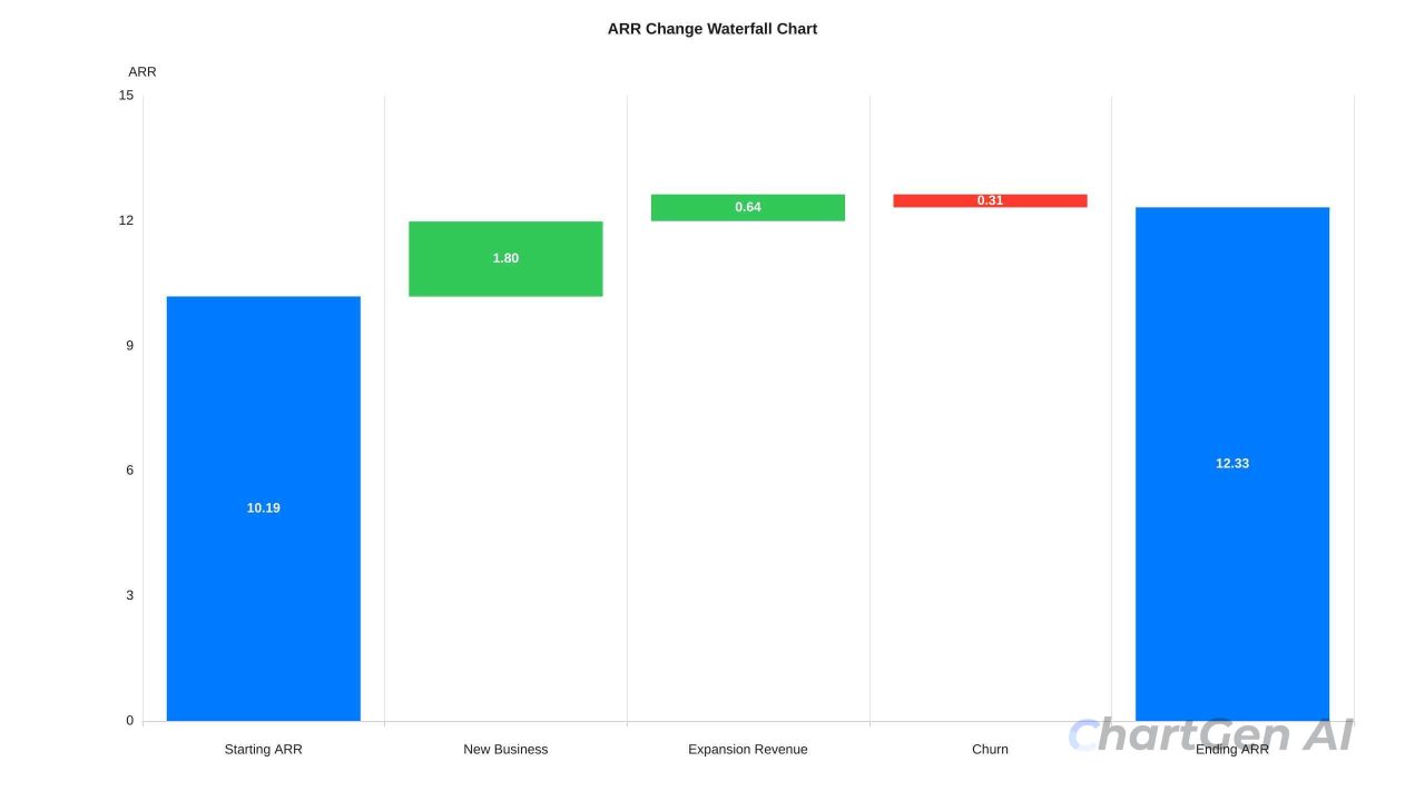
- ### Waterfall Chart
What it answers: How did we get from Point A to Point B?
In almost every financial review, I start by using a waterfall chart. This is not because it is the most commonly used, but because it resolves any subsequent queries in one go.
waterfall chart breaks down a cumulative change into its individual components, shown as floating bars that stack from left to right. Each bar starts where the previous one ends. The result is a visual narrative: "We started at $10.2M ARR, added $1.8M from new business, expanded $640K from existing accounts, lost $310K to churn, ended at $12.33M." Every number has a cause. The board doesn't need to ask where the growth came from — it's in the chart.
A bar chart showing only the starting and ending values gives you the conclusion without the explanation. Finance teams that present bar charts for MRR movement are making their boards do work that a waterfall chart would eliminate.
Best for: MRR bridge, profit bridge from gross revenue to net income, budget variance analysis, year-over-year P&L comparison.
Key design rule: Color consistently across every report. Green for additions, red for subtractions, grey or blue for totals. Once your audience learns the color vocabulary — usually after one meeting — they stop reading the labels and start reading the story.
- ### Combo Chart— Bar + Line
What it answers: How do two related metrics with different scales move together?
combo chart overlays bars and a line on the same time axis using two Y-axes. Revenue might be growing while margin is compressing — a critical signal that would be invisible in two separate charts or buried in a table. The combo chart makes that relationship visible at a glance.
Best for: Quarterly revenue (bars) + gross margin percentage (line), sales volume (bars) + average deal size (line), headcount (bars) + revenue per employee (line).
Key design rule: The left Y-axis belongs to the bars; the right Y-axis belongs to the line. Label both clearly. When the two axes are scaled independently, the line can appear to closely track the bars even when the actual correlation is weak — always verify that the visual relationship reflects the real one.
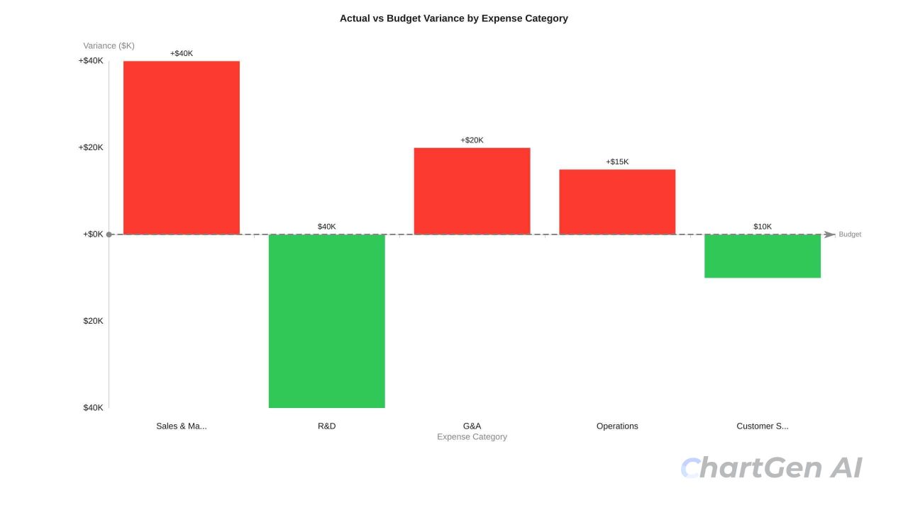
- ### Variance Bar Chart
What it answers: Where are we off-plan, and by how much?
A variance bar chart shows the difference between actual and target for each line item. Bars extending right are favorable; bars extending left are unfavorable. Standard bar charts showing absolute values force readers to compare two bars mentally. Variance charts make the gap itself the bar — the reader sees immediately which line items are most off-plan, and in which direction.
Best for: Budget vs. actual by expense category, this year vs. last year by revenue segment, forecast vs. actual by region.
Key design rule: Sort by variance magnitude, not alphabetically. The largest deviations should appear first. If you sort alphabetically, the most critical issues get buried in the middle.
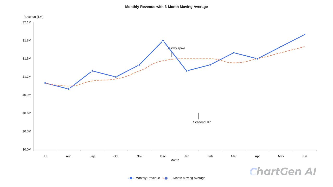
- ### Rolling 12-Month Line Chart
What it answers: What is the real trajectory of this metric, stripped of monthly noise?
Monthly financial data is noisy. A single large enterprise contract can make one month look exceptional. A one-time expense can make a month look alarming. The rolling 12-month view reveals whether the business is genuinely moving in a direction — or just bouncing around a stable baseline.
Best for: Revenue trend, gross margin over time, burn rate trajectory, headcount growth.
Key design rule: Add a 3-month moving average trend line. Not a complex forecast — just enough to show whether things are genuinely going up or down beneath the monthly variation.
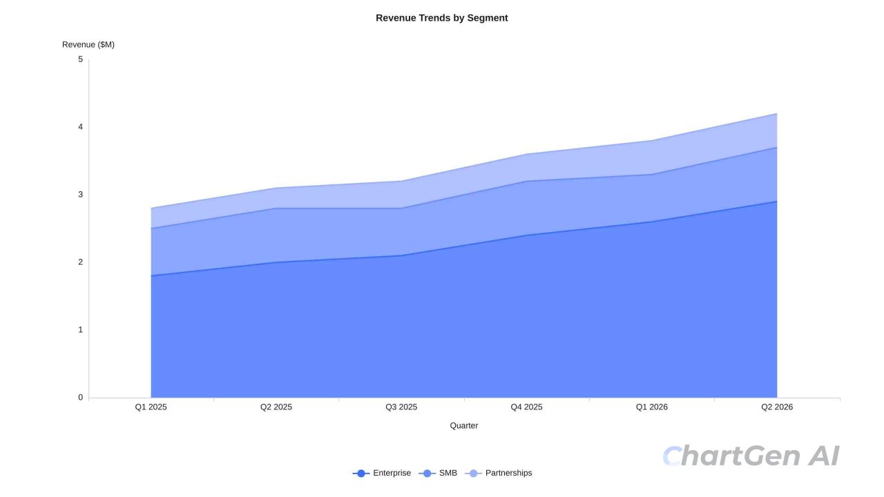
- ### Area Chart for Cash Flow and Composition
What it answers: How is total volume building up, or how are parts composing the whole?
Area charts work in two specific financial scenarios: cumulative cash position over time, and how multiple revenue streams compose a total. For cash flow, the filled region between the line and zero represents the actual cash available — the shape of the fill communicates whether the business is flush or tight. A narrowing shape toward the right of the chart is one of the most visceral ways to show a shrinking runway.
Best for: Monthly cash position with a minimum threshold line, revenue by segment composing total ARR, and operating expenses by category over time.
Key design rule: In most financial reporting contexts, area charts should use zero as the baseline. For stacked area charts, keep series to four or fewer — beyond that, the floating baselines make individual bands unreadable.
Financial Chart Design Rules
Some of these rules apply broadly to data visualisation; others are specific to financial reporting. All of them matter more when the audience is a board.
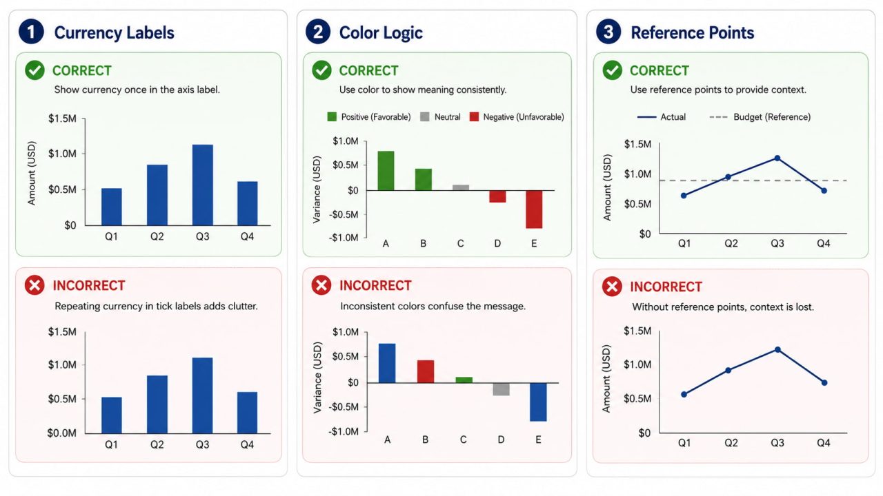
Abbreviate currency values—$ 6.3M, not $6,300,000. Precision beyond what's needed for the decision creates visual noise. Board members do not need four decimal places on a $50M revenue figure.
Establish consistent colour logic across the entire report. One colour for positive (blue or green), one for negative (red), and one for neutral/baseline (grey). Once your audience learns the vocabulary, they read the charts faster.
Every metric needs a reference point. Revenue of $4.2M means nothing without context. Against a $3.8M budget target, or against $3.1M in the prior year, it tells a story. Every financial chart should have a baseline, a target, or a comparison period.
Annotate anomalies on the chart itself. If a data point looks unusual, explain it with a brief label. "Q3 spike: annual contract prepayment." This prevents five minutes of Q&A per chart and shows the audience you've already thought through the question.
Keep time periods consistent within a report. Mixing monthly data in one chart and quarterly in the next creates unconscious confusion. Pick one granularity and hold it across the entire report.
In most financial reporting contexts, bar and area charts should use zero baselines. Truncating the Y-axis makes a 5% variance look like a 50% swing.
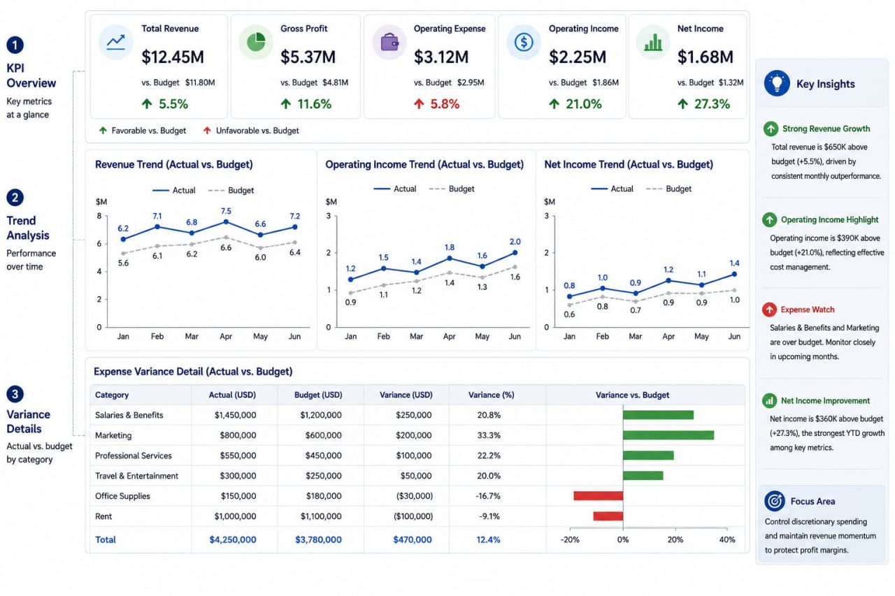
What Is a Financial Report Dashboard
A financial report dashboard is not a collection of charts on a single screen. It is a structured visual system designed to answer a specific set of questions about financial performance without requiring the reader to navigate between slides or scroll through a report.
Here is the thing about board members: they do not want to explore the data. They want answers to three questions: are we on track, where are the problems, and what are we doing about them? A dashboard that makes them work to find those answers has failed before anyone opens their mouth.
The layout itself communicates priority before the reader processes a single number. Place the most important metric in the top-left — readers scan left to right, top to bottom. Keep time ranges consistent across all charts; if revenue shows 12 months, cash flow should show 12 months. Nothing erodes trust in a dashboard faster than charts that appear to cover the same period but don't.
Top Row — Status at a Glance
Current revenue vs. target, gross margin, burn rate, and runway. Each shows current value vs. target or prior period, and a trend indicator. This is what the board reads in the first ten seconds. If these numbers look fine, the meeting stays calm. If they don't, everyone knows before the presenter says a word.
Middle Section — The Trends
Rolling 12-month revenue line, cash flow area chart, and a key operational metric. This is where trajectory becomes visible — not just what the number is today, but where it's been heading.
Bottom Section — The Detail
Variance bar chart by expense category, waterfall chart for the P&L bridge. This is where readers go when the top-row numbers prompt a question.
Right Panel — Key Insights
3–5 bullet points interpreting what the charts show. Not descriptions ("revenue increased") but interpretations ("enterprise drove 80% of growth; SMB declined for the second consecutive quarter"). The charts show what happened. The insights panel explains what it means.
Creating Financial Charts with ChartGen AI
Before AI tools, building a quarterly financial dashboard in Excel meant configuring axes, choosing aggregation methods, applying colour themes, and formatting labels — before you could see whether the chart was actually communicating what you intended. BI tools like Tableau or Power BI added more capability but also $70–150/user/month in licensing and a steep learning curve.
If your financial data is already in a spreadsheet, ChartGen AI can turn it into a board-ready chart from a plain English prompt — and automatically apply the design rules above. Whether you need a bar chart, a line chart, a waterfall chart, or a full financial dashboard, ChartGen AI generates any chart type from a single description — no design skills or coding required.
The workflow is three steps: upload your CSV or Excel file, describe what you need in plain English, and export the result.
Prompts that work for financial charts:
"Create a waterfall chart showing how we went from $10M gross revenue to $7.8M net income — green for additions, red for subtractions"
"Build a combo chart of quarterly revenue as bars and gross margin percentage as a line, dual axis"
"Show monthly cash position over the past 12 months as an area chart, add a threshold line at $500K"
"Variance bar chart comparing actual vs. budget by expense category, sorted by largest variance"
After generating the chart, ChartGen AI automatically produces key insights drawn from your data — identifying top and bottom performers, significant variances, and trend direction. These appear as a panel alongside the chart, ready to paste directly into a board report.
Export options: PNG (free), SVG and PDF on Ada.im.
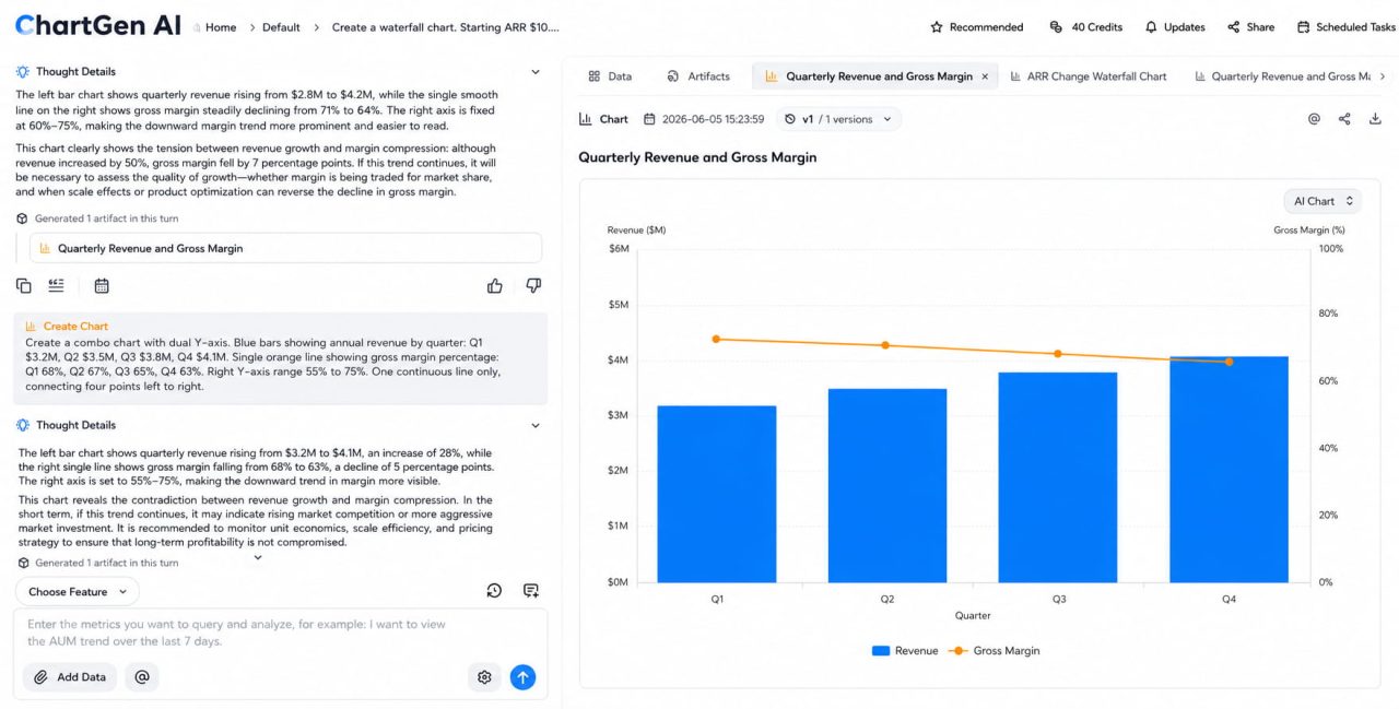
Real Example: A Quarterly Board Update in Minutes
A SaaS finance team is preparing for a board meeting. Their Q2 numbers are complicated: ARR grew 18% year-over-year, but gross margin dropped from 71% to 64%, and cash runway has shortened from 16 months to 11. Good news and bad news in the same quarter, and the CFO needs the board to understand both without the meeting turning into a detective investigation.
They upload their quarterly CSV to ChartGen AI — columns for month, revenue category, actual amount, and budget. Three prompts.
The waterfall chart shows ARR starting at $10.2M, adding $1.8M from new business, expanding $640K from existing accounts, losing $310K to churn, ending at $12.33M. The growth story is clear and credible.
The combo chart shows quarterly revenue as bars and gross margin percentage as a line on the right axis. The bars go up every quarter. The line goes down. The margin compression that had been hiding inside a revenue growth narrative is now the first thing anyone sees.
The area chart shows the monthly cash position with a threshold line at a $1M minimum balance. The fill shape narrows visibly toward the right. Runway isn't a number in a footnote anymore — it's a shape the board can see closing.
The CFO walks into the meeting with three charts instead of twelve slides. The board asks two clarifying questions instead of twenty. They leave with a decision on the next funding timeline.
Common Financial Visualisation Mistakes
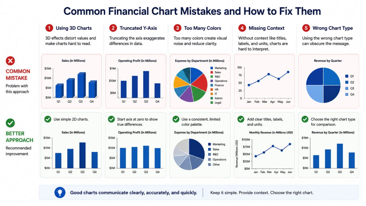
Using pie charts for revenue breakdown over time. Pie charts show proportions at a single point in time. They cannot show how proportions change across periods, which is almost always the actual question. Use a stacked bar chart or stacked area chart instead.
No reference point. A revenue number without a budget target, prior year comparison, or growth rate is an isolated data point. Every financial chart needs a "compared to what."
Over-precision in labels. $48,312,847.23 on a board slide is harder to read than $48.3M. Round to the level of precision the decision requires.
Mixing time granularity within a report. Monthly data in one chart, quarterly in the next, forces the reader to recalibrate their mental model between every chart. Pick one granularity and hold it.
Dual-axis combo charts with misleading scale relationships. When the two Y-axes are scaled independently, the line can appear to closely track the bars even when the actual correlation is weak. Always verify that the visual relationship reflects the real one.
Frequently Asked Questions
What is financial data visualisation?
Financial data visualisation is the process of converting financial data — revenue, expenses, cash flow, margins, variances — into visual formats such as charts and dashboards. The goal is to make financial information faster to interpret and easier to communicate, particularly to non-technical audiences like boards and investors.
What charts work best for financial reporting?
The most effective charts for financial reporting are waterfall charts for showing how a value changed component by component, combo charts for revenue vs. margin, variance bar charts for actual vs. budget, rolling line charts for trend analysis, and area charts for cumulative cash flow or revenue composition.
What is a financial report dashboard?
A financial report dashboard is a structured visual layout presenting multiple financial metrics simultaneously, organised by priority. A well-designed financial dashboard includes a top row of KPI summaries, a middle section of trend charts, a bottom section of variance detail, and an insights panel.
Can AI generate financial charts automatically?
Yes. ChartGen AI generates financial charts — including waterfall charts, combo charts, and variance bar charts — from a plain English description and a CSV or Excel file. The AI detects currency and date columns automatically, selects appropriate aggregation methods, and produces AI-generated insights alongside the chart. Charts are ready in under 5 seconds.
What's the difference between a waterfall chart and a bar chart for financial reporting?
A bar chart shows absolute values per category or time period. A waterfall chart shows how a value changed from one total to another, with each bar representing a single contributing factor. For financial reporting, a waterfall chart is more useful when the question is "how did we get from last quarter's number to this quarter's" — because it makes each contributing factor directly visible.
How do I create a financial dashboard without coding?
Upload your financial data as a CSV or Excel file to ChartGen AI, describe each chart in plain English, and export. For a multi-chart dashboard, Ada.im — the platform behind ChartGen — provides an AI Dashboard Generator that assembles multiple charts into a structured layout with filters and interactive elements.
Turn Your Spreadsheet Into a Board-Ready Report
Financial data visualisation is not a design skill. It is a communication skill — and the right chart type does most of the work once you understand which question each chart is built to answer.
Waterfall for change. Combo for two-metric relationships. Variance bars for off-plan analysis. Rolling lines for trend. Area charts for composition and cash flow. Apply the design rules, and the data speaks clearly enough that your next board meeting runs shorter.
Try ChartGen AI — upload your financial data, describe the charts you need, and get board-ready visualisations with AI-generated insights in seconds. Free up to 50 charts per month.