

How to Create a Chart from Your Data with ChartGen AI
Turn any spreadsheet or dataset into a clear, publication-ready chart with ChartGen AI. Upload data, describe the chart in plain language, pick the right chart type, refine, and export — no code required.
A chart is the fastest way to turn a column of numbers into something people actually understand. With ChartGen AI you don't pick menus or write formulas — you upload your data, describe the chart in plain language, and get a clean, styled visualization in seconds. This guide walks through the full flow for any dataset.
By the end you'll know how to:
- Upload or select a dataset to chart
- Write a prompt that gets the right chart type on the first try
- Refine colors, labels, and layout in natural language
- Export the chart as PNG, SVG, or into a report/PPT
Step-by-Step Walkthrough
Step 1: Upload or Select Your Data
Open ChartGen AI and upload a CSV, Excel file, or paste a table. If you just want to explore, start from one of the built-in sample datasets. ChartGen AI reads the columns and infers which are dimensions (categories, dates) and which are measures (numbers).
Step 2: Decide What the Chart Should Say
Before prompting, name the one question the chart should answer — "how did sales trend over time?", "which category is largest?", "how do two groups compare?". The question points to the chart type: trends → line, comparisons → bar, parts of a whole → pie/stacked, relationships → scatter.
Step 3: Write the Chart Prompt
Describe the axes, the metric, and the style. Be specific about what goes where — ChartGen AI handles the rest.
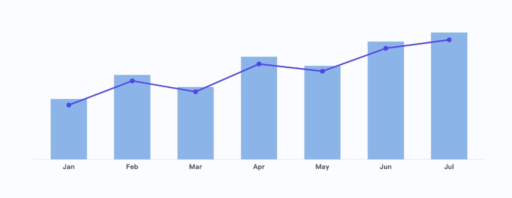
Create a bar chart with a trend line from my data. X-axis: month. Bars: total revenue per month. Overlay a line showing the moving trend. Use a clean, low-saturation palette, label each bar with its value, and highlight the highest month.
Step 4: Generate and Review the Chart
ChartGen AI produces the chart with sensible defaults — readable labels, a fitting color scheme, and a legend. Check that the axes, aggregation (sum vs. average vs. count), and sort order match your intent.
Step 5: Refine in Natural Language
Iterate by just describing the change — no need to regenerate from scratch:
- "Sort the bars from high to low."
- "Change the color scheme to teal and gray."
- "Add data labels and remove the gridlines."
- "Switch to a horizontal bar chart."
Step 6: Export or Reuse the Chart
When it looks right, export as PNG for documents, SVG for crisp scaling, or drop the chart straight into a dashboard, report, or PPT inside ChartGen AI.
Tips for Better Charts
| Goal | Best chart type |
|---|---|
| Trend over time | Line or area chart |
| Compare categories | Bar / column chart |
| Composition / share | Stacked bar or pie |
| Relationship between two metrics | Scatter plot |
Conclusion
Creating a chart with ChartGen AI comes down to three moves: bring your data, say what you want to see, and refine in plain language. Because the whole loop is conversational, you can go from raw numbers to a polished, on-brand chart faster than it takes to open a spreadsheet's chart wizard.
Try it yourself
Upload your data and describe what you need — ChartGen AI builds it in seconds.
Try ChartGen AI free →