

How to Build an Interactive Dashboard with ChartGen AI
Combine KPIs and multiple charts into a single interactive dashboard with ChartGen AI. Upload your data, describe the metrics you want to track, and get a shareable dashboard — no code required.
A dashboard brings your most important numbers together on one screen — KPIs at the top, supporting charts below, all updating from the same data. With ChartGen AI you describe what you want to monitor and it assembles a coherent, interactive dashboard for you. This guide covers the full flow for any dataset.
By the end you'll know how to:
- Choose the KPIs and charts that belong on one dashboard
- Prompt ChartGen AI to lay them out cleanly
- Add filters so viewers can slice the data themselves
- Share the dashboard or export it
Step-by-Step Walkthrough
Step 1: Upload the Data Behind the Dashboard
Upload the dataset you want to monitor — sales, traffic, operations, finance, anything with dates and measures. A dashboard usually reads best from a single clean table, so if your data is spread across files, combine them first (ChartGen AI can help with that too).
Step 2: Pick Your Headline KPIs
A good dashboard leads with 3–5 numbers that answer "how are we doing right now?" — totals, averages, rates, or period-over-period change. Everything else on the dashboard should explain or break down those headline numbers.
Step 3: Write the Dashboard Prompt
Ask for the KPI row and the supporting charts in one prompt. Name the metrics and how to slice them.
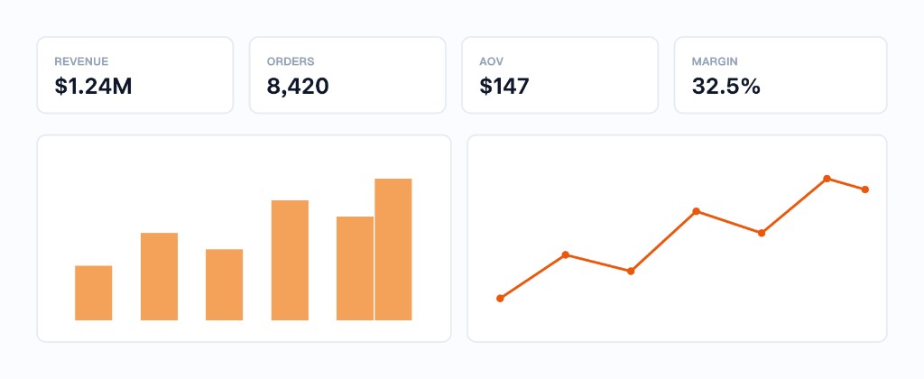
Build a dashboard from my data. Top row: KPI cards for total revenue, order count, average order value, and gross margin. Below, add a monthly revenue trend line and a bar chart of revenue by category. Add a date-range filter and a category filter. Use a clean, consistent color theme.
Step 4: Generate and Arrange the Layout
ChartGen AI assembles the KPI tiles and charts into a responsive grid. Rearrange by asking — "move the trend chart to the top-right" — or resize tiles so the most important view is largest.
Step 5: Add Interactivity
Filters and cross-highlighting turn a static picture into a tool. Ask for what viewers should be able to control:
- "Let me filter by region and quarter."
- "When I click a category bar, filter the rest of the dashboard to it."
- "Show percentage change vs. last period on each KPI card."
Step 6: Share or Export
Share a live link with your team, or export the dashboard as an image / PDF for a report. Because it's tied to the dataset, refreshing the data updates every tile at once.
Conclusion
A dashboard is just a well-organized set of KPIs and charts that share one dataset. In ChartGen AI you get there by naming the metrics you care about and letting the AI handle layout, styling, and interactivity — so you spend your time reading the story, not building the slides.
Try it yourself
Upload your data and describe what you need — ChartGen AI builds it in seconds.
Try ChartGen AI free →