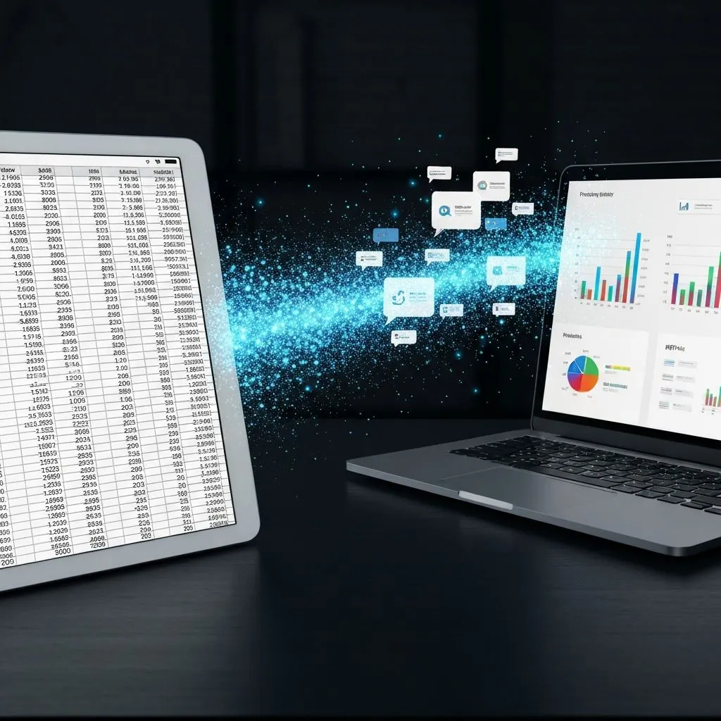
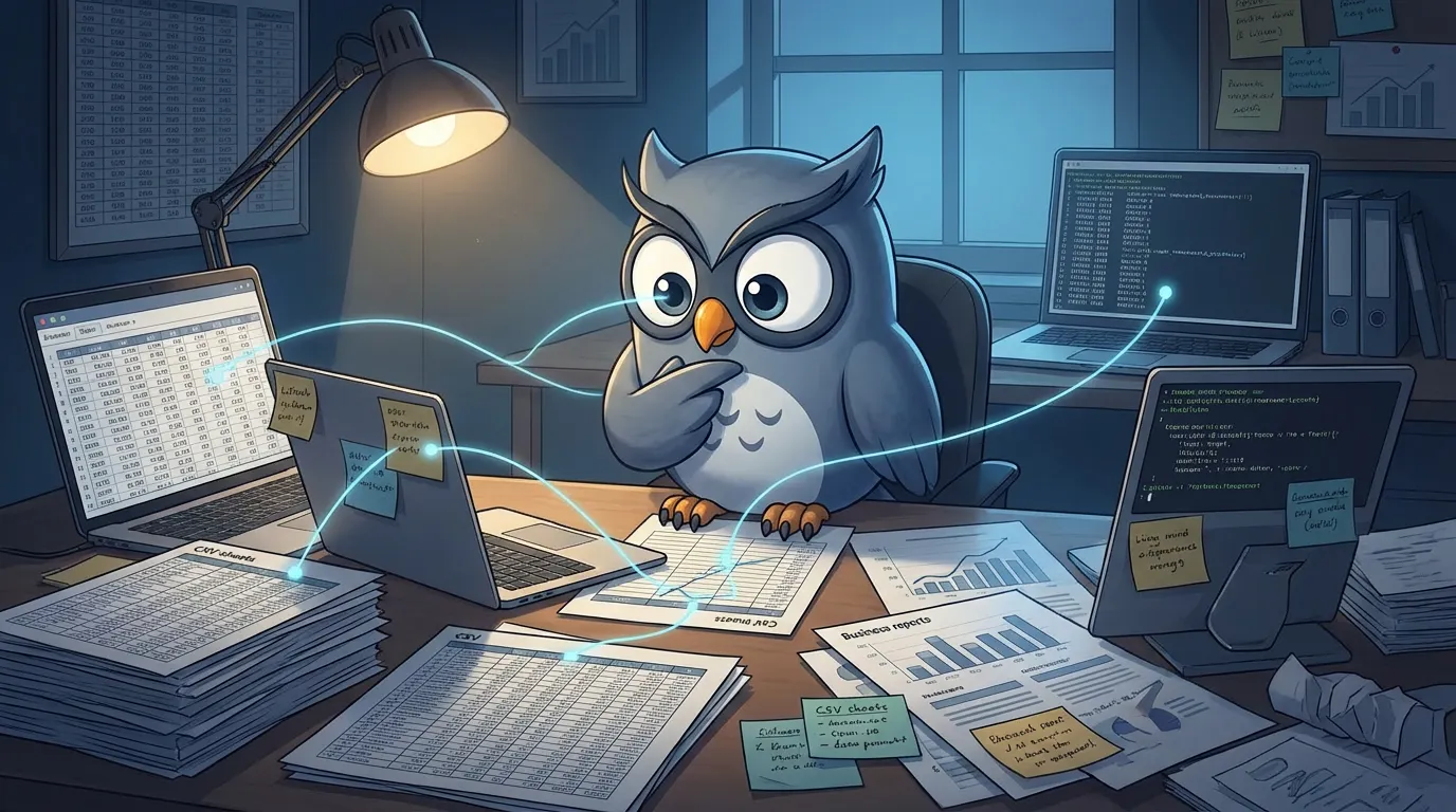
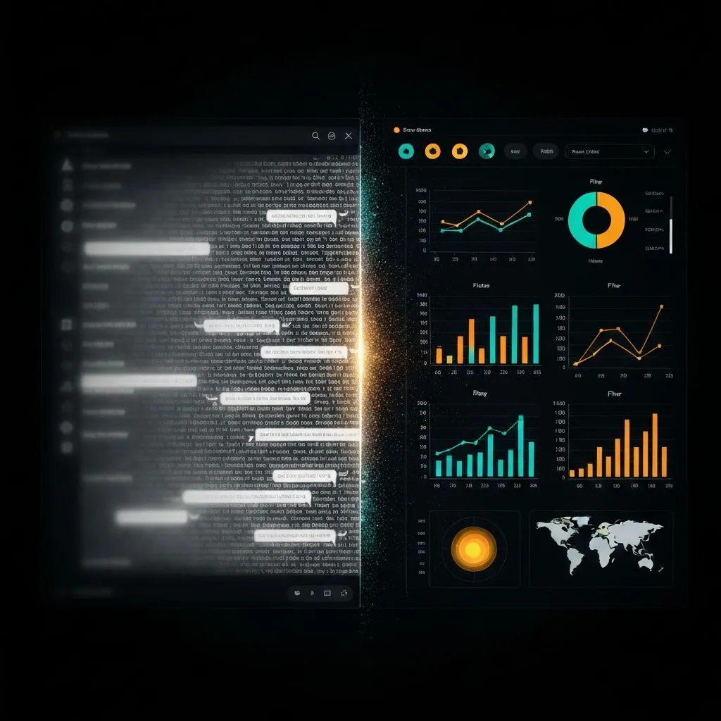
I Stopped Building Dashboards. AI Now Does It Better
Why manual dashboard production breaks decision velocity, and how an AI-first insight workflow helps teams move from chart output to faster actions.
Steven Cen
2026-05-08

Practical guides, industry insights, and hard-won lessons from data professionals. No fluff, no filler—just what works.

Stop retyping chart numbers from PDFs and screenshots — extract data from images, rebuild editable charts, and export in minutes with AI.
Steven Cen
2026-06-17

Turn messy survey exports into clear, actionable dashboards — the right chart for each question type, plus AI-built KPI cards and insights.
Steven Cen
2026-06-15

Which financial charts actually work for boards and executives — waterfall, combo, variance bars, and AI-built report dashboards.
Steven Cen
2026-06-11

Turn spreadsheet columns into professional bar charts in seconds with a free bar chart generator — no manual formatting required.
Steven Cen
2026-06-11

Learn what area charts encode, when to use them over line charts, and how to build one with ChartGen AI in minutes.
Steven Cen
2026-06-11

Most retail dashboards get built then abandoned. Learn how to design a retail analytics dashboard managers actually open every Monday.
Steven Cen
2026-06-11

GTC 2026 framed OpenClaw as the OS of agentic computers. SaaS is shifting to skills on ClawHub — here is why we shipped ChartGen AI as a skill in three days and what that means for API-first products.
Steven Cen
2026-05-21

Text models are plateauing in perception. The next wave of AI value is visual: video, UI, charts, dashboards, and presentations you can see, edit, and ship.
Steven Cen
2026-05-15

After testing 20 AI presentation makers, three patterns kept breaking professional work: hallucinated data, locked editing, and shallow content.
Steven Cen
2026-05-15

Upload or connect your data, pick a workflow (file upload, NL query, or one-shot prompt), and ship a traceable multi-chart dashboard in minutes—plus an 8-tool comparison and executive design techniques.
Steven Cen
2026-05-14

Upload your dataset, describe the insight you want, and generate traceable charts and slides—plus three workflows, a 6-tool comparison, and techniques for consulting-grade decks.
Steven Cen
2026-05-14

We ran the same 28-task SaaS launch plan through seven Gantt diagram creators — here is how they scored on speed, accuracy, exports, dependencies, and fit.
Steven Cen
2026-05-13

We swapped puzzles for messy business tables. The surprise was not prettier charts—it was how the AI behaved before drawing them, and what that means for analytics at work.
Steven Cen
2026-05-13

From prompt-driven assistants to delegated workflows: why agentic AI is an operational shift, not a model benchmark story — and what it means for organizations.
Steven Cen
2026-05-12

Why text-first chat fails for data work, how Google’s A2UI (Agent-to-UI) protocol moves agents toward native dashboards, and what still belongs in the intelligence layer beyond JSON transport.
Steven Cen
2026-05-12

Six high-value use cases, three generation methods, why editable output beats static images, a practical creation flow, and eight design rules—so you go from blank page to a useful map in seconds.
Steven Cen
2026-05-11

Design rules, a when-to-use framework, tool trade-offs, and how AI pie graph makers validate chart type before they render — so proportions read clearly instead of decorating slides.
Steven Cen
2026-05-11

How ChartGen AI helps teams move from delayed reporting to real-time, insight-led decisions across business functions.
Steven Cen
2026-05-08

Manual chart formatting is becoming a competitive liability. Here is how agent-based visualization changes analyst workflows, decision speed, and team output in 2026.
Steven Cen
2026-05-08

Why “LLM-to-SQL” fails in enterprises, and how agent architecture + a semantic layer enables governed, accurate, self-serve analytics for non-technical teams.
Steven Cen
2026-05-08

Why manual dashboard production breaks decision velocity, and how an AI-first insight workflow helps teams move from chart output to faster actions.
Steven Cen
2026-05-08

Learn the classic Excel graph workflow and a faster AI alternative so you can create decision-ready visuals in seconds instead of spending half an hour on formatting.
Steven Cen
2026-05-07

A practical step-by-step guide to turn Excel data into professional AI-generated charts quickly, with better chart choices and fewer manual formatting bottlenecks.
Steven Cen
2026-05-07

A practical guide to generating interactive Gantt charts from prompts or spreadsheets in under a minute, with less manual project-planning overhead.
Steven Cen
2026-05-06

A practical framework for shifting from manual chart production to question-first analysis, so teams can turn data into faster decisions.
Steven Cen
2026-05-06

A practical, experience-based checklist to decide when a bar chart is worth making, when it's not, and what to do instead-so you stop shipping charts nobody uses.
Steven Cen
2026-05-06

Linear chat is great for Q&A, but weak for connected analysis. This guide explains why infinite canvas workflows produce faster, more complete decisions.
Steven Cen
2026-04-30

From spreadsheet paradox to finished charts: the 6-step pipeline, four-question chart framework, data prep rules, traditional vs AI workflows, and a ChartGen AI walkthrough for campaign performance data.
Steven Cen
2026-03-21

Learn what heatmaps are, when to use them, the five heatmap types, design best practices, traditional vs AI workflows, and how to build professional heatmaps with ChartGen AI in seconds.
Steven Cen
2026-03-20

Why data decks differ from content slides, a 5-step data-to-presentation framework, three AI failure modes, six essential slide types, ChartGen AI workflow, step-by-step prompts, and best practices for accurate charts.
Steven Cen
2026-03-16

A $500 API bill with no attribution led to an interactive token dashboard built from CSV exports in about 30 minutes — and actionable cuts to cron waste and runaway usage.
Steven Cen
2026-03-13

A practical 4-question framework for choosing bar, line, or pie charts — with design rules, same-data comparisons, common mistakes, and how AI tools apply chart selection intelligence.
Steven Cen
2026-03-11

When to use line charts versus bars, six chart types with examples, eight professional design rules, five common mistakes, how AI line chart tools work, and prompts that produce presentation-ready output.
Steven Cen
2026-03-10

From Monday morning reports to anomaly alerts and local dashboards — five high-ROI data workflows OpenClaw can run end-to-end, and where specialized visualization closes the polish gap.
Steven Cen
2026-03-07

A single visual map of OpenClaw's six core systems—memory, capabilities, gateway, channels, dual-loop execution, and security—plus how messages flow from WhatsApp to the Brain.
Steven Cen
2026-03-05

A practical 2026 guide to bar chart types, design rules, common mistakes, how AI bar chart makers work, and when to choose bars versus other visuals.
Steven Cen
2026-03-02

Learn how to build professional, interactive dashboards using AI tools. Step-by-step guide covering dashboard design, data visualization best practices, and real-world examples for business intelligence.
Sarah Chen
2025-12-15

Learn how to transform your Excel spreadsheet data into professional charts using AI tools. Step-by-step tutorial with examples, tips, and best practices for instant data visualization.
Michael Torres
2025-12-10

Not sure which chart type fits your data? This comprehensive guide helps you choose the perfect visualization based on your data type, audience, and message. Includes decision flowchart and examples.
Dr. Aisha Patel
2025-12-09

Learn the best ways to visualize survey data. Complete guide covering Likert scales, multiple choice, ranking questions, and demographic breakdowns with chart recommendations and examples.
Emily Rodriguez
2025-12-08

After reviewing 500+ dashboards, here's what actually works when picking charts. Skip the theory—this is what matters in practice.
Sarah Chen
2025-12-08

Discover the most effective charts for displaying percentage breakdowns. Compare pie charts, donut charts, stacked bars, and treemaps with examples and best practices.
Sarah Chen
2025-12-07

Transform your boring spreadsheet into an engaging infographic. Complete guide covering data preparation, tool selection, design principles, and step-by-step tutorials with examples.
James Morrison
2025-12-06

Master pie charts with this comprehensive guide. Learn when pie charts work, when they don't, and how to create effective pie visualizations that communicate clearly.
Sarah Chen
2025-12-05

Master scatter plots for correlation analysis. Learn to identify relationships, add trend lines, interpret patterns, and avoid common pitfalls in bivariate data visualization.
Dr. Aisha Patel
2025-12-02

Master heatmap visualizations with practical examples from e-commerce, web analytics, and business intelligence. Learn design principles, color selection, and interpretation techniques.
James Morrison
2025-11-28

The bar vs line debate isn't as simple as most guides make it. Here's the nuanced answer from someone who's made both mistakes.
Marcus Thompson
2025-11-28

Detailed comparison of ChartGen and Tableau for data visualization. Compare features, pricing, ease of use, and find which tool fits your needs.
Marcus Thompson
2025-11-25

Comprehensive comparison of ChartGen and Microsoft Excel for creating charts. Compare ease of use, chart quality, features, and find which tool suits your workflow.
Jennifer Walsh
2025-11-20

After 15 years of Excel charts, I switched to modern tools. Here's why, what I learned, and whether it was worth it.
Jennifer Walsh
2025-11-15

After a decade in data, I keep seeing the same visualization mistakes. Here's what they are and how to fix them.
Emily Rodriguez
2025-11-10

15% of your audience may struggle with your charts due to accessibility issues. Here's how to fix that.
Rachel Kim
2025-10-28

The charts that actually work in board meetings and financial reviews. From a CFO who's sat through hundreds of them.
David Park
2025-10-22

Great data presentations follow a story structure. Here's how to apply narrative techniques to your visualizations.
Michael Torres
2025-10-05

What happens when your charts need to update faster than users can process? Lessons from building real-time systems at scale.
Priya Sharma
2025-09-22

The science behind why certain colors work in charts—and how to use this knowledge without a design degree.
Dr. Aisha Patel
2025-09-18

Most dashboards are abandoned within months. Here's how to build ones that become indispensable.
James Morrison
2025-09-08
Put these insights into practice. Generate professional visualizations in seconds with ChartGen.
Try ChartGen Free