
Quick answer: A Gantt diagram creator turns tasks, durations, and dependencies into a horizontal bar timeline — a Gantt chart. In 2026, the strongest options use AI to parse natural language or raw Excel/CSV into interactive diagrams with dependency arrows, milestones, and critical-path emphasis. Standouts include ChartGen AI (data-driven Gantt with strong export, including PPT), ClickUp AI for teams already on ClickUp, Microsoft Project for enterprise PMOs, and lighter or free tools such as GanttChart.ai and Google Sheets.
1. What is a Gantt diagram creator — and why it matters
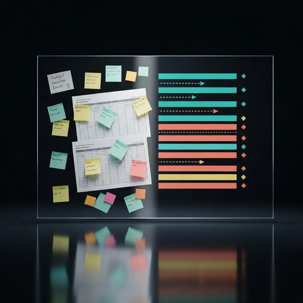
A Gantt diagram creator takes tasks — with start and end dates, durations, dependencies, and assignees — and renders a timeline where each bar is a task, the horizontal axis is time, and arrows show dependencies.
The idea dates to Henry Gantt in the 1910s. A century later, the Gantt view is still the shared language of delivery planning across Agile, Waterfall, and hybrid programs.
The friction is familiar: many teams still build Gantt diagrams by hand in Excel, Google Sheets, or PowerPoint. A medium-complexity plan with 25–30 tasks can cost 30–90 minutes to draw — and one slipped deadline forces a rebuild. Dependencies cascade, milestones move, and a polished chart can quietly go stale within a week.
AI-powered creators parse natural language or messy spreadsheets and return an editable Gantt in seconds. This article compares seven tools using the same real project and input.
2. How we tested: one project, seven tools
To keep the comparison fair, every tool received the same scenario: a six-month SaaS product launch with 28 tasks, four phases (Research, Design, Development, Launch), 12 dependencies, three milestones, and five team members.
The input was one CSV with columns for Task Name, Phase, Start Date, End Date, Duration (days), Dependencies, Assignee, Priority, and Status. Each product was scored on seven dimensions:

- Speed — How fast from input to a finished Gantt?
- Accuracy — Did it parse all 28 tasks, 12 dependencies, and 3 milestones?
- Visual quality — Presentation-ready for stakeholders?
- Customization — Can you edit colors, labels, groupings, and layout after generation?
- Export options — PNG, PDF, SVG, PPT, interactive embed?
- Dependencies — Arrows, critical path, circular-dependency handling?
- Price — Free tier, per-seat pricing, or one-time cost?
3. The seven best Gantt diagram creators in 2026


Tool 1: ChartGen AI — best for data-driven teams (8.8/10)
Top pick for spreadsheet-backed plans.

Strengths: Upload CSV or Excel and the pipeline cleans fields, detects date columns, infers dependencies, and produces presentation-quality Gantt layouts. Export coverage was the broadest in the test set (PPT, PNG, SVG, interactive web, PDF). The multi-agent flow — planning, data cleaning, visualization — held accuracy across all 28 tasks.
Weaknesses: Not a full PM suite (no native task assignment workflows, notifications, or sprint tooling). Full features sit behind a subscription.
Best for: Teams whose source of truth lives in spreadsheets and who need stakeholder-ready timelines fast — especially product managers moving from raw rows to a boardroom-ready chart in under a minute.
Tool 2: ClickUp AI Gantt generator (8.5/10)
Strengths: Lives inside a real PM platform. Natural-language input can spawn tasks and dependencies; timeline updates propagate when dates move. Deep ties to ClickUp tasks, workload views, and reporting.
Weaknesses: Ecosystem lock-in; limited export (no PPT in our test). Per-seat pricing scales with headcount, and new users face a learning curve.
Best for: Teams already standardized on ClickUp who want timelines generated from briefs or meeting notes without leaving the workspace.
Tool 3: Microsoft Project (8.2/10)
Strengths: The reference implementation for dependency math, critical path, resource leveling, and earned value. Handled all 28 tasks and 12 dependencies with perfect structural accuracy. Copilot assists with scheduling suggestions.
Weaknesses: Cost (~$30/user/month at typical tiers), setup time (about 15 minutes for the same CSV that AI-first tools ingested in seconds), and a steep learning curve. No natural-language “describe the project” generation comparable to lighter AI tools.
Best for: Enterprise PMOs on complex programs with compliance, EVM, and deep resource constraints.
Tool 4: Miro AI Gantt maker (7.5/10)
Strengths: Strong visual polish and real-time collaboration; Gantt views sit naturally next to journey maps, wireframes, and workshops.
Weaknesses: Dependency arrows skew cosmetic — no rigorous critical-path engine. Parsing missed two of twelve dependencies in our run. Data import options were narrower than spreadsheet-first tools.
Best for: Design-led teams where the timeline is one panel on a larger visual canvas.
Tool 5: GanttChart.ai (6.8/10)
Strengths: Fastest end-to-end time in the test — under ten seconds from text prompt to chart. Minimal UI and a usable free tier.
Weaknesses: Text-in only (no CSV/Excel upload in our workflow). Limited post-generation customization; dependency handling was basic. Missed five dependencies and misread three durations versus the reference plan.
Best for: Quick one-off diagrams for proposals, Slack, or early framing when speed beats precision.
Tool 6: Diagram-Generator.com (5.3/10)
Strengths: Free, no account, fast text-based generation.
Weaknesses: Thin customization, no file upload, dated visuals, and weak dependency support relative to modern AI Gantt tools.
Best for: Disposable charts when “something on screen in thirty seconds” is the only requirement.
Tool 7: Google Sheets SPARKLINE method (3.8/10)
Strengths: Free; data never leaves your sheet; only a Google account.
Weaknesses: Extremely manual — about 45 minutes for the 28-task build. No dependency arrows, weak aesthetics at scale, brittle updates, and no first-class milestones. Every schedule change is manual bar math.
Best for: Students, freelancers, or anyone avoiding new vendors at all costs.
4. Step-by-step: Gantt from Excel or CSV in under a minute

Prepare your data (or do not)
Ideal columns: task name, phase, start, end, duration, dependencies, assignee, priority, status. Real files rarely arrive that clean — mixed date formats, duration-only rows, and prose dependencies (“after design review”) are normal. A capable creator normalizes this; a weak one leaves you cleaning for twenty minutes before the first bar appears.
Choose an input path
- A: Upload CSV/Excel (best for existing plans).
- B: Natural-language description (best for greenfield schedules).
- C: Paste from another PM tool (Jira, Asana, etc.).
Let AI parse structure
Behind a solid upload flow you should see: column detection, date standardization, dependency resolution, derived end dates from duration, milestone detection (zero-duration tasks), and optional phase grouping.
Review the first render
Check task count, dependency arrows, milestone markers, and critical-path emphasis if offered. Watch for wrong task order, ambiguous dependency arrows, and overlapping bars from bad date parsing — better tools surface ambiguity instead of guessing silently.
Customize the visual layer
Color by phase, priority, or owner; switch time scale; toggle arrows; emphasize critical path; add a today line for status reviews. The goal is to tune the story without rebuilding from scratch.

Export for the audience
- Stakeholders: PPT or PDF.
- Dashboards: Interactive embed.
- Docs: PNG or SVG.
- Collaboration: Share link with edit permissions.
Pro tip: Prefer tools that let you refresh underlying data and regenerate without throwing away styling. Living plans change weekly — if every refresh is a rebuild, the tool costs more time than it saves.
5. Five Gantt mistakes that make plans look amateur
Your software cannot fix these if the narrative is wrong — but knowing them upgrades every chart you ship.

Mistake 1 — Every sub-task on an executive slide: 150 rows nobody can parse. Fix: Roll up to summary phases for leadership; keep task-level detail for working sessions.
Mistake 2 — Ignoring dependencies: Bars that float alone hide what blocks what. Fix: Model finish-to-start links explicitly; arrows carry the logic, not just dates.
Mistake 3 — Hiding the critical path: If everything looks equally urgent, teams polish non-bottlenecks. Fix: Highlight the longest dependent chain — that is the minimum-duration spine of the program.
Mistake 4 — Static screenshots that expire before Monday: Friday’s PNG is stale by the stand-up. Fix: Prefer data-connected regeneration or live embeds tied to the source sheet.
Mistake 5 — No progress overlay: Plans without percent complete or actuals hide drift. Fix: Overlay progress and a today line — planned bars plus darker progress fills read faster than narrative status alone.
6. Advanced: AI insights beyond drawing bars
Modern Gantt tools increasingly analyze, not only render:
- Automatic critical path — surface the chain where a one-day slip moves the end date.
- Resource conflicts — flag overlapping assignments and suggest date shifts.
- What-if modeling — extend design by two weeks and watch downstream effects instantly.
- Natural-language edits — “Push testing two weeks” without manual bar surgery.
- Multi-output from one upload — Gantt, milestone strip, heatmaps, and summaries with consistent styling. ChartGen AI routes work through specialized agents so each view stays aligned with the same cleaned dataset.
7. Frequently asked questions
What is the best Gantt diagram creator in 2026?
For spreadsheet-first teams, ChartGen AI (~8.8/10) balances parsing, visuals, and exports including PPT. On ClickUp already, use ClickUp AI (~8.5/10). For enterprise PMOs with heavy dependency math, Microsoft Project (~8.2/10) remains the benchmark. For free speed, try GanttChart.ai; for zero signups and maximum friction, Google Sheets.
How do I create a Gantt diagram from Excel data?
Upload a workbook with task names, dates, and optional dependencies to an AI Gantt tool such as ChartGen AI or ClickUp. Expect column detection, date normalization, dependency linking, and an interactive chart. Sheets-only workflows trade time for cost.
Can AI create Gantt charts automatically?
Yes — tools like GanttChart.ai, ClickUp AI, and ChartGen AI accept prose or files and return structured timelines in well under a minute for typical plans.
What is the best free Gantt chart maker?
GanttChart.ai (AI, text-first), Diagram-Generator.com (simple, anonymous), and Google Sheets SPARKLINE (fully local, manual). For occasional AI charts, GanttChart.ai’s free tier was the most capable in this cohort.
How do you model dependencies?
Include a Dependencies column naming prerequisite tasks. Strong parsers render arrows and may compute critical path. Sheets-only setups usually need add-ons or separate drawing for arrows.
Gantt diagram vs Gantt chart?
Same artifact — regional wording differs. Both mean a horizontal timeline of tasks with optional dependency arrows.
8. Stop drawing bars — start managing projects
In 2026, spending 30–90 minutes hand-building a Gantt in Excel is a choice, not a requirement. AI-first creators can ingest messy inputs, preserve dependency logic, call out risk on the critical path, and export formats your stakeholders already use.
Decision shortcut:
- On ClickUp → ClickUp AI Gantt.
- Fast disposable charts → GanttChart.ai.
- Visual collaboration boards → Miro AI.
- Spreadsheet in, PPT out → ChartGen AI.
- Enterprise program controls → Microsoft Project.
- Zero budget, zero vendors → Google Sheets.
The value is not the picture — it is the hours returned for risk review, staffing trade-offs, and scope conversations instead of cell formatting.
See it in action
Upload a project CSV to ChartGen AI and get a Gantt with dependency arrows, milestones, phase grouping, and one-click PPT export — without manual bar dragging.