


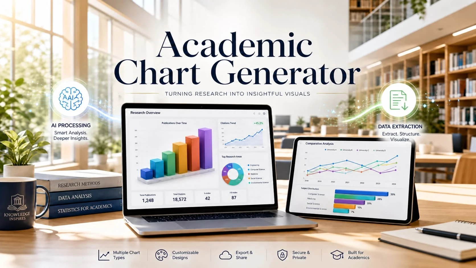
Academic reports often contain useful data, but the data does not always become easy to understand. We may have survey results, lab records, paper tables, classroom performance data, or research notes. When those numbers stay inside long tables, readers need more time to understand the pattern behind the data.
An academic chart generator helps turn study data into clearer charts for reports, papers, presentations, and classroom projects. We can use it to compare pre-test and post-test scores, show lab results across several trials, turn survey response percentages into charts, or track weekly learning progress. The goal is not to decorate the report. The goal is to help readers understand what the data is saying without checking every row manually.
Why Are Academic Reports Hard to Read with Plain Tables?
Academic tables are useful because they keep data organized. They can show scores, counts, survey answers, test results, experiment records, and statistical values in a structured way. But tables are not always the clearest format for explaining a pattern.
When a report includes too many rows, readers may miss the main point. They may see the numbers but not the trend. They may understand one value but not the difference between groups. This is where charts can make academic data easier to read.
Study Data Often Comes from Different Sources
Study data may come from survey forms, lab experiments, classroom tests, interviews, observation records, or published papers. Each source may use a different format.
One file may contain student scores. Another may contain survey responses. A research paper may include a table with sample groups, percentages, and test results. When these sources stay separate, we need extra time to organize them before we can explain the result clearly.
Tables Can Hide Patterns in Study Results
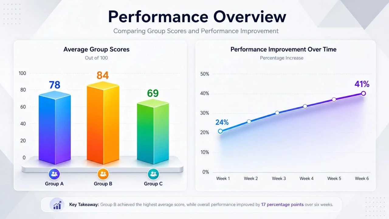
A table can show that Group A scored 78, Group B scored 84, and Group C scored 69. But the difference becomes easier to understand when those values appear in a chart.
The same problem appears in survey data. If one answer choice grows from 24% to 41%, the change may not stand out in a table. A chart helps readers see the comparison faster, especially when the report needs to explain findings clearly.
What an Academic Chart Generator Should Help Us Show?
A useful academic chart generator should help us turn study questions into visual answers. We should not create charts only because the data exists. We should choose charts based on what the report needs to explain.
In academic writing, charts often need to show comparison, change, distribution, or proportion. These visual patterns help readers understand data without reviewing every value one by one.
Compare Groups, Scores, or Survey Results
Many academic reports need to compare groups. We may compare student performance across classes, test scores across teaching methods, or survey answers across age groups.
A bar chart can help show these differences clearly. For example, if one teaching method produces higher post-test scores than another, a chart can make that comparison easier to understand. We still need to explain the result in writing, but the chart helps the reader see the pattern first.
Show Trends in Research or Study Data
Some academic data changes over time. We may track learning progress across several weeks, experiment results across several trials, or participation data across a semester.
For this kind of data, an AI Area Chart Generator can help show growth, decline, or cumulative change. This works well when the report needs to explain how values move over time instead of only comparing one group against another.
How a Paper Table Extractor Helps Before Charting?
Before we create a chart, we often need to move the data into a usable format. This step can take time when the data comes from a paper, PDF, image, or screenshot instead of a clean spreadsheet.
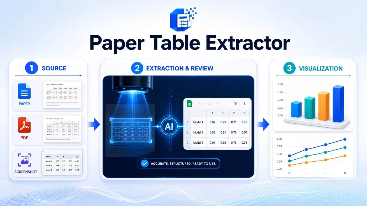
A paper table extractor helps turn tables from research papers, PDFs, scanned pages, or screenshots into editable data that we can review and chart. It does not only copy the table. It helps prepare the table data so we can continue working with it in a report, presentation, or study summary.
Extract Tables from Papers, PDFs, or Screenshots
Research papers often include tables with valuable data, such as sample sizes, group results, survey percentages, experiment values, or statistical outcomes. If the table is locked inside a PDF or image, retyping the data by hand can slow the whole report.
With AI Image to Chart, we can work from visual data sources and turn them into a chart-ready format. This is useful when we need to create a chart from a paper table, classroom handout, lab result screenshot, or scanned report page.
Check Data Before Creating the Chart
Extracted data still needs review. A tool can read a table, but we should check whether headers, values, units, and labels were captured correctly.
For example, a paper table may include percentages, sample sizes, confidence intervals, and notes in the same area. Before charting, we need to confirm which values should become the chart data. This keeps the final report accurate and easier to explain.
How a Study Report Chart Maker Builds Clearer Reports?
A study report chart maker helps us connect data with the report question. Instead of only asking for a chart, we can describe what we want to compare or explain. The tool can then help choose the chart structure based on the data.
This makes the report easier to build because we do not need to decide every visual detail manually. We still control the meaning, but the tool helps prepare the chart faster.
Choose the Right Chart for the Study Question
Different study questions need different chart types. If we need to compare groups, a bar chart may work well. If we need to show change over time, a line chart or area chart may be clearer. If we need to show proportions, a pie chart may help when the number of categories is small.
The chart should match the question. A chart that looks clean but answers the wrong question can still make the report harder to understand.
Make Reports Easier to Explain
Charts help readers understand the main finding faster. A study report may include detailed tables, but a chart can show the main result before the reader studies the numbers.
This is useful for classroom reports, research summaries, academic presentations, and project reviews. We can use the chart to support the written explanation instead of forcing the reader to build the pattern alone.
How an Education Dashboard Maker Helps Track Learning Data?
When one chart is not enough, an education dashboard maker can help us show several learning metrics in one place. Instead of creating one chart for one number, we can organize multiple views into a clearer dashboard.
This can help teachers, researchers, or academic teams review student performance, participation, assignment completion, survey feedback, or learning progress across time.
Track Class Performance and Participation
Education data often includes more than one metric. A class report may need to show average scores, attendance, completion rates, assignment submission, and survey responses.
A dashboard can place these metrics together so the reader can see the broader picture. For example, if test scores fall during the same period as attendance drops, the report can show both patterns more clearly.
Review Progress Across Time
Learning data often changes gradually. Weekly quiz scores, project completion, reading progress, and participation records may not look meaningful in a single table.
A dashboard can show these changes with charts that make progress easier to review. This helps academic teams understand whether learning outcomes are improving, staying flat, or declining over time.

Using the Academic Chart Generator in Research Reports
An academic chart generator helps turn tables, paper data, survey results, and classroom records into charts that readers can understand faster.
It works best when we have a clear question. What group scored higher? How did results change over time? Which survey answer appeared most often? What learning trend needs attention? These questions are easier to explain with charts than with long tables alone.
A chart does not replace academic judgment. We still need to check the data, explain the result, and avoid overstating what the numbers show. But with ChartGen AI, we can spend less time rebuilding charts manually and more time explaining what the study data actually means.