


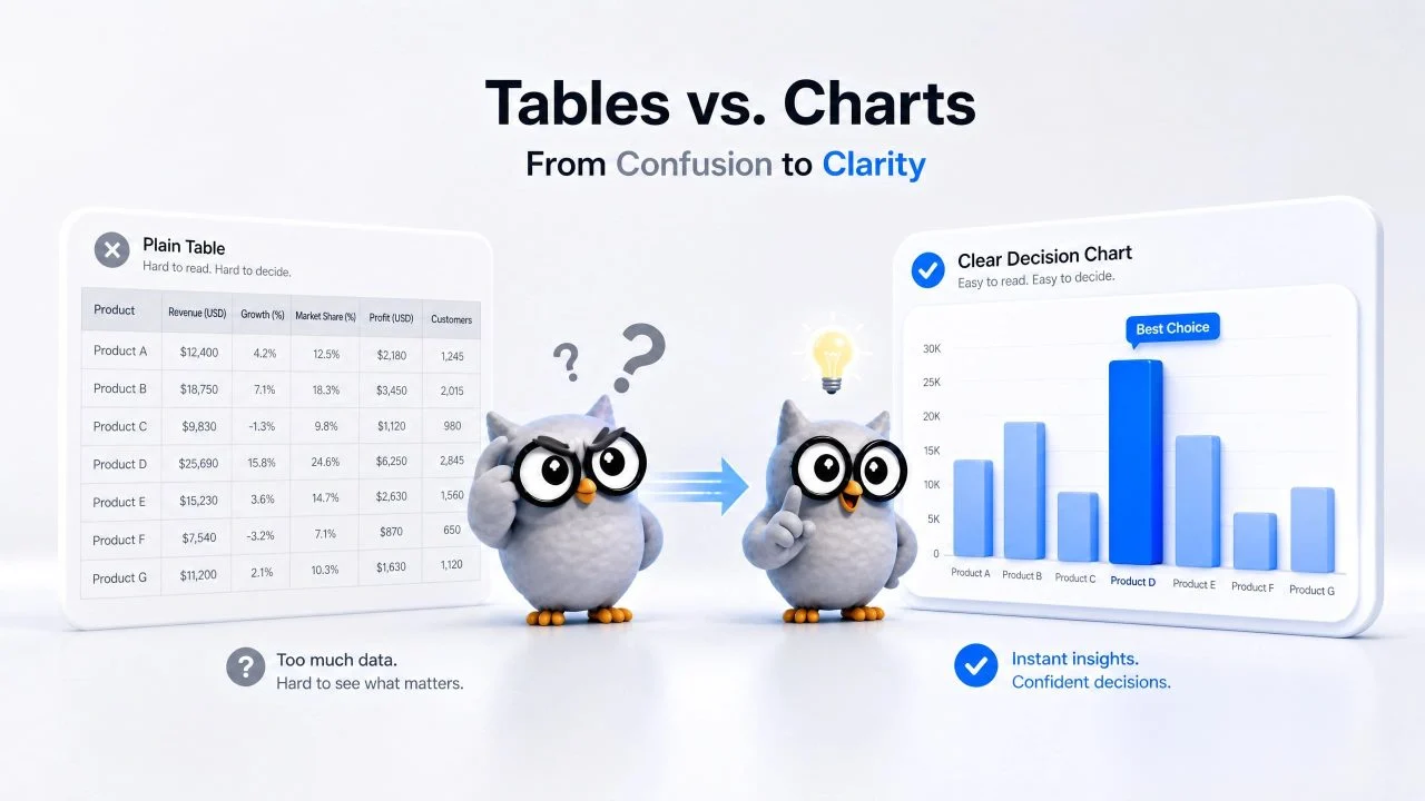
Plain tables are useful when we need to store data. They can show prices, scores, product features, survey results, campaign numbers, or business performance in rows and columns. But when we need to compare options and make a decision, a table often makes the process slower.
When teams compare options during a meeting, slow table reading can delay decisions or lead people to focus on the wrong metric. A comparison chart maker helps turn side-by-side data into a visual format that is easier to scan. Instead of checking every cell, we can see which option performs better, which category ranks higher, and which result needs attention.
Plain Tables Create Decision Problems When Comparisons Matter
A table looks organized, so it may seem like the comparison is already clear. The problem appears when the reader needs to compare several rows, columns, or values at the same time.
When a table has too many numbers, the reader must keep switching between cells. That makes it harder to see the strongest option, the weakest option, or the gap between results. The data exists, but the decision is still buried inside the layout.
Readers Must Scan Too Many Cells
A product comparison table may include price, size, weight, rating, delivery time, and warranty. A business report may include revenue, cost, conversion rate, customer count, and growth rate.
When all of these values stay in table form, readers must scan across several columns before they understand the difference. If two options are close, the comparison becomes even slower. A chart can reduce that effort by showing the difference visually.
Small Differences Can Be Missed
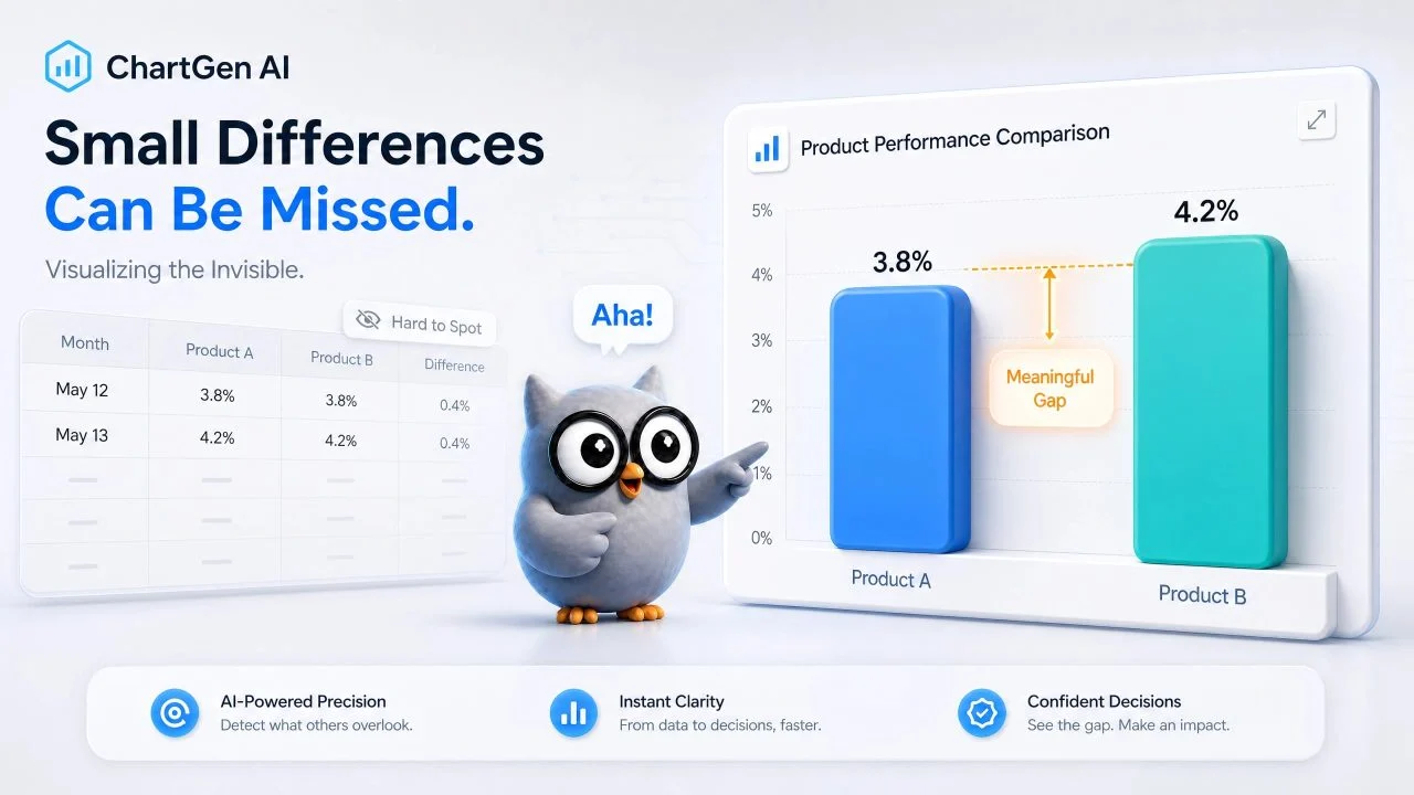
Some comparisons depend on small gaps. A campaign may have a conversion rate of 3.8%, while another has 4.2%. A product may score 82 in one test and 87 in another. These differences are easy to miss when they sit inside a table.
A chart makes the gap easier to notice. It helps readers understand whether the difference is meaningful enough to discuss, investigate, or act on.
A Comparison Chart Maker Solves the Problem of Hidden Differences
A useful comparison chart maker helps us turn comparison questions into clear visual answers. We should not create charts only because the data exists. We should create them when the reader needs to compare options quickly.
Comparison charts work well when the report needs to show differences, rankings, strengths, weaknesses, or performance gaps. They help us move from reading data to understanding what the data means.
Compare Products, Groups, or Results
Many reports need to compare several options. We may compare product features, student scores, sales channels, survey answers, service plans, or supplier performance.
A comparison chart can show which option is higher, lower, faster, cheaper, or more consistent. For example, if we compare three suppliers by delivery time, defect rate, and cost, a chart helps readers see the trade-offs faster than a long table.
Show Strengths and Weaknesses Clearly
Some decisions depend on more than one metric. One product may have a lower price but weaker performance. Another may have better ratings but a longer delivery time.
A comparison chart helps show these strengths and weaknesses in a clearer structure. We can use it to support a recommendation, explain a choice, or show why one option should be reviewed more carefully.
A Ranking Visualization Tool Solves Slow Sorting and Scanning
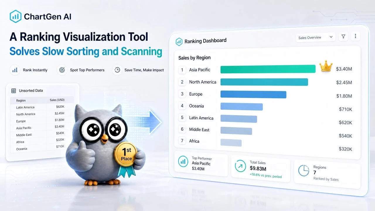
A ranking visualization tool becomes useful when the main question is order. Which product ranks first? Which campaign produced the highest return? Which region performed the weakest? Which category deserves attention first?
Tables can show rankings, but they often require the reader to sort, scan, and compare manually. A ranking chart makes the order visible immediately.
Rank Business Results from High to Low
Business teams often need to rank results. We may rank sales by region, traffic by channel, revenue by product, or support tickets by issue type.
When the values are sorted visually, the reader can see the top performers and low performers faster. This helps reports become more useful in meetings, where people need to understand the result quickly.
Find the Best and Worst Performers Faster
Ranking charts also help identify outliers. One product may sell much more than others. One campaign may spend more but produce fewer leads. One department may close tickets slower than the rest.
These patterns are easier to see in a chart. A table may still be needed for exact values, but the chart helps readers know where to look first.
A Business Chart Generator Solves the Reporting Gap Between Data and Decisions
A business chart generator helps turn comparison data into charts that match the reporting goal. This matters because business reports often include different types of data, and one chart type does not fit every comparison.
Before creating the chart, we need to know what the report should explain. Are we comparing categories? Ranking results? Showing changes over time? Highlighting one option against another? The chart should match the decision.
Turn Business Data into Visual Comparisons
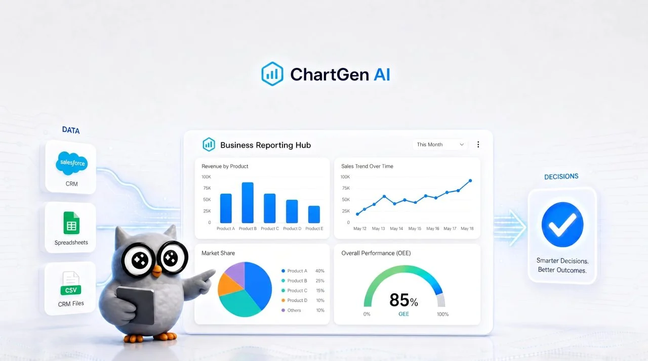
Business data may come from spreadsheets, dashboards, survey exports, CRM files, or sales reports. The data may include product names, regions, dates, revenue, costs, ratings, or counts.
A chart maker from data helps organize these fields into a visual comparison. For example, we can compare monthly sales by region, product ratings by category, or campaign leads by source.
Choose the Right Chart Format
A bar chart is often useful for direct comparisons. If we need to compare revenue by product, sales by region, survey results by group, or campaign performance by channel, Bar Chart Generator can show the difference clearly.
If we need to compare rankings, a sorted bar chart may work better. If we need to compare change over time, another chart format may be clearer. The chart format should reduce confusion. A chart that looks clean but does not match the question can make the report harder to understand.
How to Generate a Chart from Data Without Rebuilding Reports Manually?
Once the comparison problem is clear, we can turn the data we already have into a clearer visual answer. The data may come from Excel, CSV, copied tables, survey exports, or business reports. We can upload the file, explain what we want to compare, and refine the chart around the decision.
This makes the workflow faster when we need to generate chart from data without rebuilding every chart manually. We can focus on the comparison question while the tool helps prepare the visual structure.
Start with the Data We Already Have
We can start with the data file we already use for reporting. It may contain product rows, business metrics, survey results, regional performance, or ranking data.
For example, we may ask the tool to compare product ratings, rank sales channels by revenue, or show which campaign had the highest conversion rate. The clearer the request, the easier it becomes to create a useful chart.
Refine the Chart Around the Decision
After the first chart is created, we can adjust it. We may ask the tool to sort values from highest to lowest, group small categories, change the chart type, focus on one metric, or remove rows that do not belong in the comparison.
This helps turn the chart into a decision-support visual instead of just another image placed inside a report. The final chart should help readers understand what changed, what ranked higher, and what needs attention.

Plain Tables Need a Comparison Chart Maker When Decisions Depend on Clear Differences
Plain tables still have value. They are useful for storing exact values, checking details, and keeping records. But when the goal is to compare options, explain rankings, or support a decision, tables often make the reader work too hard.
A comparison chart maker helps show differences more clearly. It can compare products, rank business results, highlight performance gaps, and make side-by-side data easier to understand. This is useful for reports, presentations, internal reviews, and decision-making documents.
When readers need to choose between options, a clear chart can show the answer faster than a dense table. The table can keep the details. The chart can show the decision.