


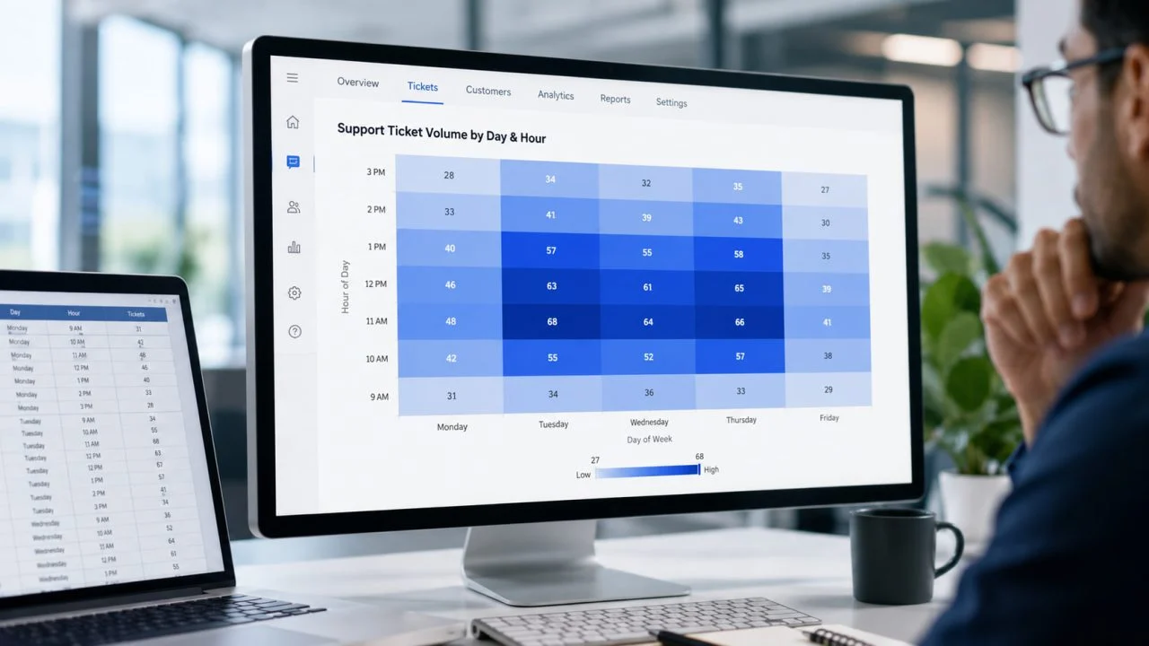
A spreadsheet can contain every number a team needs and still make the most important pattern difficult to see.
Consider a customer support manager reviewing ticket volume by day of the week and hour of the day. In the example dataset used in this article, Tuesday rises from 34 tickets at 9 AM to 68 at 11 AM, while Wednesday and Thursday show similar increases around midday.
Every number is available in the table. But the manager is probably not interested only in the fact that Tuesday at 11 AM recorded 68 tickets.
The more useful questions are broader.
Does demand repeatedly peak around midday? Are the busiest periods concentrated on particular days? Is one time slot unusually different from the surrounding values? Should staffing levels change during those hours?
Finding those answers from a grid requires repeated comparison across rows and columns.
A heatmap changes that task by using color intensity to make higher, lower, or unusual values visually distinct.
The purpose is not simply to make a table more colorful. It is to make patterns across two dimensions easier to recognize.
In this article, “heatmap” refers primarily to a color-coded data matrix rather than website click or scroll heatmaps.
A Table Shows Values, but the Pattern Is Harder to See
Tables are effective when someone needs to retrieve an exact value.
If a manager wants to know exactly how many support tickets arrived at 10 AM on Tuesday, the corresponding cell can provide the answer immediately.
The task becomes harder when the question changes from one value to a pattern.
Determining whether late mornings are consistently busier than afternoons requires comparing several cells across multiple days. A table still contains the answer, but the pattern may not be immediately visible.
Dense Data Creates a Comparison Problem
The difficulty often appears when two meaningful dimensions intersect repeatedly.
Common structures include:
Day × Hour
Product × Region
Department × Metric
Machine × Shift
Campaign × Channel
Each cell represents one intersection between those dimensions.
As the number of combinations increases, readers need to compare more values with surrounding rows and columns. That is where a heat map can become useful.
This use of color across rows and columns also aligns with Tableau's guidance on comparing categorical data in its “Build a Highlight Table or Heat Map” documentation.
From a Support Ticket Table to a Visible Pattern
The support ticket dataset used here contains seven hourly periods from 9 AM to 3 PM and five weekdays from Monday to Friday.
Every ticket count is already visible in the original table. The challenge is identifying whether the higher values form a meaningful pattern.
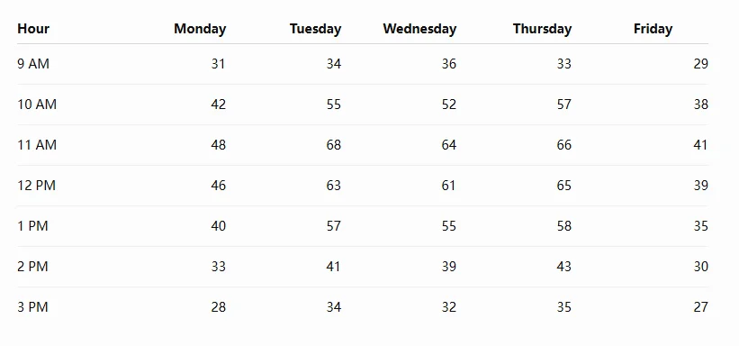
Reading the table alone shows individual values such as 55 tickets on Tuesday at 10 AM, 68 on Tuesday at 11 AM, 64 on Wednesday at 11 AM, and 66 on Thursday at 11 AM.
Once the same values are displayed as a heat map, the broader pattern becomes easier to locate.
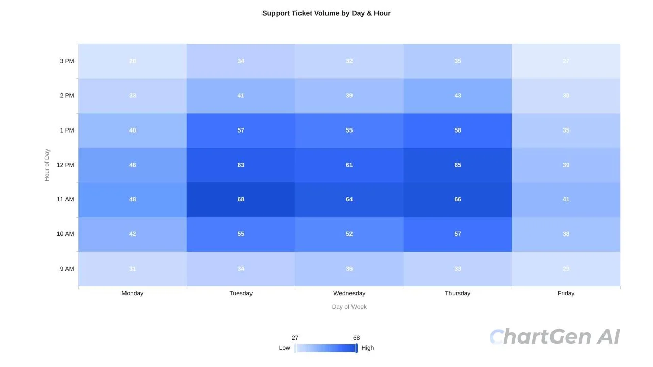
Tuesday at 11 AM contains the highest individual value at 68 tickets.
However, the more useful finding is not limited to that one cell.
Ticket volume remains elevated across Tuesday, Wednesday, and Thursday from roughly 10 AM to 1 PM. The neighboring high-value cells form a visible midday cluster.
For a support manager, that pattern may be more relevant to staffing decisions than the single highest hour.
The table remains useful for checking exact counts. The heatmap adds another layer by making the overall concentration easier to identify before individual values are reviewed.
Color Turns Individual Values Into a Visible Pattern
A heatmap gives each value an additional visual signal.
Higher values may appear more intense, while lower values remain less prominent. In other cases, colors can indicate movement above or below a meaningful reference point.
The exact values still matter. Color simply helps readers decide where to look first.
Instead of moving through dozens of cells one by one, a reader may notice a concentrated area, identify which row-column combinations created it, and then return to the underlying numbers.
This can change how the reader approaches a dense spreadsheet:
Visible pattern → Relevant cells → Exact values
That sequence is particularly useful when the question concerns concentration rather than one isolated number.
The Most Useful Insight Is Often a Cluster, Not a Single Cell
The most intense cell in a heatmap is not automatically the most important finding.
The support ticket example shows why.
Tuesday at 11 AM is the maximum at 68 tickets. If the analysis stopped there, the conclusion might simply be that Tuesday at 11 AM is the busiest period.
The surrounding cells tell a more useful story.
Tuesday records 55, 68, 63, and 57 tickets between 10 AM and 1 PM.
Wednesday records 52, 64, 61, and 55.
Thursday records 57, 66, 65, and 58.
This creates a sustained high-volume band across several neighboring days and hours.
For staffing decisions, the repeated midday cluster matters more than one isolated maximum.
Repeated Hot Zones Show Where Activity Concentrates
Groups of high-intensity cells can reveal where activity repeatedly concentrates.
For a support team, the pattern may indicate several adjacent hours requiring additional coverage.
A retailer could use a heatmap to identify product-region combinations that consistently perform strongly or weakly.
In manufacturing, repeated concentration around certain machines and shifts could direct attention toward operational issues.
Marketing teams may use the same principle to compare performance across campaigns and channels.
The business context changes, but the analytical question remains similar:
"Where do important values occur together rather than in isolation?"
Isolated Cells Can Point to Exceptions
Clusters are not the only patterns worth noticing.
A single cell that differs sharply from surrounding values may indicate an exception that deserves further investigation.
If one normally quiet period suddenly becomes much more active than neighboring periods, the heatmap can make that deviation easier to notice.
It cannot explain the cause.
The next step would still be to check the underlying records and relevant business events. A product release, service interruption, campaign, billing issue, or another event might explain the change.
This distinction is important.
A visualization can show where to investigate without proving why something happened.
Color Can Make a Heatmap Clearer or More Misleading
Color is the main visual mechanism in a heatmap, but it is also one of the easiest elements to misinterpret.
The same dataset can appear very different depending on the scale, midpoint, and range used to encode the values.
Readers should therefore avoid treating visual intensity as if it were the original measurement.
Color represents the data. It is not the data itself.
The Scale Changes What Looks Important
Imagine that most values fall between 90 and 100.
If the color scale is tightly fitted to that range, the visual difference between 91 and 99 may appear dramatic.
That may be appropriate when an eight-point change matters operationally.
But if the business considers values from 90 to 100 essentially similar, the same design could visually exaggerate a small difference.
The reverse problem occurs when the scale is too broad.
Suppose the important values fall between 40 and 80, while the full scale runs from 0 to 1,000. Differences inside the range that actually matters may become difficult to see.
A heatmap should therefore be read together with its legend and underlying values.
A darker cell only has meaning in relation to the scale that produced it.
A Meaningful Midpoint Can Matter More Than the Maximum
Some heatmaps are not simply about moving from low to high.
Budget variance provides a useful example.
A value of zero may mean that spending matched the budget.
Positive values could represent overspending, while negative values represent underspending.
In that case, the important information is the direction and distance from zero.
A diverging color scale can distinguish values on opposite sides of that reference point.
The midpoint should therefore reflect the business meaning of the data.
Zero, target, average, or another threshold may be more informative than simply emphasizing the highest number.
A Heatmap Works Best When Position Has Meaning
The decision to use a heatmap should not begin with the size of the spreadsheet.
It should begin with the structure of the comparison.
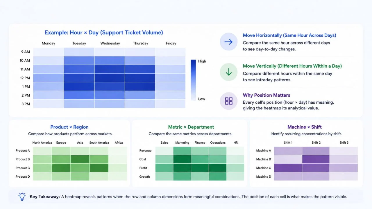
A matrix such as Hour × Day works because every position represents a meaningful time combination.
That is exactly what happens in the support ticket example. Moving horizontally compares the same hour across different days, while moving vertically compares different hours within the same day.
Other structures can work for the same reason.
Product × Region can show how individual products perform across markets.
Metric × Department can place the same measures across multiple teams.
Machine × Shift can make recurring operational concentrations easier to identify.
In each case, the position of the cell contributes to the interpretation.
That is what gives the heatmap analytical value.
Heat Maps Support Repeated Row-and-Column Comparisons
Heat maps are most useful when the reader needs to compare the same measure across repeated row-column intersections.
A large dataset alone is not enough reason to use one.
Thousands of observations may still be better represented as a trend, ranking, distribution, or relationship depending on the question.
The matrix structure matters more than the number of rows.
When Is Another Chart Easier to Read?
A heatmap should not replace a simpler chart when that chart answers the question more directly.
If a business wants to compare sales across five products, a bar chart makes the ranking easier to judge.
Monthly revenue across a year is fundamentally an ordered time trend, so a line chart is usually clearer.
When the goal is to investigate the relationship between two continuous numerical variables, a scatter plot is more appropriate.
A distribution of individual observations may be easier to understand with a histogram.
More data does not automatically mean a heatmap is the right chart.
The structure of the comparison matters more.
Patterns Become Useful When They Lead to a Decision
Finding the darkest cell is not the final purpose of a heatmap.
The useful outcome is understanding whether the visible pattern changes what someone should investigate, prioritize, or decide.
Return to the support ticket data.
A narrow interpretation would be:
Tuesday at 11 AM has the highest ticket volume at 68.
That reports a value.
A more useful interpretation is:
Ticket volume remains elevated around midday from Tuesday through Thursday, suggesting that staffing coverage during those hours deserves review.
Now the visualization has moved through four stages:
Color → Pattern → Interpretation → Decision
The same logic applies in other areas.
A concentration of equipment issues may direct maintenance teams toward a particular machine-shift combination.
A regional performance cluster can tell sales teams which product-market combinations deserve closer review.
A budget variance matrix may show which departments repeatedly move away from target.
None of those decisions should come from color alone.
The source values, units, scale, labels, and business context still need to be checked before the visualization is used to support action.
The support ticket example also shows why this matters. The heatmap makes the Tuesday-to-Thursday midday cluster visually obvious, but deciding whether staffing should actually change would require additional information such as ticket complexity, resolution time, current staffing levels, and service targets.
The chart identifies a pattern. Business context determines what to do with it.
The best heatmap is therefore not necessarily the one with the strongest colors.
It is the one that makes an important comparison easier to recognize without distorting the underlying differences.
When data already forms a meaningful row-and-column matrix, a heatmap generator can reduce the manual work required to turn those values into a visual pattern. The resulting scale, labels, and source values should still be reviewed before the chart is used for a decision.