


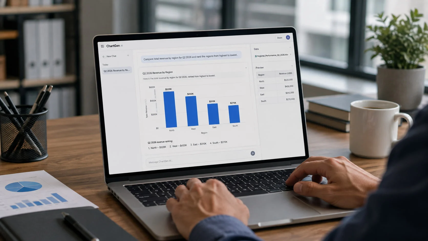
Natural-language analytics makes it easy to ask a dashboard a question. The harder part is making sure that question has one clear, measurable meaning.
We tested this with ChartGen using a controlled regional performance dataset containing revenue, profit, profit margin, orders, return rate, year-over-year growth, and quarterly data for four regions.
The first question was deliberately vague:
“Which region performed best?”
We then asked a more specific question:
“Compare total revenue by region for Q2 2026 and rank the regions from highest to lowest.”
The two prompts produced very different types of answers.
That difference demonstrates an important limitation of conversational ai dashboards: natural language makes data easier to explore, but it does not automatically define what a business term such as “best,” “strong,” or “successful” actually means.
One Simple Question Produced Several Valid Answers
Our first prompt did not define what “performed best” meant.
ChartGen did not force the dataset into one arbitrary ranking. Instead, it evaluated regional performance across several available metrics.
West stood out for profitability. Across the available quarterly data, it had an overall profit margin of about 20.8%, the highest of the four regions.
North led on scale. It generated the highest revenue and order volume, although its overall profit margin was lower at about 16.8%.
South showed the strongest growth, with average year-over-year growth of about 11%.
East performed best on return rate, with an overall rate of about 2.56%, the lowest of the four regions.
ChartGen therefore concluded that West was stronger if profitability was the priority, while North led if scale and business volume mattered more.
The result is useful because it exposes the real problem with the original question.
There was no single definition of “best” in the data.
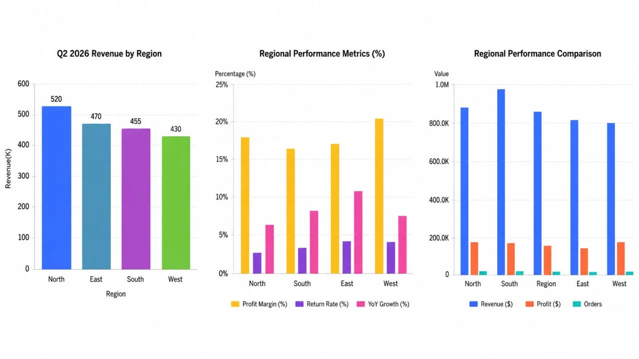
(The same dataset produced different leaders depending on whether performance was measured by revenue, profitability, growth, or return rate.)
“Best Performing” Is Not a Field in the Spreadsheet
The source file included Revenue, Profit, Profit Margin, Orders, Return Rate, and YoY Growth, but it did not contain a field called “Best Performing Region.”
When we asked ChartGen “Which region performed best?”, the answer reflected that ambiguity. Instead of forcing the data into a single ranking, ChartGen compared the regions across several metrics.
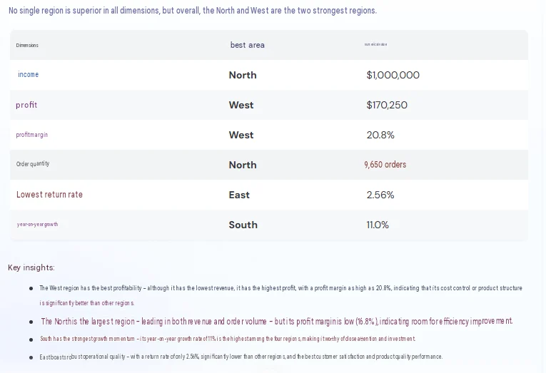
In this test, North led on revenue and order volume, West led on profit and profit margin, East had the lowest return rate, and South showed the strongest growth.
The important point is not that the AI chose the wrong answer. The business question itself did not define what “best” meant.
A More Specific Question Produced a Verifiable Answer
For the second test, we removed the ambiguous word “best” and defined exactly what should be compared.
We asked:
Compare total revenue by region for Q2 2026 and rank the regions from highest to lowest.
This time, the result was much more specific.
ChartGen ranked Q2 revenue as:
North — $520,000
East — $470,000
South — $455,000
West — $430,000
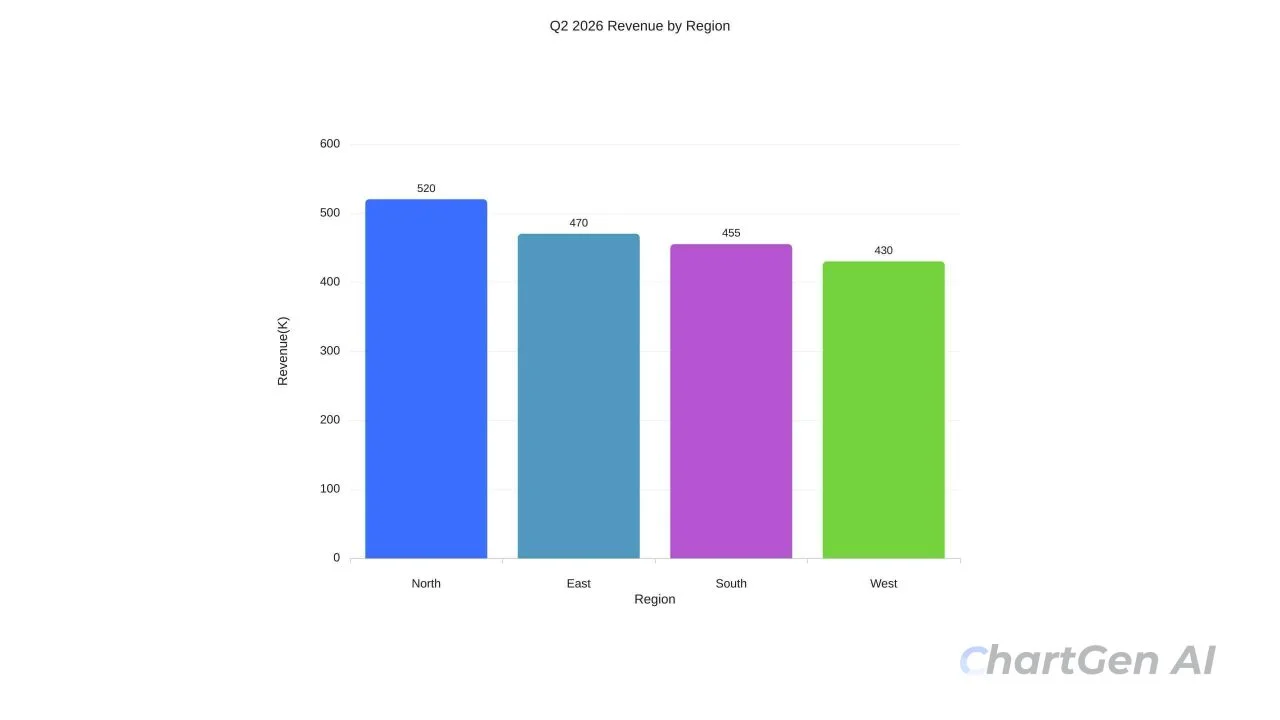
(After the metric and time period were defined, ChartGen returned a clear Q2 2026 revenue ranking by region.)
The highest and lowest Q2 revenue differed by $90,000.
More importantly, the result could now be checked directly against the uploaded source file.
There was no need for the AI to decide what “performance” meant.
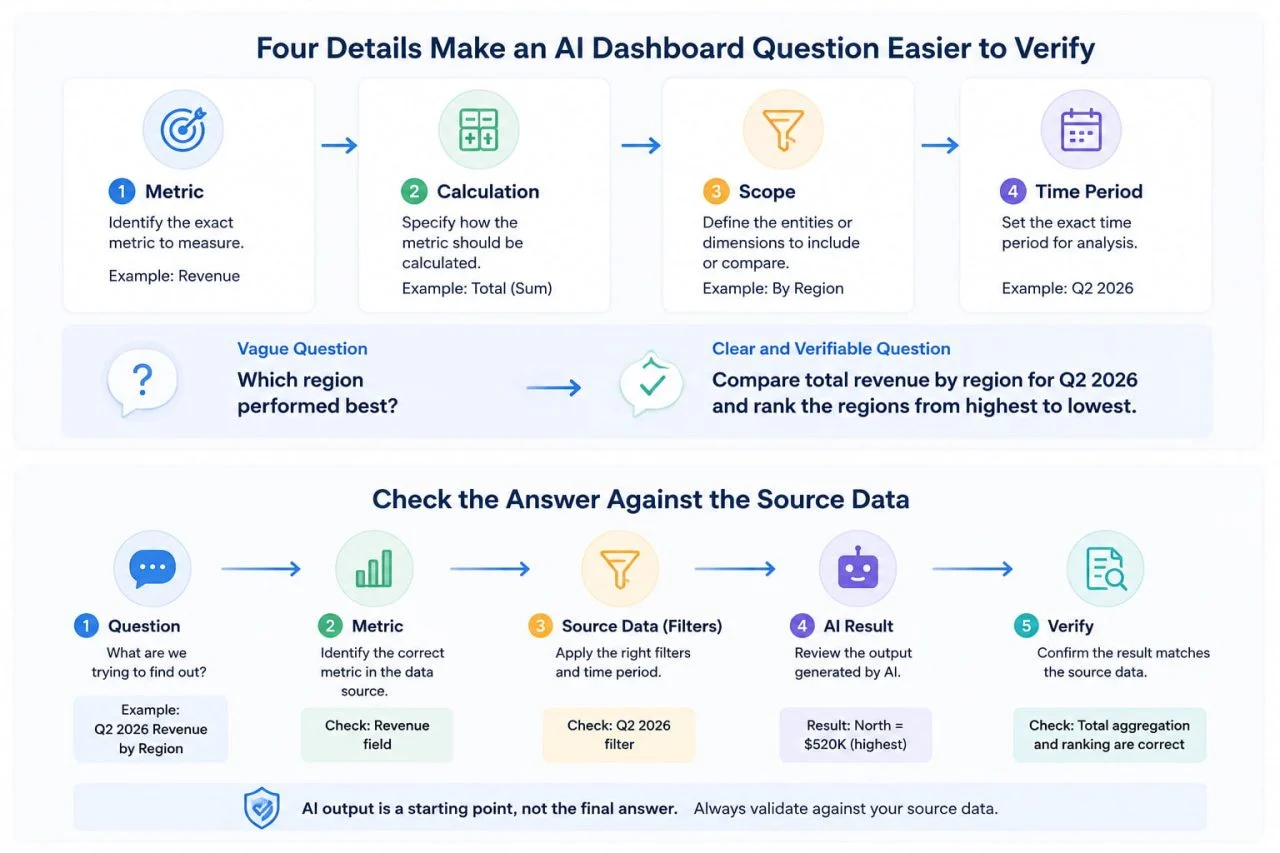
The metric was Revenue.
The calculation was total revenue.
The scope was Region.
The time period was Q2 2026.
Those four details turned an open-ended business question into an answer that another reviewer could reproduce.
The Time Period Can Change the Meaning Too
The first prompt also left another decision undefined.
Which region performed best?
does not say whether performance should be evaluated for Q1, Q2, the latest quarter, or all available periods.
In our test, ChartGen used the available quarterly records to produce broader observations about the four regions.
That was a reasonable way to explore the dataset, but it also shows why the time period matters when an answer will be used in a formal report.
Compare these two questions:
Which region has the highest revenue?
and:
Which region generated the highest total revenue in Q2 2026?
The second question is easier to verify because another person knows exactly which records should be included.
The same issue appears with phrases such as “recent growth,” “current performance,” “top customers,” or “best product.”
Without a defined period or metric, the AI still has to make an interpretation.
Why Conversational Analytics Needs Business Context
This problem is not unique to ChartGen.
Microsoft has been moving Power BI away from its older Q\&A experience toward Copilot. The older Q\&A system already relied on synonyms and model terminology to help natural-language questions map to the correct fields, and Microsoft plans to retire the legacy Q\&A experiences in December 2026. \(Microsoft Learn, “Introduction: Use Natural Language to Explore Data with Power BI Q\&A”\)
Google takes the same issue further with Looker Conversational Analytics. Its data agents can use semantic models and custom instructions that define which fields matter, how calculations should work, and what particular business terms mean. \(Google Cloud, “Conversational Analytics in Looker Overview”\)
This highlights the difference between understanding language and understanding business meaning.
A system may understand the words “best-performing region,” but it still needs a definition of performance before the answer becomes unambiguous.
Four Details Make an AI Dashboard Question Easier to Verify
A useful dashboard question usually defines four things.
Define the Metric
Replace broad words such as “best,” “strongest,” or “most successful” with something measurable.
Instead of:
Which product performed best?
ask:
Which product generated the highest gross profit?
Now the result has a specific metric behind it.
Define the Calculation
Be clear about whether the question requires a total, average, count, percentage, or rate.
“Highest revenue” is different from “highest average revenue per order.”
“Most returns” is different from “highest return rate.”
Define the Scope
Specify which part of the data belongs in the analysis.
That might mean all regions, one product line, new customers, a particular sales channel, or one market.
An ai dashboard builder can automate much of the analysis and visualization process, but it still needs to know what data the question is intended to cover.
Define the Time Period
Use a clear period such as Q2 2026, July 2026, year to date, or the last six complete months.
This removes another decision that the system would otherwise need to make.
The same principle applies when working with an Excel AI dashboard. A well-structured workbook helps the tool recognize fields and values, but the workbook still cannot decide which business objective matters unless that definition exists somewhere in the data model or the question.
Check the Answer Against the Source Data
A natural-language answer should not be accepted only because it sounds reasonable.
Before using the result in a report, check whether the system used the intended metric, calculation, scope, and time period.
For our second test, those checks were straightforward.
The question asked for Revenue, so the output should use revenue rather than profit or orders.
It asked for total revenue, so the values should not be averaged.
It specified Region, so the output should compare the four regions.
It specified Q2 2026, so Q1 records should not affect the ranking.
The final order could then be compared directly with the CSV:
North first, followed by East, South, and West.
This is what makes the second answer more useful for formal reporting. It is not simply more detailed. It has a clear path back to the source data.
AI Can Analyze the Data, but the Business Defines the Question
The first ChartGen result should not be treated as a failure.
In fact, it was useful.
By separating profitability, scale, growth, and return rate, it revealed that several definitions of regional performance were possible.
That type of exploratory answer can help a user discover which part of the data deserves further investigation.
The standard changes when the answer needs to become a report headline, KPI conclusion, or business decision.
At that point, the metric must be explicit enough that another person can reproduce the result.
ChartGen's AI Dashboard Generator can use Excel or CSV data to create dashboards, visualizations, and natural-language insights. But the business still has to decide what terms such as “best,” “high value,” “successful,” or “underperforming” mean in its own context.
AI can process a definition.
It should not silently become the owner of that definition.
Better Questions Produce More Verifiable Answers
Our two ChartGen tests used the same underlying regional dataset.
The first question was:
“Which region performed best?”
It produced a multi-metric interpretation because several answers were defensible. West led profitability, North led scale, South led growth, and East had the lowest return rate.
The second question was:
“Compare total revenue by region for Q2 2026 and rank the regions from highest to lowest.”
It produced one clear ranking that could be checked against the source data: North at $520,000, East at $470,000, South at $455,000, and West at $430,000.
That difference is the practical lesson.
Natural-language analytics makes it easier to ask questions about data. It does not make ambiguous business definitions disappear.
Before relying on an AI dashboard answer, define the metric, calculation, scope, and time period.
The clearer those four elements are, the easier the answer is to verify—and the safer it is to use in a business report.