


An AI tool can read a spreadsheet, generate several charts, and explain the result before most people have checked the first formula. That speed is useful. It also makes a confident answer easy to accept too early.
To see what still needs checking, we uploaded a controlled six-month e-commerce dataset to ChartGen and asked it which month performed best and what caused the change.
The result was not a simple success or failure. ChartGen found the main revenue movement, connected it to orders and average order value, and noticed the one metric that complicated the story. A second prompt made the calculations much easier to audit.
Even then, a few labels and assumptions needed human review before the result was ready for a report.
The Dataset Used in the Test
The file contained six monthly records and six fields:
The dataset was deliberately small. Every percentage could be recalculated manually, and there were no customer, campaign, product, or refund-reason fields that could explain why a metric changed.
We first asked:
"Analyze this monthly e-commerce performance data. Which month performed best, and what caused the change?"
The First Answer Was Better Than a Simple Revenue Summary
ChartGen described June's revenue increase as a “dual-engine lift” because order volume and average order value increased together. It also suggested several possible explanations, including an upsell campaign, a change in product mix, or a promotion.
More importantly, it did not stop at the positive metrics. It called the refund rate a red flag and concluded that June had the best gross performance while the net picture was less clear.
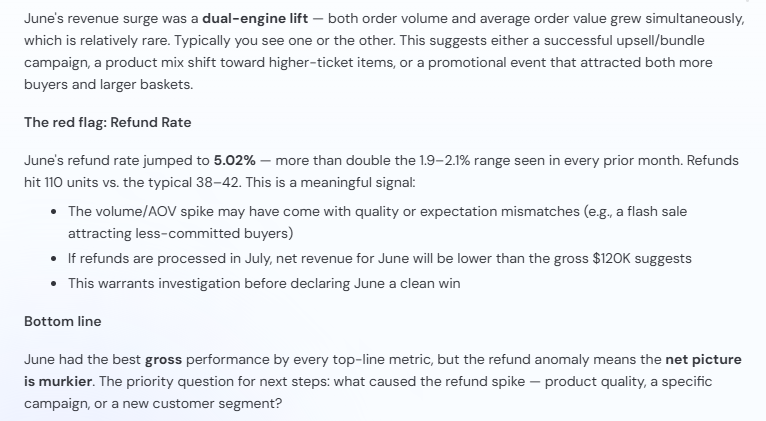
ChartGen connected the June revenue increase to orders and average order value, then qualified the result because of the refund spike.
This was a useful first pass. The description of a dual lift matched the data, and terms such as “suggests” made it clear that the proposed causes were possibilities rather than confirmed facts.
One sentence still went beyond the file. The response said that simultaneous growth in orders and average order value was “relatively rare.” The six monthly records could not establish how rare that pattern was. That claim would need a larger historical dataset or an external source.
The possible explanations also remained hypotheses. Nothing in the spreadsheet showed whether ChartGen was looking at a promotion, a new product category, a pricing change, or a different customer mix.
The Revenue Was Correct, but the Axis Changed the Impression
The first generated chart showed monthly revenue from January through June. All six values were correct, and June was clearly marked at $120,000.
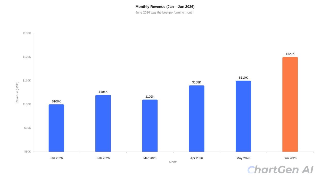
The generated revenue chart used an $80,000 baseline, making the difference between the monthly bars appear larger.
The vertical axis began at $80,000 rather than zero. That choice made the June bar appear roughly twice as tall as the January bar above the visible baseline.
Actual revenue increased from $100,000 to $120,000, which is a 20% increase. The chart did not change the values, but it gave the visual difference more weight than the numbers alone justified.
This is an important distinction in AI chart analysis. A correct label does not guarantee a neutral visual scale. The UK Government Analysis Function’s chart guidance notes that breaking a numerical axis can help readers see a narrow trend, but it is not always appropriate. Here, the $80,000 baseline gave a 20% increase more visual weight than it deserved.
Two Rising Lines Did Not Mean the Scales Were Comparable
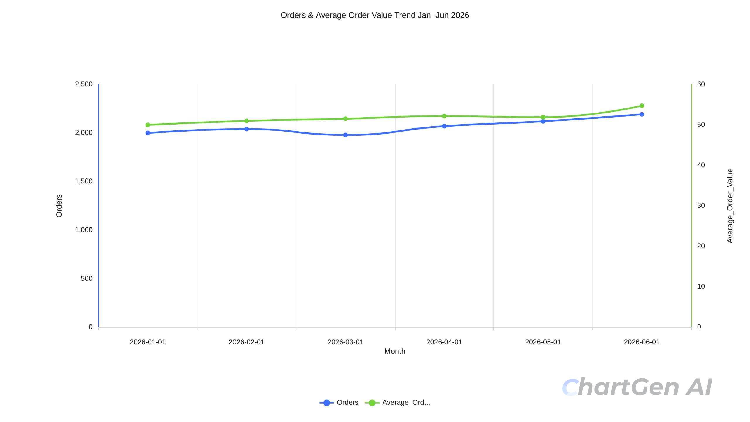
ChartGen also placed Orders and Average Order Value on a dual-axis line chart.
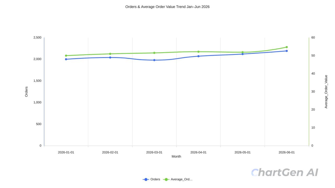
Orders use the left axis, while average order value uses a separate scale on the right.
The chart correctly showed that both measures increased in June. However, the two lines used different units and different axes: orders on the left and dollars per order on the right.
Their vertical positions could not be compared directly. The nearby lines did not mean that the two metrics had the same size, moved by the same percentage, or had a causal relationship.
The chart also retained spreadsheet-style labels such as Average\_Order\_Value, and the legend shortened the field name. These are minor presentation issues, but they matter once a chart leaves an analysis workspace and enters a client report.
The safest version would use two aligned charts with the same monthly axis, or clearly label the percentage change for each metric instead of inviting readers to compare line height.
One Generated Chart Was Not Ready to Publish
The third output was intended to show the monthly refund-rate trend. Its title correctly stated that June had reached 5.02%, but the exported image displayed only an average reference line at approximately 2.48%. The six monthly values and the June spike were not visible in the plot.
We excluded that image from the article visuals.
This was not a problem with the underlying calculation. It was a problem with the rendered evidence. A reader could see the claim in the subtitle but could not verify it from the chart itself.
That check is easy to overlook when the written analysis already sounds right: confirm that every exported chart actually displays the series described in its title and caption.
A Second Prompt Made the Reasoning Easier to Audit
We then asked ChartGen to use only the uploaded data, show its calculations, separate observations from explanations, and identify any metric that contradicted the main conclusion.
The second response calculated:
Revenue growth from May to June: 9.09%
Order growth: 3.40%
Average order value growth: 5.49%
Refund growth: 161.9%
Refund rate: 1.98% to 5.02%
It also checked whether Revenue was consistent with Orders multiplied by Average Order Value. The small differences were explained by the AOV values being stored to two decimal places.
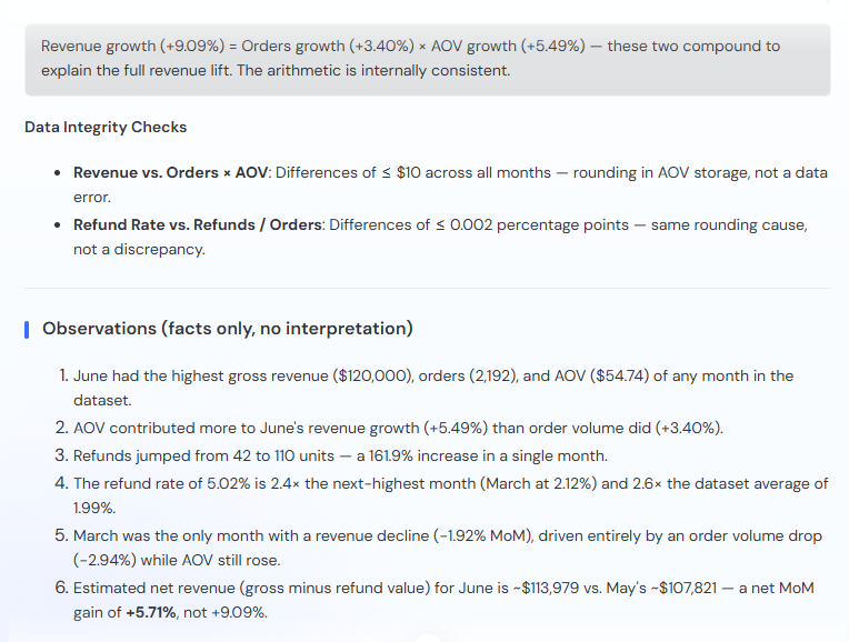
The follow-up response exposed the calculations and checked whether the related fields reconciled.
This was more useful than another general summary. It showed where the percentages came from and made rounding differences visible.
ChartGen also separated possible explanations from its observations. Promotions, new product categories, quality problems, and refund timing were explicitly presented as hypotheses that the dataset could not confirm.
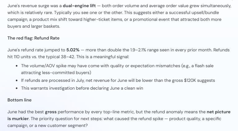
The second response clearly marked campaign, product, fulfilment, and accounting explanations as unconfirmed hypotheses.
That separation made the answer safer to use. It prevented a plausible business story from being mistaken for a result contained in the spreadsheet.
The Verification Answer Still Needed Verification
The second response improved the analysis, but it was not ready to copy into a report unchanged.
The “Dataset Average” Used the Wrong Baseline
It called 1.99% the “dataset average” refund rate. Across all six months, the average was approximately 2.48%. The 1.99% figure represented the January-to-May baseline, before the June spike. The number was useful, but the label was wrong.
The Net Revenue Estimate Depended on Three Assumptions
The answer also estimated June net revenue by multiplying the number of refunds by average order value and subtracting the result from gross revenue. The arithmetic was understandable, but the source file did not contain actual refund values. It also did not show whether June’s refunds belonged to June orders.
That estimate depended on at least three assumptions:
- Every refunded order had the same value as the monthly average order.
- All refunds recorded in June related to June sales.
- The Revenue field had not already been adjusted for refunds.
It could be presented as a scenario, but not as a fact-only observation.
The 164% Increase Used an Unclear Baseline
The response also described the refund-rate increase as 164% without specifying the comparison period. From May’s 1.98% to June’s 5.02%, the relative increase was approximately 153.5%. A 164% increase would use a different baseline, close to January’s 1.90%.
Six Months Were Not Enough for a Formal Outlier Claim
Finally, calling June a statistical outlier based on six monthly observations was stronger than necessary. June was clearly an anomaly relative to the January-to-May range. A formal statistical conclusion would need more history and a method suited to the underlying process.
None of these issues made the second answer useless. They showed why a verification prompt improves the work without replacing the reviewer.
The Conclusion We Would Actually Publish
After checking the source data, calculations, labels, and assumptions, the result can be stated more cleanly:
June recorded the highest gross revenue, order volume, and average order value in the six-month dataset. Revenue increased by 9.09% from May, while orders rose by 3.40% and average order value increased by 5.49%.
The result was not an unqualified improvement. Refunds increased from 42 to 110, and the refund rate rose from 1.98% to 5.02%, an increase of 3.04 percentage points.
The dataset does not include refund values, product-level records, campaign information, or refund reasons. It therefore cannot confirm June's net revenue or explain what caused the refund spike.
This version keeps the findings that can be reproduced and removes the explanations that the file cannot provide.
What Changed Between the First Answer and the Final Version?
The first ChartGen response was directionally strong. It found the most important month, identified the two contributors to revenue growth, and noticed the refund anomaly without being asked.
The second prompt improved the answer by exposing calculations and separating facts from hypotheses.
Human review still changed four things:
The revenue chart needed a more appropriate baseline.
The refund chart needed to be regenerated because its monthly series was not visible.
The refund-rate baseline needed a correct label.
The net-revenue estimate and causal explanations needed to remain outside the verified findings.
That is a practical way to use an AI Chart Generator. Let it perform the fast first pass, then check the parts that require context or judgment.
A Short Review Process for AI-Generated Chart Insights
Start by checking whether the chart contains the correct fields, dates, units, and aggregation. Recalculate the headline change from the source file rather than from the chart label.
Next, inspect the visual itself. Check the axis baseline, confirm that every promised series is visible, and be cautious when two measures use different scales.
Then separate three kinds of statements:
Values copied directly from the data
Findings calculated from those values
Explanations that require information outside the file
Finally, ask a second question designed to challenge the first answer. Request the formulas, contradictory metrics, assumptions, and missing evidence. The second response should also be reviewed; a more detailed answer can introduce new assumptions along with useful checks.
The Result Can Be Trusted, but Only with Proper Verification
This test reached a clear conclusion. ChartGen found the main pattern, but its output was not ready to publish without review.
The revenue figures, the May-to-June calculations, and the refund spike matched the source data. The estimated net revenue and proposed causes did not have enough evidence.
AI chart analysis is useful for a fast first review, not as final proof. Verify the values, calculations, chart design, and causal claims before using the result in a report.
Try ChartGen with your CSV or Excel file, then use a second prompt to verify the result before publishing it.