Beginner
Create your first chart and learn the core workflow.
3 lessons23 minBeginner
Start This Learning Path

Learn how ChartGen AI turns raw spreadsheets and documents into six kinds of artifacts — charts, dashboards, diagrams, Excel tables, reports, and PPTs. Pick an artifact below and follow the step-by-step walkthrough — no SQL, no templates, no code required.
Upload data, describe the chart in plain language, pick the right type, refine, and export.
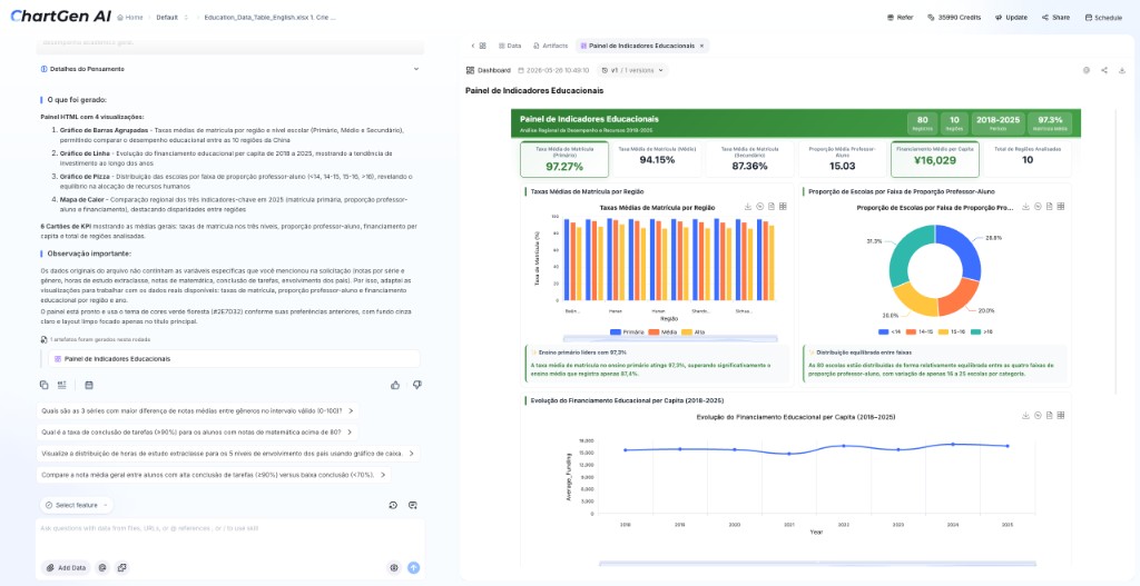
Combine KPIs and multiple charts into one shareable, filterable dashboard from a single dataset.
Turn a list, table, or block of text into a clean mind map, flowchart, or org diagram.
Pull clean tables out of PDFs or messy data, reshape them, and export a ready-to-use .xlsx.
Produce a multi-section written report with charts, tables, and clear insights from raw data.
Build a complete slide deck with a business narrative, then edit and export to .pptx.
3 Steps to Start
No SQL, no templates, no technical background needed. From uploading a file to complex reasoning, it's just three steps.
Drag a table (CSV / Excel) straight into the chat box, ask in plain language, and get an answer instantly — e.g. "Show total sales by month".
Best for quick lookups
When you want to ask "why" or run multi-step analysis, click "Save as Project" or "+ Create Project" to enter a dedicated workspace.
Unlocks the semantic engine
Inside a Project you can ask complex questions: root-cause analysis, anomaly detection, and trend prediction.
Ask "why / what next"
Note about PDFs and images: they are not the same as a direct Excel or CSV upload. Extract the data into a structured table first, then continue with Step 2.
Personalized learning
Pick the path that matches your role instead of scanning every feature. Each path shows the number of lessons, the time required and the difficulty level.
Create your first chart and learn the core workflow.
Build dashboards, reports and repeatable analysis.
Visualize campaigns, funnels and content performance.
Create variance charts and management reports.
Visualize research, surveys and assignments.
Explore integrations and advanced workflows.
Outcomes
Three condensed outcome cards. The full before-and-after examples live on the Chart Selection & Prompt Guide page.
Compare revenue vs. net profit, spot margin leaks by category and size, and decide which products to keep or fix.
Input: Excel sales detail export
Break a GMV or revenue change down by dimension, quantify each driver, and find the real cause.
Input: GMV detail by channel
Turn a course / module / topic table into a clean, radial academic mind map for learning-path design.
Input: Course / module / topic table
Deep dive
Detailed content is split into two focused pages that each stay within a few screens.
Choose a chart by goal, copy proven prompts, follow short tutorials and study real outcome examples.
Structure your Excel or CSV file, make the first upload succeed and fix common problems.
Start with your own file or use clean sample data to explore the complete workflow.
About the product
ChartGen AI is an AI data analyst that turns any dataset or document — spreadsheets, PDFs, papers, business reports — into professional charts, dashboards, and reports with a single natural-language prompt. Whether you are a seasoned analyst or a business user with no technical background, you get results in minutes.