


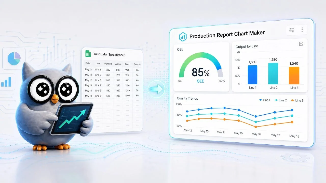
Factory reports often contain the data we need, but they do not always make production problems easy to see. Output numbers, defect counts, downtime records, shift results, and machine performance may sit inside long spreadsheets. The data is available, but the pattern is often buried under rows and columns.
When production meetings depend on slow spreadsheet checks, small issues can stay hidden until they become missed output, delayed orders, or repeated quality problems. A production report chart maker helps turn factory data into charts that we can read faster. We can compare planned output vs actual output, track defect rate by shift, review downtime minutes by machine, and see whether production performance is stable or starting to fall. The goal is to make factory reports easier to read, easier to repeat, and easier to act on.
Why Factory Production Reports Are Hard to Read in Spreadsheets?
Factory spreadsheets are usually built for recording data. They can store daily output, machine logs, inspection results, and shift notes, but they do not always show patterns clearly. When the report grows longer, it becomes harder to see which line is underperforming or which quality issue keeps returning.
A production manager may need to compare several lines, machines, shifts, and product models at the same time. A spreadsheet can hold all of that information, but it can slow down review when every answer depends on scanning rows manually.
Production Data Comes from Many Places
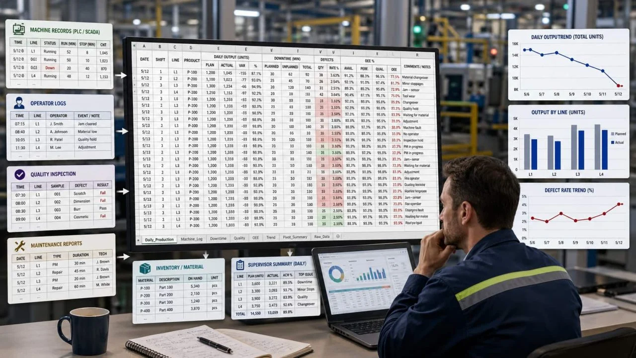
Production data may come from machine records, operator logs, quality inspection forms, maintenance reports, inventory systems, or supervisor summaries. Each source may use a different format.
One sheet may show daily output by production line. Another may record downtime minutes by machine. A third may list defect types and rejected units. When those files stay separate, it becomes harder to see how output, quality, and equipment performance affect one another.
Tables Hide Output and Quality Changes
A table can show that Line A produced 8,200 units on Monday and 7,600 units on Tuesday. But unless we compare the numbers visually, that drop may not stand out.
The same problem appears in quality reports. If the defect rate rises from 2.1% to 3.4% across several shifts, the change may look small inside a spreadsheet. A chart makes the trend easier to notice, especially when the team needs a fast daily review.
What a Production Report Chart Maker Should Track?
A useful production report chart maker should start with the factory questions we need to answer. We should not create charts only because the data exists. We should choose charts based on the decisions the production team needs to make.
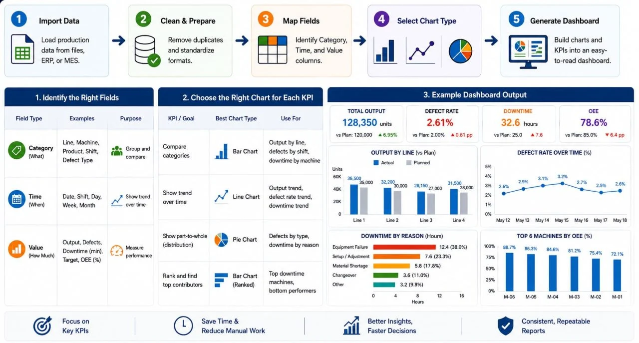
Most production reports need to show output, quality, downtime, and equipment performance. These metrics help us understand whether the factory is meeting targets and where action may be needed.
Output by Line, Shift, or Day
Output is usually the first metric to chart. We can compare production by line, shift, product model, or date. A Bar Chart Generator works well when we need to compare categories, such as Line 1 vs Line 2, day shift vs night shift, or planned output vs actual output.
For example, if one line misses its target for three days in a row, the chart makes the gap easier to see. We can then check whether the issue comes from staffing, material supply, machine speed, product complexity, or downtime.
Defects, Downtime, and Equipment Performance
Output alone does not explain the full production picture. A line may produce many units but also create more rejected parts. That is why a quality control dashboard should track defect count, defect rate, rejected units, rework volume, and defect type.
Downtime also needs a separate view. An equipment performance chart can show which machines stop most often, which machines lose the most working time, and whether downtime is reducing daily output. When we connect equipment data with production results, the report becomes more useful than a simple output table.
How a Manufacturing Dashboard Generator Turns Data into Charts?
A manufacturing dashboard generator helps organize factory data before we turn it into charts. This step is important because production reports often contain mixed columns, repeated categories, different date formats, and several KPI types in one file.
Once the production metrics are clear, the next step is turning those fields into repeatable charts instead of rebuilding reports manually every time. The tool needs to understand what each column means before it can create a useful report.
Identify Category, Time, and Value Columns
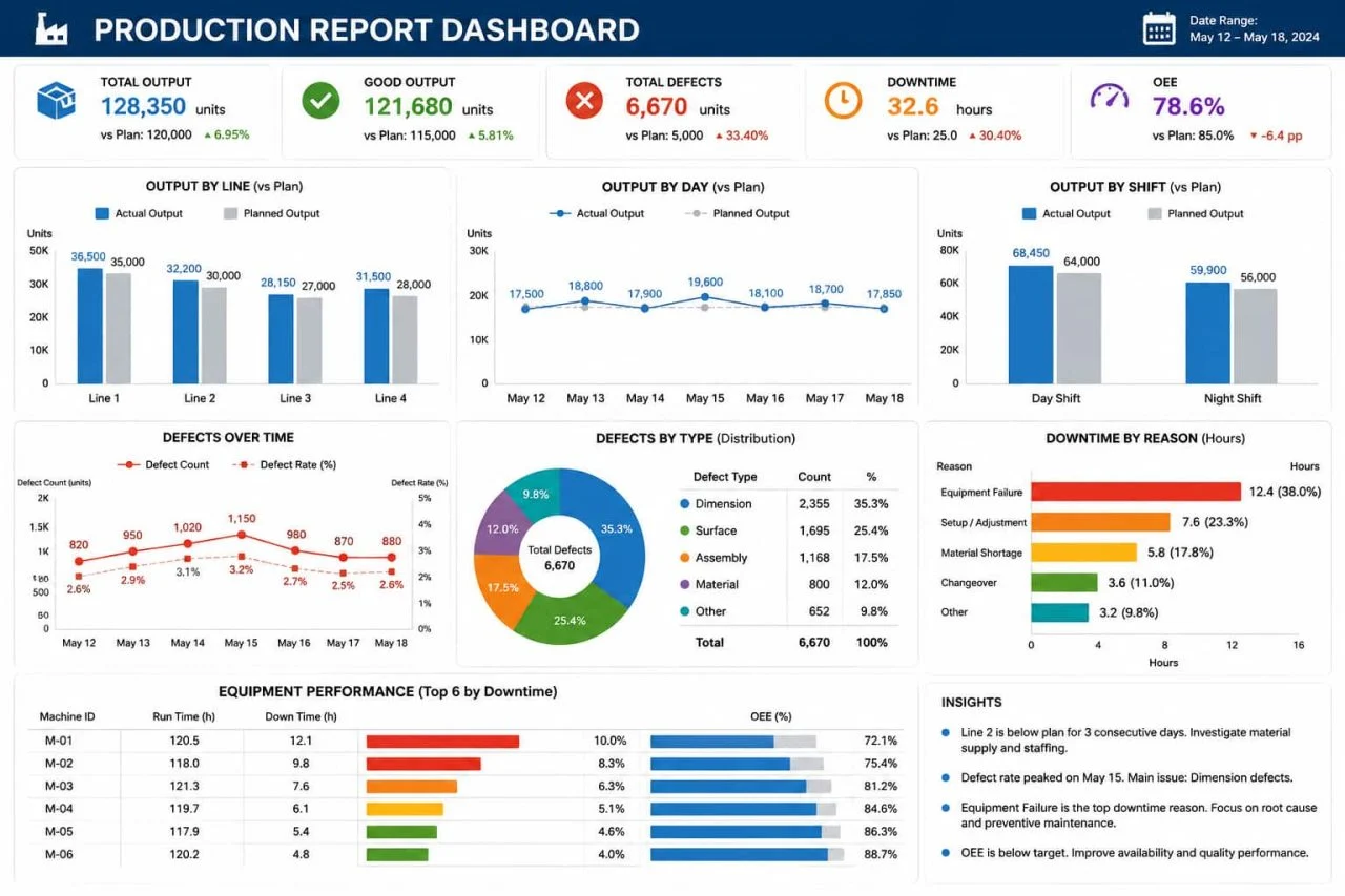
Most production charts depend on three field types: category, time, and value.
A category may be a production line, machine name, product model, shift, or defect type. A time field may be a date, week, month, or shift period. A value field may be output quantity, defect count, downtime minutes, target quantity, or efficiency rate.
If we want to compare actual output by production line, the line name becomes the category and output quantity becomes the value. If we want to track defect rate over time, the date becomes the time field and defect rate becomes the value. Getting this structure right helps the chart answer the right question.
Choose the Right Chart for Each KPI
Different factory KPIs need different chart types. A bar chart works well for comparing output by line, defects by shift, or downtime by machine. A Line Chart Generator works better for showing output trends, defect rate changes, or downtime patterns over several days or weeks.
For factory KPI visualization, the report should stay easy to scan. Too many charts can make a dashboard harder to read, even when the visual design looks cleaner. A cleaner approach is to focus on the few views that teams review most often: output performance, defect trend, downtime ranking, and equipment efficiency.
How to Build a Clear Factory Report with ChartGen AI?
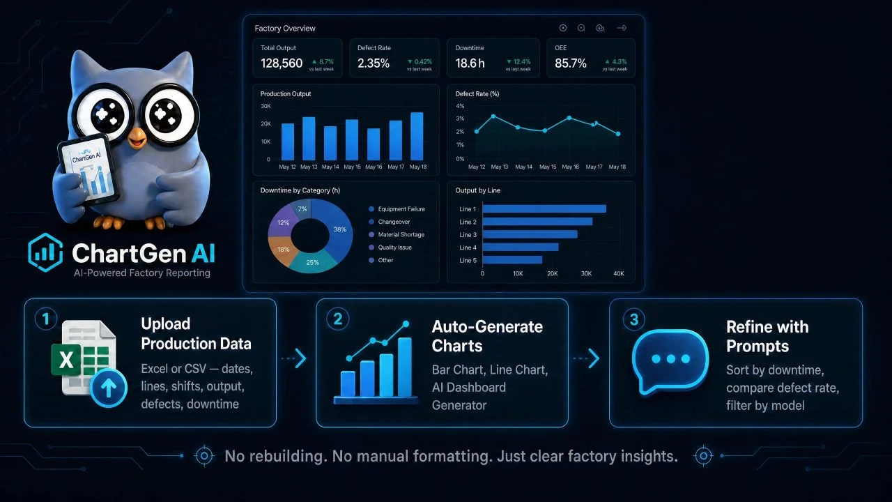
With ChartGen AI, we can start from the production file we already have. We do not need to rebuild the spreadsheet from scratch before creating charts. We can upload production data, explain what we want to compare, and refine the report with follow-up prompts.
This helps when factory reporting needs to happen every day or every week. If the team keeps checking the same metrics, the report should become easier to repeat. An AI Dashboard Generator can help organize several production views in one place, while single chart tools can handle specific comparisons.
Upload Production Data from Excel or CSV
We can upload an Excel or CSV file that contains production records. The file may include dates, production lines, shifts, product models, planned output, actual output, defect count, downtime minutes, and machine names.
After upload, the tool can read the available fields and help turn them into charts. If we only need to compare output by line, the Bar Chart Generator may be enough. If we need to track production output over time, the Line Chart Generator can show whether the trend is rising, falling, or staying stable.
Refine the Report with Follow-Up Prompts
After the first chart is created, we can refine the report with prompts. We may ask the tool to sort machines by downtime, compare defect rate by shift, show planned output vs actual output, or filter the report by product model.
This prompt-based workflow reduces manual formatting. Instead of rebuilding a chart every time the reporting question changes, we can adjust the metric, category, chart type, or time range through plain language.
Should We Use a Production Report Chart Maker for Factory Reporting?
Yes, especially when the factory report includes repeated production records, quality checks, downtime logs, equipment data, and shift performance. A production report chart maker helps turn those records into charts that are faster to review and easier to compare.
It works best when we have clear reporting questions. Which production line missed target output? Which shift had the highest defect rate? Which machine caused the most downtime? Is the defect rate rising over time? These questions are easier to answer with charts than with long spreadsheets.
A tool cannot replace production judgment, but it can make warning signs easier to find. With ChartGen AI, we can turn factory data into clearer reports, spend less time searching through rows, and focus more on deciding what to fix first.