
I used to think the chart itself was the work.
Sales breakdowns, weekly snapshots, leadership decks - most of them were not hard. They were just slow.
The real problem was not data complexity. It was process design.
When teams treat chart construction as the main task, insight becomes a late byproduct instead of the goal.
The Hidden Cost of Manual Chart Building
A pattern repeats across many teams:
- Someone has a business question
- They open Excel, BI, or slides
- They spend 30-60 minutes building one chart
- The chart answers only part of the question
- They rebuild or tweak again
This loop consumes energy that should be spent on interpretation.
The chart gets delivered. The decision often does not.
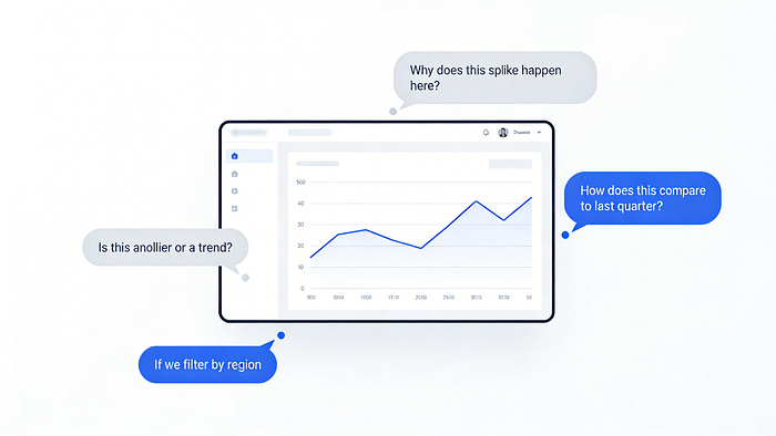
Charts Should Start Conversations
A good chart immediately triggers follow-up questions:
- Why did this spike happen?
- Is this a one-off or an actual trend?
- How does this compare with last quarter?
In traditional workflows, every follow-up means rebuilding.
That friction silently trains teams to stop asking better questions.
What Changes in a Question-First Workflow
The key shift is from:
"What chart should I build?"
to:
"What do I need to understand?"
That sounds minor, but it changes the bottleneck.
You are no longer limited by tool clicks. You are limited by question quality, which is exactly where analysis value should live.
Explore More, Format Less
When chart generation is fast, teams can spend more time on:
- Comparisons
- Trends
- Exceptions
- Relationships they did not originally plan to inspect
This is where productivity actually compounds: less formatting overhead, more reasoning depth.

Dashboards Should Behave Like Living Analysis
Most dashboards are static snapshots with short shelf life.
A better approach is to treat dashboards as dynamic views over the same dataset:
- Bar charts for category comparisons
- Line views for trend direction
- Breakdowns that expose anomalies
The objective is not to rebuild faster. It is to switch perspectives without losing momentum.

AI Does Not Replace Thinking
Removing manual steps does not replace analytical judgment. It reveals judgment quality faster.
When execution friction drops:
- Vague questions become obvious
- Weak assumptions surface quickly
- Shallow insights fail under follow-up
That is a feature, not a bug.

Final Thoughts
The future of data visualization is not just prettier charts.
It is fewer steps between:
- A business question
- A visual explanation
- A defensible insight
- The next better question
Once teams experience this shift, manual chart-building feels less like craftsmanship and more like avoidable friction.