

A line chart is one of the most trusted chart types in business reporting. It is also one of the easiest to manipulate — not through bad data, but through presentation decisions that look like formatting choices yet function as editorial bias.
Most Line Chart Generator tools are designed to render what you give them. They execute. They do not evaluate. Whether the trend line you are looking at accurately represents what is happening in the data, or whether it has been shaped by three invisible decisions that happened before anyone read the chart — that is not something the tool tells you. The same is true of most **Trend Chart Generator** tools: execution without judgment.
The Three Ways a Line Chart Misleads Without Lying
Y-axis truncation, time range selection, and smoothing level — three decisions that feel like formatting and function like bias. All of them appear in real business reporting, often without anyone noticing. Understanding them is the difference between a trend chart that informs and one that confirms what someone already wants to believe.
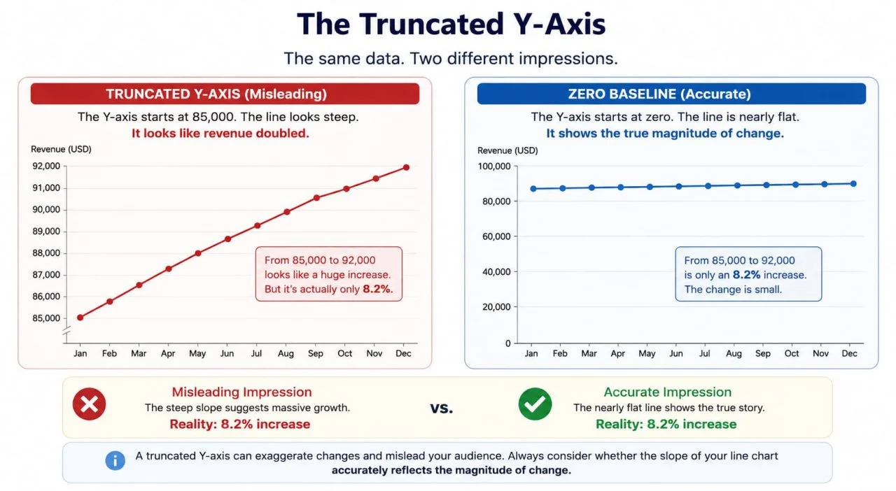
The Truncated Y-Axis
A Y-axis that starts at 85,000 instead of zero moves from 85,000 to 92,000 looks as if it doubled. The line climbs steeply across the chart. The actual change is 8.2%.
Line charts do not carry the same strict zero-baseline requirement as bar charts — there are legitimate cases where starting the axis at a non-zero value helps the reader see variation in a narrow range. But there is a test worth applying: if someone looked at the slope of this line and formed an impression of the magnitude of change, would that impression be accurate?
When the answer is no, the axis truncation is not a design decision. It is a distortion.
The most common version of this in business reporting is monthly revenue charts, where the Y-axis starts at last year's revenue figure. The line for this year climbs confidently upward. What the chart does not show is that the climb represents 3% growth, and the line would be nearly flat if the axis started at zero.
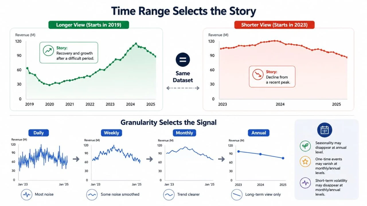
The Time Range That Selects the Story
The same dataset, which started in 2019 versus one that started in 2023, tells completely different stories. The trend, which started in 2019, might indicate a business recovering from a difficult period. The same data, starting in 2023, might show a business in decline from a recent peak. Neither view is wrong. Both are incomplete.
Time range selection is not a neutral technical decision. It is a narrative decision. The question to ask before setting the range: what context does the reader need to interpret this trend accurately, and does the current range provide it?
The related problem is time granularity. Weekly data smooths the noise that daily data surfaces. Monthly data smooths what the weekly data shows. A Trend Chart Generator that defaults to monthly aggregation is making a judgment about which signals are worth seeing — usually without making that judgment explicit.
Annual seasonality, one-time events, and short-term volatility all disappear at different levels of aggregation. Choosing the granularity is choosing which of these the reader gets to see.
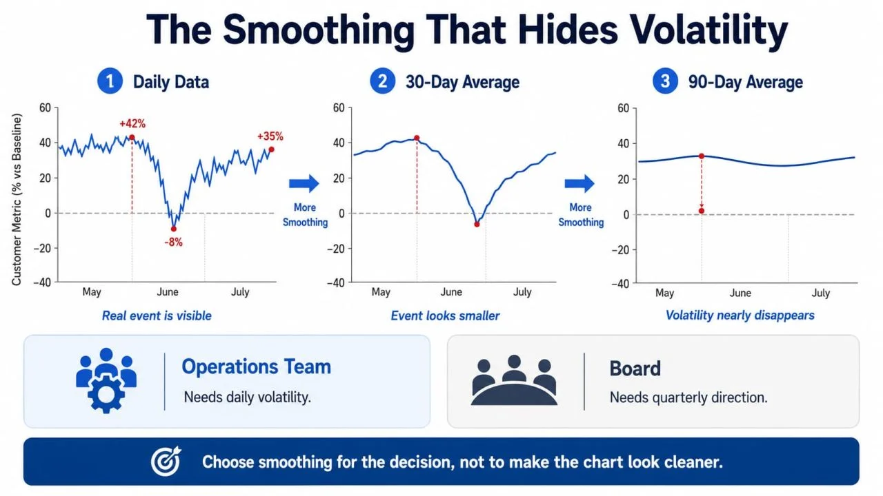
The Smoothing That Hides Volatility
Rolling averages are legitimate and useful. A 7-day rolling average strips out day-of-week effects. A 30-day rolling average makes monthly patterns visible without the noise. These are reasonable choices.
The problem is when smoothing is applied to hide volatility that is genuinely informative.
A net promoter score that moved from \+42 to -8 and back to \+35 over three months reflects a real event — a product failure, a service disruption, a PR problem. On a 30-day rolling average, that movement becomes a modest dip. On a 90-day rolling average, it might disappear entirely. The trend line is accurate. The event that it is concealing drove customer behavior in ways that the smoothed chart cannot explain.
Smoothing should be chosen to match the decision being made, not to make the chart look cleaner. An operational team needs to see daily volatility. A board needs to see quarterly direction. The same data, presented to both audiences at the same smoothing level, is serving one of them poorly.
What Does an Honest Line Chart Actually Require?
Truncated axes, cherry-picked time ranges, and over-smoothed data each have a specific correction. None requires statistical expertise. All require making an active decision rather than accepting whatever the tool defaulted to.
Does the Y-Axis Starting Point Match the Story You Are Telling?
Zero is not always the right starting point. There are legitimate cases where starting higher makes a small but meaningful variation visible. The test is not "does the axis start at zero?" It is "Does the slope of the line accurately represent the magnitude of the change?"
A 3% increase shown on an axis starting at 97% looks identical to a 50% increase shown on an axis starting at zero. Both are technically accurate. One creates an impression that the data does not support. The practical check: take the percentage change the line appears to show visually, then calculate the actual percentage change from the raw numbers. If they differ by more than a factor of two, the axis range is creating a distortion worth correcting.
A good Online Line Chart Maker should make the axis range visible and editable before export — not buried in a submenu that most users never find.
Does the Time Range Include the Context the Reader Needs?
A minimum viable time range for most business trend charts is two full cycles of whatever the primary seasonality is. Annual seasonality means a minimum of two years. Weekly cycles mean at least two months. Anything shorter risks presenting a local trend as a general one.
The specific failure this prevents: a business that had a strong Q4 last year, showing only Q1 this year,r will look like it is in decline. The same business shown across two full years looks like a business with normal seasonality. The data is identical. The impression is opposite.
One additional check: if the chart is being used to support a recommendation, ask whether a different starting point would lead to a different recommendation. If yes, the time range choice is doing argumentative work that should be made explicit, not hidden in axis settings.

Does the Smoothing Level Match the Decision Being Made?
An operations team deciding whether to add staff this week needs daily or weekly data. A rolling 30-day average will hide the Thursday spike that is driving their overtime costs. A board deciding whether to increase investment in a product line needs quarterly direction. Daily volatility in that context is noise that makes the underlying trend harder to read.
The practical approach: decide who is reading the chart and what decision they need to make, then choose the smoothing level that preserves the signals relevant to that decision. When the audience is mixed — or unknown — show both. The raw data as a lighter line, the smoothed trend as a heavier one. The reader sees the signal and the noise simultaneously, and the smoothing choice becomes visible rather than invisible.
How Does a Line Chart Generator Handle These Decisions?
Y-axis range, time period, and smoothing level are not decisions a tool can make correctly on your behalf. They depend on context that the tool does not have: who is reading the chart, what decision they are making, and what the reader needs to understand, rather than what the data happens to show.
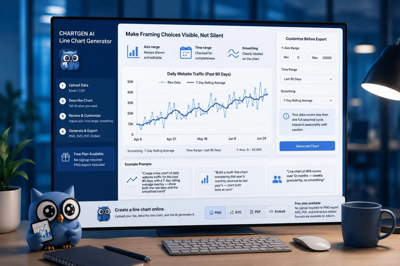
We can use **ChartGen AI Line Chart Generator **to make line chart creation and interpretation more transparent and controllable. When you upload a line chart from Excel or a line graph from CSV, the axis range is displayed and editable before you export — not locked into whatever the algorithm chose. If you ask for a rolling average, the chart labels the smoothing window directly on the visualization. If the time range in your data is shorter than one seasonal cycle, the AI flags it.
The result is a chart where the framing choices are visible to anyone who looks, not just to the person who built it. That is not a small thing. Most of the misleading trend charts in circulation are misleading because the reader has no way to know what choices were made around the data. Making those choices legible is the first step toward making them contestable.
"Create a line chart of daily website traffic for the past 90 days with a 7-day rolling average overlay — show both the raw data and the smoothed trend"
"Build a multi-line chart comparing this year's monthly revenue to last year's — start both lines at zero"
"Line chart of NPS scores over 12 months — weekly granularity, no smoothing"
To create a line chart online, upload your file, describe the chart, and the AI generates it. Free plan available, no signup required for PNG export. SVG, PDF, and interactive embed formats are available on Ada.im.
The Revenue Chart That Looked Like Growth
A marketing team shared a line chart in a monthly business review. Monthly website revenue, Y-axis starting at $180,000. The line climbed steadily left to right across eight months. The room read it as strong growth.
The actual numbers: $181,200 to $196,400 over eight months. An 8.4% increase. Meaningful, but not the dramatic growth the chart's slope implied.
The same data, Y-axis starting at zero, produced a line that barely moved. The trend was real. The impression the original chart created was not.
Neither chart used false data. The choice of the Y-axis range changed what the reader concluded. In the meeting, no one asked about the axis. No one checked. The chart told a story, and the story stuck.
The Trend Is Real. The Impression Might Not Be.
The hardest part of making an honest**growth trend chart** has never been the data. It is the three decisions that happen before the line is drawn: where the Y-axis starts, how much of the timeline is shown, and how much the data has been smoothed. Each one shapes what the reader concludes before they read a single number.
Most Line Chart Generator tools make these decisions silently. ChartGen AI Line Chart Generator makes them visible — the axis range is editable before export, the smoothing window is labeled on the chart, and the AI flags time ranges that are too short to show a meaningful trend.
A trend chart that shows its Y-axis range, labels its smoothing window, and covers at least two seasonal cycles is one that a reader can evaluate. A trend chart that hides these choices behind default settings is one that can only be trusted or doubted — never checked.