


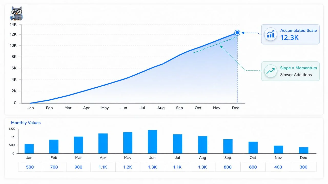
A cumulative growth chart can keep rising even when current performance is slowing because every point includes all earlier results. The curve’s height shows accumulated scale, while its slope shows how quickly new value is being added.
An upward line therefore does not prove that monthly sales, users, revenue, or output are accelerating. To judge momentum, readers must compare the cumulative total with period values, growth rates, and changes in the slope.
What a Cumulative Growth Chart Actually Shows
A cumulative growth chart adds each new period to everything recorded before it. It shows long-term progress, but it does not isolate the performance of one month or quarter.
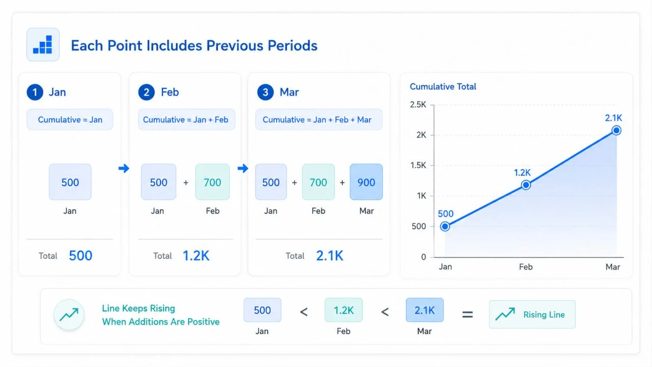
Each Point Includes Previous Periods
For monthly sales, January’s cumulative value equals January sales. February equals January plus February, while March includes all three months.
As long as each period adds a positive amount, the line continues upward. Monthly sales may fall from $50,000 to $20,000, yet the cumulative total still increases.
The Final Height Shows Accumulated Scale
The final point shows how much has been accumulated by the end of the selected period.
A higher ending value may reflect stronger performance, but it may also result from an earlier starting date or more periods being included. It is useful for measuring progress toward a target, but not for judging recent momentum by itself.
The Slope Shows the Speed of Addition
A steeper section suggests that larger amounts are being added. A flatter section means the total is still increasing, but more slowly. A nearly horizontal section indicates little new activity.
The slope helps show whether recent additions are becoming larger or smaller.
How Slowing Growth Can Hide Behind a Rising Line?
Earlier results remain inside every later point, so weak recent periods may be absorbed by the existing total.
Smaller Additions Still Push the Total Upward
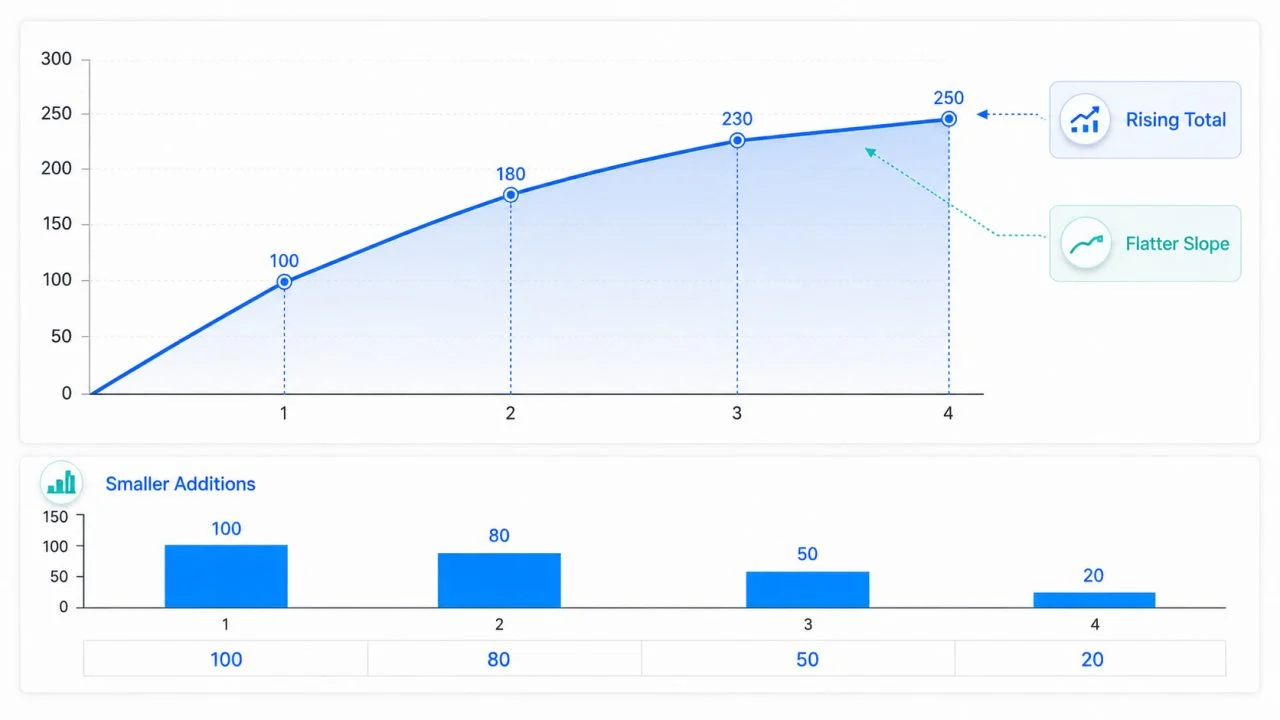
Imagine monthly additions of 100, 80, 50, and 20. The cumulative total becomes 100, 180, 230, and 250.
The line rises throughout the period, but every addition is smaller. The upward direction shows continued accumulation, while the flatter slope shows weaker momentum.
The total can therefore continue rising even while the rate of addition declines.
A Large Baseline Reduces the Visual Impact of Change
Once the cumulative total becomes large, each new addition represents a smaller share of the whole.
A business with $5 million in accumulated revenue may add only $50,000 in the latest month. The change may appear almost invisible on an axis measured in millions.
Weak Periods May Look Less Serious
A poor month may cause only a slight flattening in a long upward curve, hiding the weakness of the latest period.
Compare Scale with Period-by-Period Performance
A cumulative view becomes more useful when it is paired with data that isolates each period.
Show Monthly or Quarterly Values Beside the Total
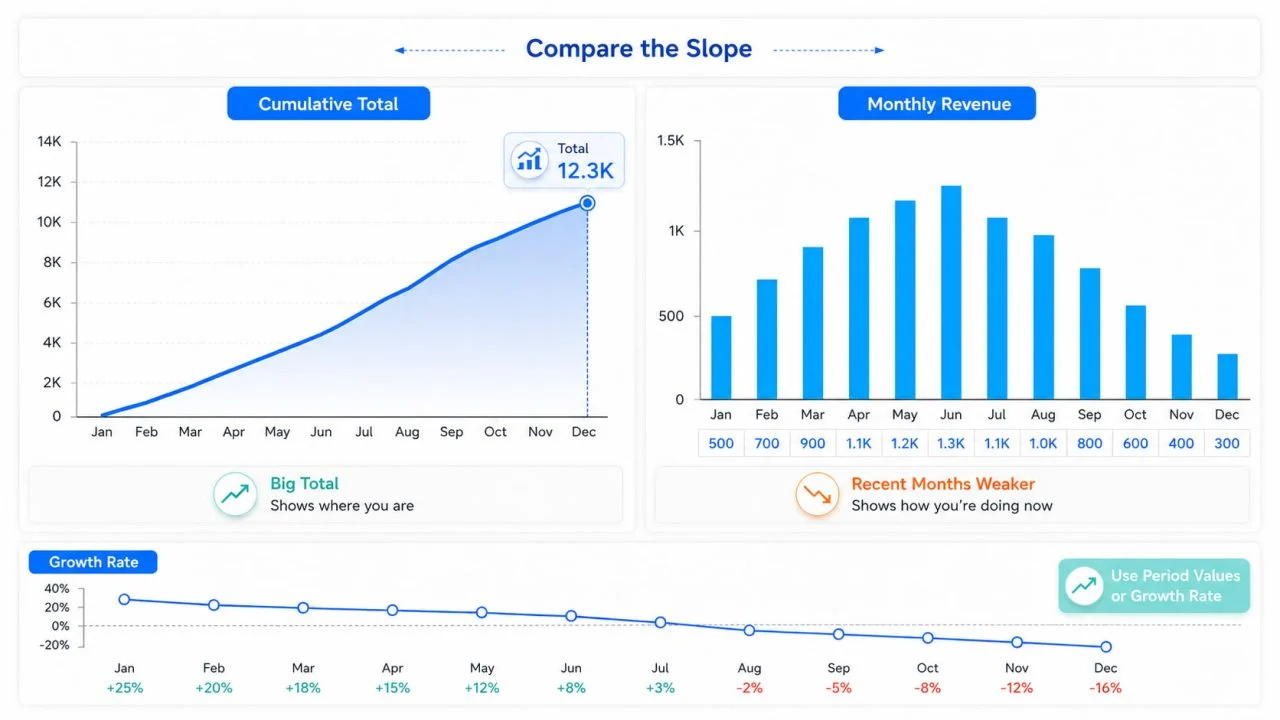
A cumulative total shows how much has been accumulated. A period value shows how much was added during a specific month or quarter.
Displaying both prevents readers from confusing a large total with strong recent performance. The comparison may use a separate chart or a small table.
Compare the Slope Across Time Periods
Do not evaluate only the first and last points. Compare how quickly the line rises during different stages.
A curve that climbs rapidly in the first half and flattens in the second still shows accumulation, but the later slope indicates smaller additions. Seasonality should also be considered.
Use Growth Rates When Momentum Is the Main Question
When the goal is to evaluate speed rather than accumulated scale, growth rates may provide a clearer answer.
Month-over-month, quarter-over-quarter, and year-over-year rates measure different relationships. The U.S. Bureau of Labor Statistics explains that percentage changes over different time periods require separate calculations.
Growth rates can reveal a slowdown that remains difficult to see within a large cumulative total.
When a Stacked Area Graph Adds Useful Context
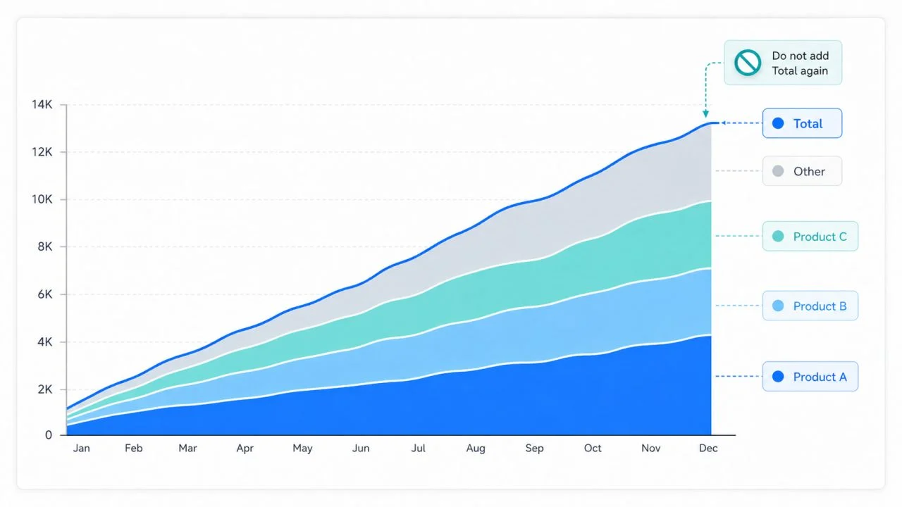
A stacked area graph shows how several categories contribute to the overall total over time. It is useful when readers need to understand both scale and composition.
Show Which Categories Contribute to the Total
Products, regions, channels, or customer groups can be stacked to show their combined volume. The top boundary represents the total, while each band shows a category’s contribution.
This structure can help readers see whether overall growth is supported by several categories or depends mainly on one product, region, or channel.
Keep the Number of Categories Manageable
Too many categories create thin bands that are difficult to follow. Small groups may be combined into “Other” when the extra detail does not support the main question.
Category order should remain consistent so readers can track each band across time.
Do Not Mix Components with the Overall Total
The overall total should not be added as another stacked component beside the categories used to calculate it. Doing so counts the same values twice.
The source data should separate category-level values from already calculated totals before the stacked area graph is created.
What an Area Graph Generator Should Preserve?
An Area Graph Generator can reduce setup work, but the source data still needs a clear structure.
Chronological Order and Complete Intervals
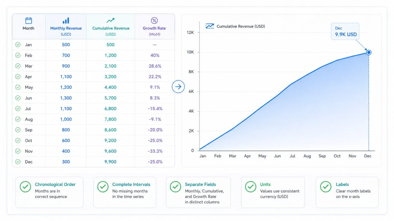
Dates must remain in chronological order. Missing months or quarters should not be silently connected, because a complete timeline helps readers distinguish a genuine slowdown from a data gap.
If a month is missing, the chart should not automatically suggest that activity changed smoothly between the surrounding periods.
Period Values and Cumulative Values Must Stay Separate
Columns should use clear labels such as Monthly Revenue, Cumulative Revenue, and Monthly Growth Rate.
If a cumulative field is mistaken for a period field and summed again, the result becomes inflated. Clear field names help an Area Graph Generator preserve the intended calculation.
Units, Baselines, and Labels Need Review
Users should check that units are consistent, the time range is complete, and the chart clearly identifies cumulative values. Axes, legends, and category names should support the intended comparison.
The title should also make it clear whether the graph shows monthly results, cumulative results, or category contributions.
How an AI Area Chart Generator Can Support the First Draft?
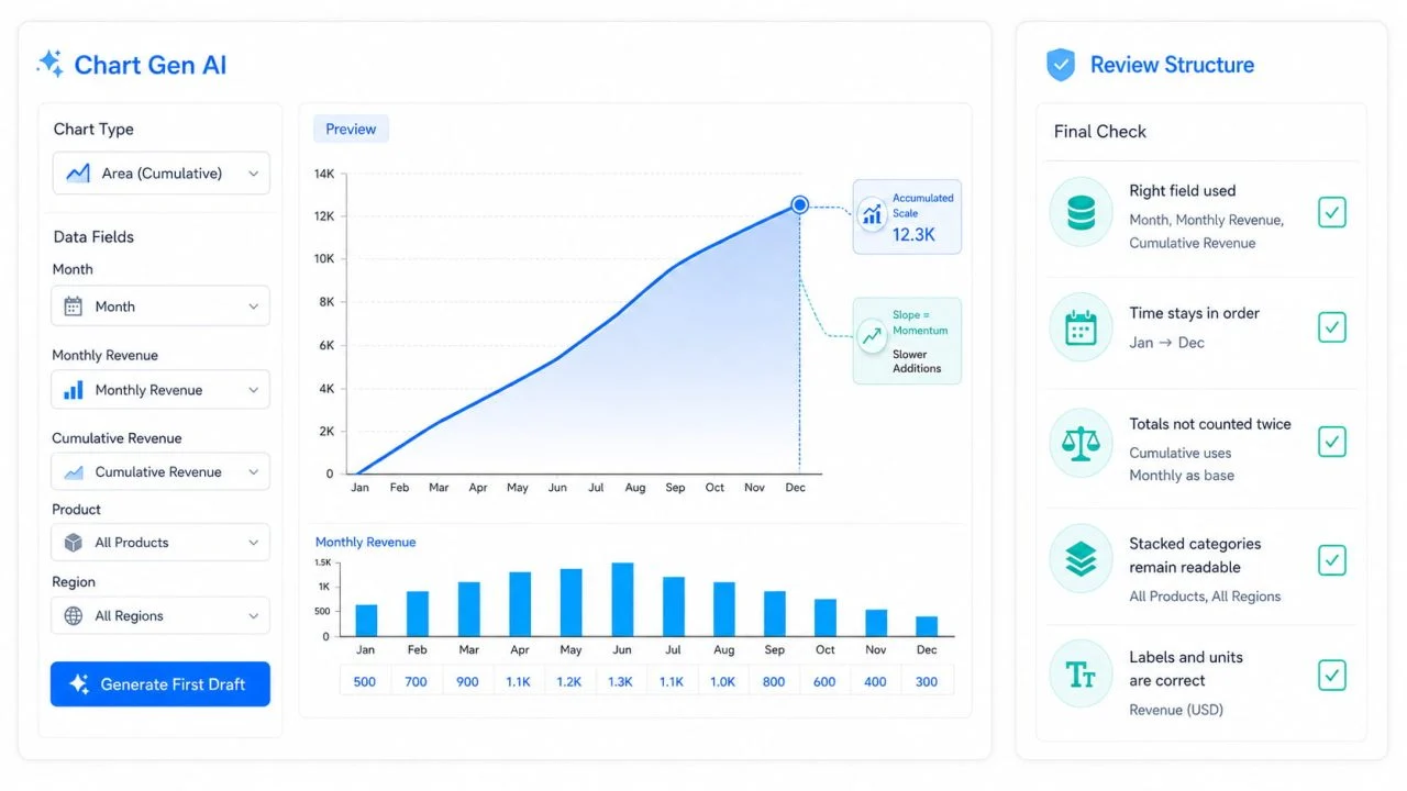
An AI Area Chart Generator can support the first draft when the source file contains clear fields, and the request explains what the chart should show.
Start with Clear Fields and a Specific Request
Useful field names include Month, Monthly Revenue, Cumulative Revenue, Product, and Region.
The request should clarify whether the goal is to show accumulated scale, current momentum, or category contribution. These questions require different calculations and visual emphasis.
A request such as “show cumulative revenue by month” is more specific than simply asking for a revenue area chart. Adding “compare it with monthly revenue” gives the first draft even clearer direction.
Review the Generated Structure
After the draft is created, check whether the correct cumulative field was used, time remains in order, totals were not counted twice, and stacked categories remain readable.
Users should confirm that labels, units, and the timeline match the dataset. When momentum is the main concern, a period or growth-rate view may still be needed.
A Cumulative Growth Chart Should Separate Scale from Momentum
A cumulative growth chart is valuable for showing how much has been built over time. It becomes less reliable when an upward curve is treated as proof that current growth is becoming stronger.
The final height shows accumulated scale, while changes in the slope reveal how quickly new value is being added. Period values and growth rates provide the context needed to judge whether recent momentum is strengthening or slowing.
A rising total means that more has been accumulated. It does not automatically mean that growth is accelerating.