



A market share chart looks simple at first. It shows how a market, sales result, audience group, or product category is divided across several segments. In theory, this should help readers see which brand, channel, product, or competitor holds the largest share.
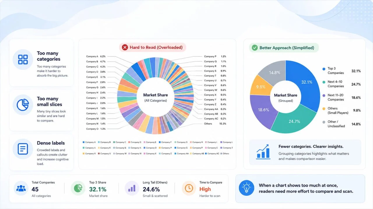
The problem starts when we place too many categories into one chart. Small slices become hard to compare. Labels start to crowd the visual. Colors become harder to separate. Readers may see the chart, but they may not quickly grasp the main pattern. A good market share visual should help readers see the leading share, the main competitors, and the categories that can be simplified.
Why a Market Share Chart Becomes Hard to Read?
A market share chart becomes harder to read when the design tries to show too much at once. This often happens when every product, brand, country, channel, or audience group is placed into the same visual without filtering.
The chart may still be technically correct, but it becomes visually weak. Readers need more time to compare values, understand labels, and find the most important category.
Too Many Small Slices Hide the Main Pattern
Small slices are one of the biggest problems in market share visuals. If a chart includes ten or fifteen categories, many slices may look almost the same size, making it harder to compare them quickly.
This becomes worse when the market has one or two dominant categories and many small competitors. If those smaller categories do not affect the main message, they may be better grouped.
Dense Labels Make the Chart Harder to Scan
Labels can also make a market share chart confusing. When every slice has a name, percentage, and color marker, the chart becomes crowded.
A chart should reduce reading effort. If readers need to move between the chart, legend, and labels before understanding the result, the design needs to be simplified.
When a Pie Chart Maker Works for Market Share Data
A Pie Chart Maker can work well for market share data when the number of categories is small, and the total is clear. Pie charts are easiest to read when they show a simple part-to-whole relationship.
The key is restraint. A pie chart should not become a container for every possible category. It works best when readers only need to understand a few main shares.
Few Categories Are Easier to Compare
A pie chart is easier to understand when it shows three to five main categories. For example, we may compare the market share of four brands, the sales share of three product lines, or the traffic share of several marketing channels.
With fewer categories, each slice has enough visual space. Readers can see the largest share and compare the main segments with minimal effort.
Percentages Should Add Up to a Clear Total
A pie chart should only be used when the values are parts of one meaningful total. Market share, sales share, audience share, and product category share can work because the percentages belong to the same whole.
It becomes confusing when unrelated metrics are forced into a pie chart. Revenue growth, customer count, conversion rate, and profit margin should not be placed into one pie chart because they do not form one total.
Why a Donut Chart Generator Can Make Share Data Cleaner?
A Donut Chart Generator can make market share data feel cleaner when the design needs more visual breathing room. Donut charts work like pie charts, but the open center can make the visual lighter and easier to scan.
This does not mean every pie chart should become a donut chart. The chart still needs a clear total, a controlled number of categories, and readable labels.
Donut Charts Leave More Visual Breathing Room
A donut chart can be easier to read because the center space reduces the visual weight of the full circle. This can help when the chart appears inside a dashboard, report section, or presentation slide.
The extra space can also make the layout feel less crowded. If the category count stays controlled, the chart can show share distribution without forcing too much information into the slices.
The Center Can Highlight the Main Share
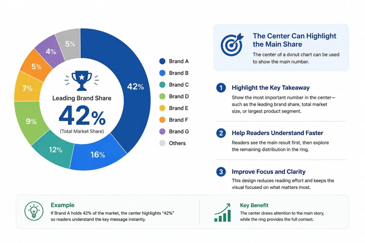
The center of a donut chart can be used to show the main number. This might be the total market size, the leading brand share, or the largest product segment.
For example, if one brand holds 42% of the market, the center can highlight that number while the ring shows the remaining share distribution. This helps readers understand the main result before they inspect smaller details.
How a Percentage Chart Generator Helps Avoid Confusion?
A Percentage Chart Generator can help when the chart needs to show proportions clearly. But percentages should support the visual, not overload it.
When too many percentage labels appear at once, the chart becomes harder to scan. The cleaner approach is to label the most important shares and keep smaller details in the legend, tooltip, or supporting table.
Show Percentages Only Where They Help
Not every slice needs a visible percentage label. If the chart has one or two important shares, those values can be labeled directly. Smaller categories can stay unlabeled in the first view.
This keeps the chart cleaner and helps readers focus on the main share pattern first.
Group Small Categories into “Other”
When there are too many small market segments, grouping them into “Other” can make the chart clearer. This is useful when the small categories do not need individual attention.
For example, a market may include four major brands and twelve smaller brands. Showing all sixteen brands in one pie or donut chart may create a crowded visual. Grouping the smaller brands into “Other” lets readers focus on the main competitors first.
When an Interactive Pie Chart Helps Readers Explore Details
An Interactive Pie Chart can help when the data contains more detail than a static chart should show at first glance. Interactive design allows the first view to stay simple while still giving readers access to smaller values.
This is useful for dashboards, online reports, and data pages where readers may want to inspect details without crowding the main visual.
Keep the First View Simple
The first view of an interactive chart should show the main categories clearly, with limited labels and a readable legend.
If the default view already looks crowded, interactivity will not fix the problem. The visual still needs a clean structure before tooltips or filters are added.
Let Tooltips Show Smaller Details
Tooltips can show exact percentages, category names, sales values, or comparison notes when readers hover over or click a segment.
This keeps the chart surface cleaner. The main visual shows the pattern, while the tooltip provides supporting details only when readers need them.
Better Design Choices for a Market Share Chart
A market share chart becomes clearer when the design supports comparison. Good design is not only about choosing a pie or donut format. It also depends on order, color, label placement, and whether the chart type matches the reader’s question.
If the goal is to show share structure, a pie or donut chart may work. If the goal is to compare rank or small differences, another format may be better.
Use Clear Category Order
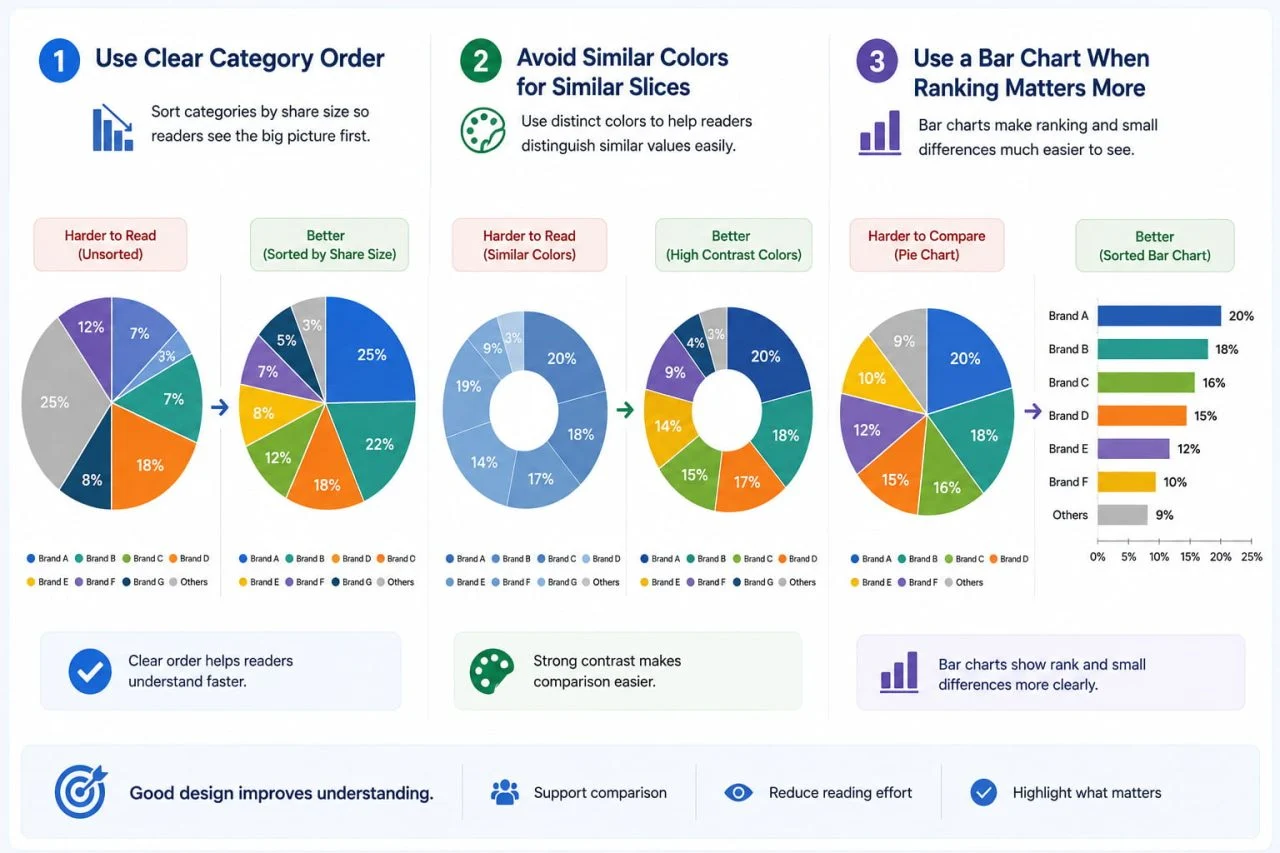
Category order affects how quickly readers understand the chart. In many cases, arranging categories by share size makes the visual easier to read.
Readers can see the leading segment first and then understand how the rest of the market is distributed.
Avoid Similar Colors for Similar Slices
Colors should help readers separate categories. If two slices are close in size and also close in color, the chart becomes harder to read.
A cleaner design uses fewer categories, stronger contrast, and consistent color logic. This helps readers compare segments without guessing which slice belongs to which label.
Use a Bar Chart When Ranking Matters More
A pie or donut chart is not always the best choice. If the main goal is to rank categories from largest to smallest, a sorted bar chart may be clearer.
This is especially true when categories have similar shares. A bar chart makes small differences easier to compare because readers can judge length more accurately than slice angles.
A Market Share Chart Needs Category Control When There Are Many Categories
A market share chart works best when it shows a small number of important categories that belong to one clear total. If the chart has too many slices, dense labels, or similar colors, readers may miss the real pattern.
When there are many categories, we should simplify the chart before publishing it. We can group small segments into “Other,” label only the most important values, use tooltips for smaller details, or switch to a sorted bar chart when ranking matters more.
A market share visual should help readers understand the market structure quickly. It does not need to display every detail in the first view. The strongest design highlights the leading share, keeps the comparison readable, and gives smaller details a cleaner place to appear.