



Traffic volume is often recorded continuously by hour, day, or month. A single value can show how many vehicles passed during one period. Still, it cannot clearly reveal how long heavy traffic lasted, whether similar peaks appeared on different days, or whether overall traffic volume is increasing over time.
A traffic volume area chart places these changes on a continuous timeline. The filled area makes it easier to compare peak heights, the duration of high-traffic periods, and longer-term changes in the same view.
The chart is most useful when the time intervals, locations, and measurement units remain consistent. Otherwise, a smooth-looking pattern may still present an inaccurate view of how traffic changed.
A Traffic Volume Area Chart Shows Peak Duration and Long-Term Change
A traffic chart should not be read only by looking for the highest point. The shape of the filled area can also show when traffic begins to increase, how long the heavier flow continues, and whether similar patterns repeat over time.
It Shows When Traffic Starts to Build
Traffic often rises gradually as more vehicles enter the road.
The beginning of this increase can be as useful as the maximum point. It shows when traffic demand starts to build and whether the increase develops slowly or appears within a short period.
Comparing this starting point across several days can reveal whether the daily pattern is stable or changing.
It Shows How Long High Traffic Lasts
Two periods may reach the same maximum vehicle count but have very different shapes.
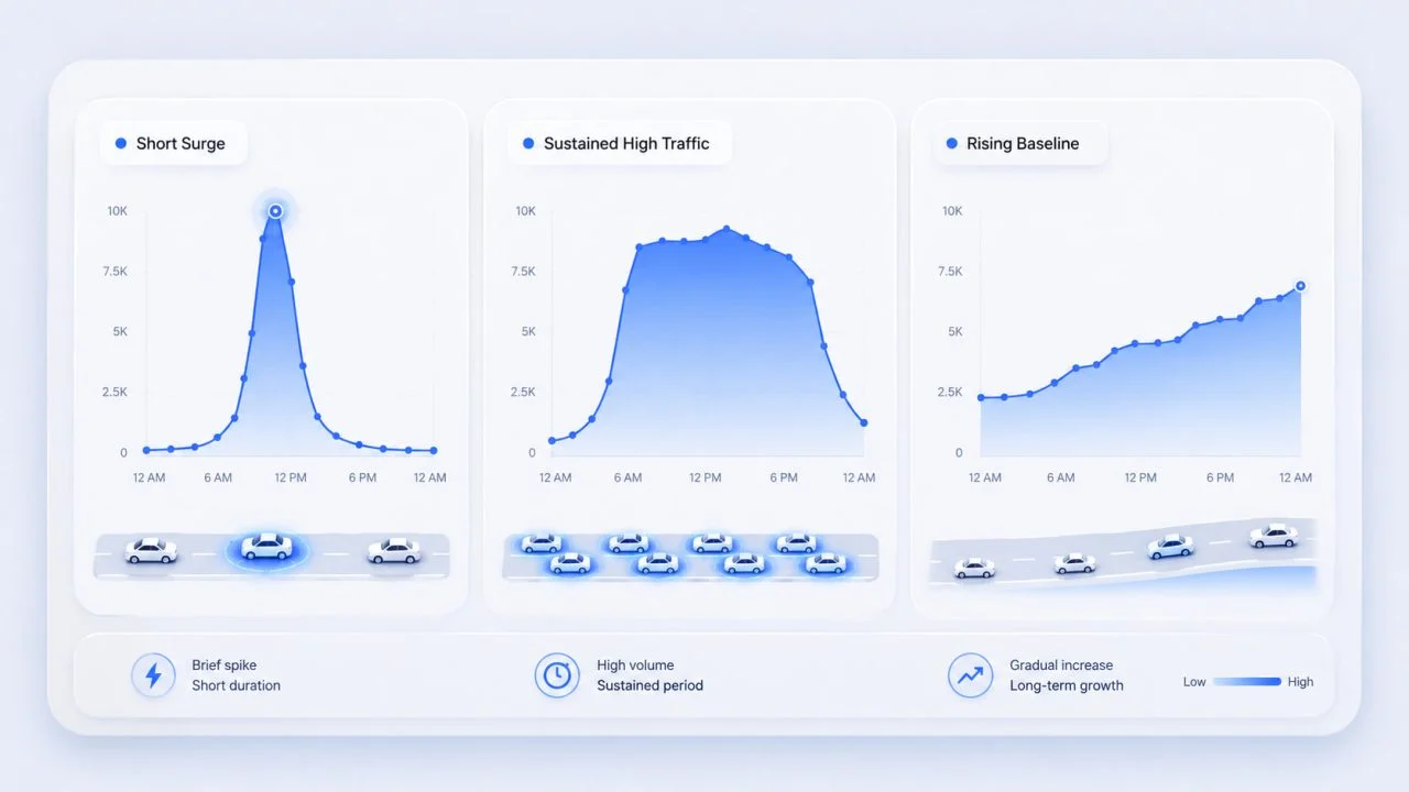
One peak may rise and fall within 30 minutes, while another may remain near its highest level for two hours. The width of the filled area helps distinguish a brief surge from a sustained period of high traffic.
This makes the chart useful for identifying not only when the busiest moment occurs, but also how long elevated traffic continues.

It Reveals Repeated Patterns
When several days use the same time intervals, the chart can show whether morning and evening peaks appear consistently.
Longer reporting periods may reveal broader changes. Traffic levels may rise gradually over several months or follow different patterns during weekends, holidays, or seasonal periods.
Start with the Traffic Question
The chart should be planned around the question that needs to be answered rather than around the appearance of the filled area.
When the goal is to identify daily peak hours, hourly traffic count data or shorter reporting intervals can show when traffic begins to rise, reaches its maximum, and returns to a lower level.
Weekday and weekend patterns should usually be examined separately. Combining them into one average may weaken the morning and evening peaks because weekend traffic often follows a different schedule.
For long-term analysis, weekly or monthly summaries may be more useful than individual hourly records. This reduces short-term variation and makes broader changes easier to identify.
Prepare Traffic Data for a Continuous Timeline
A continuous chart depends on consistent time-based data. Records measured every hour should not be connected directly to records measured by day or month because the values do not represent comparable intervals.
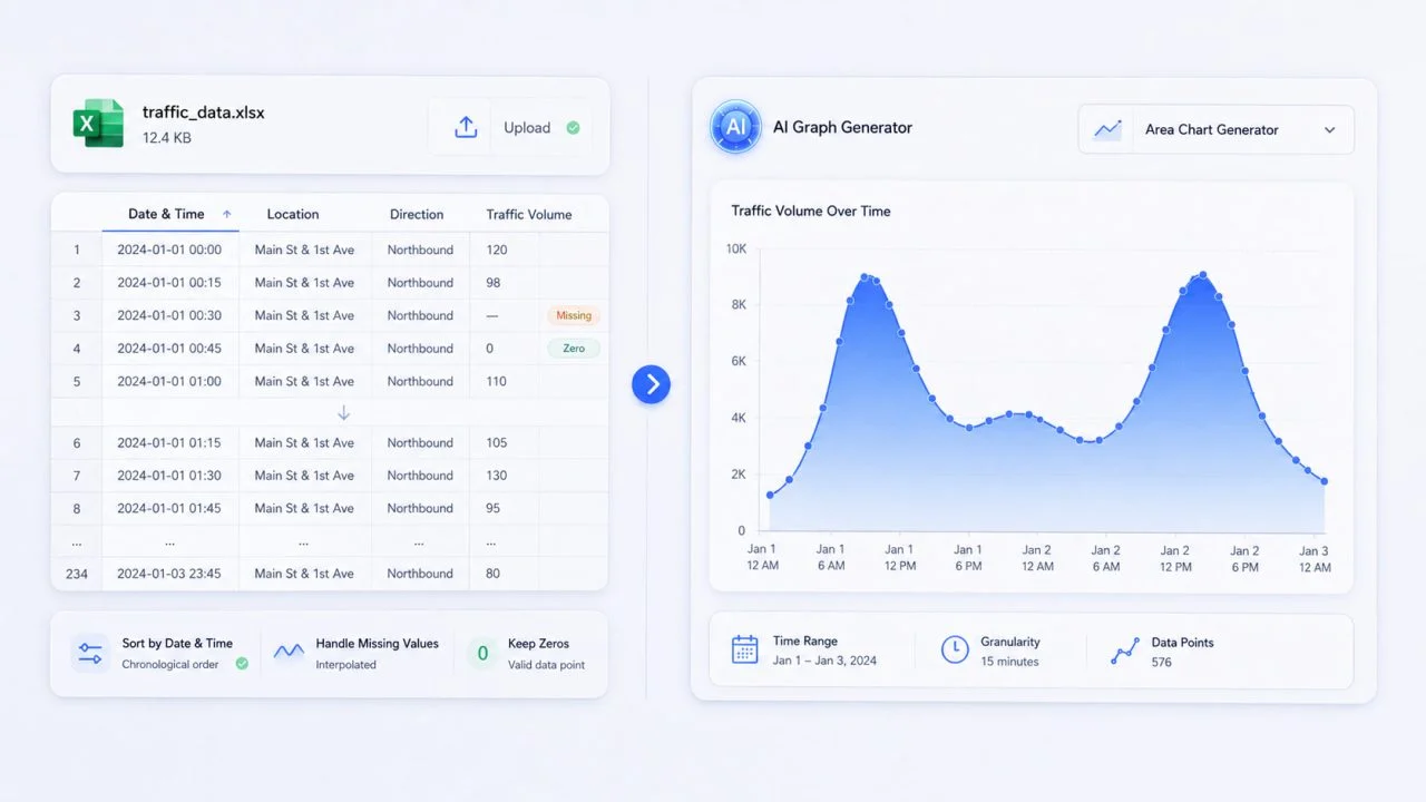
Dates and times should also use one format throughout the source file. Time, location, road direction, and traffic volume should remain in separate fields so each value has a clear role in the chart.
Missing records require careful treatment. A blank value may indicate that no data was collected, while zero means that the system recorded no vehicles during that interval. Replacing every blank with zero can create a false decline in the final chart.
Create an Area Chart from Excel in the Correct Time Order
An area chart from Excel needs a simple and consistent source structure. The spreadsheet does not need decorative formatting, but each row should be easy to interpret.
Use One Row for Each Time Interval
Each row should represent one clearly defined period.
The columns may include Date and Time, Location, Direction, and Traffic Volume. A row should not combine several time intervals or locations because this makes it difficult to place the value correctly on the timeline.
Sort Records by Date and Time
Area charts rely on sequence. If the rows are not sorted correctly, the chart may move backward and forward between different dates or hours.
This can produce sharp jumps that look like real traffic changes even though they are only caused by incorrect row order. Sorting should therefore be completed before the chart is created.
Keep the Measurement Consistent
The vertical axis may represent vehicles per hour, average traffic volume, or cumulative traffic. These measurements do not have the same meaning.
A chart should use one clearly defined unit. After creating the area chart from Excel, compare the visible peaks, low points, and unusual changes with the original records.
Read the Shape of the Traffic Pattern
The outline and filled area provide information beyond the maximum value. The height, width, and general baseline can represent different types of traffic change.
A Narrow Peak Shows a Short Surge
A tall but narrow peak shows that recorded traffic increased quickly and then returned to its previous level.
The chart can identify when the increase began and how long it lasted, but it cannot explain the cause on its own. Additional road, event, or incident data would be needed before concluding.
A Wide Peak Shows Sustained High Traffic
A broad high area indicates that traffic remained elevated across several consecutive intervals.
This pattern may be more important than one sharp maximum because it represents continued traffic demand rather than a brief increase. Comparing the width of these areas across several days can show whether peak periods are becoming longer.
A Rising Baseline Shows Broader Growth
Sometimes both the peaks and the quieter periods move upward.
When the lower parts of the chart also rise over time, the change may reflect broader growth in road usage rather than an increase limited to peak hours.
Higher traffic volume does not automatically mean congestion has become more severe. Congestion analysis may also require information about speed, road capacity, travel time, or delay. The area chart shows vehicle volume rather than every condition affecting traffic flow.
Compare Locations Without Hiding the Main Pattern
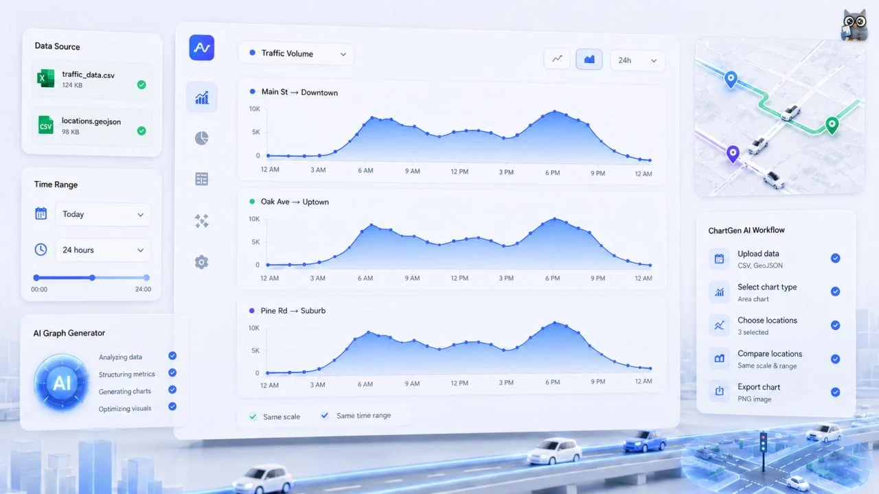
Several roads, intersections, or travel directions can be compared, but too many filled series may overlap and hide one another.
The main chart should focus on the locations most relevant to the analysis. Other roads can be shown in separate charts that use the same scale and time range.
Each location should also use the same reporting interval and measurement unit. A larger value may reflect a longer counting period rather than genuinely higher traffic volume.
Limiting the comparison makes it easier to see whether locations share the same peak periods or follow different daily patterns.
How an Area Graph Generator and AI Area Chart Generator Support the Workflow
An Area Graph Generator can help turn organized time and traffic fields into an initial chart structure. This can reduce some of the manual work involved in converting structured records into a visual timeline.
Organized Excel or traffic data may also be used with an AI Area Chart Generator to create a first visual draft.
The result still needs to be reviewed. A chart tool cannot determine whether a blank record represents missing data or zero traffic unless that meaning is clear in the source file. It also cannot confirm that different locations used the same counting method.
Time order, interval length, location labels, traffic units, and unusual values should therefore be checked against the original records before the chart is interpreted.
A Traffic Volume Area Chart Connects Peak Hours with Long-Term Change
A clear traffic volume area chart shows when traffic begins to build, how long the high-flow period continues, and whether the same pattern repeats across days or longer reporting periods.
The original traffic records preserve the individual measurements, while the area chart reveals the continuous shape of the change.
When time intervals, locations, and counting methods remain consistent, the chart can connect short-term peak hours with broader changes in road usage.