


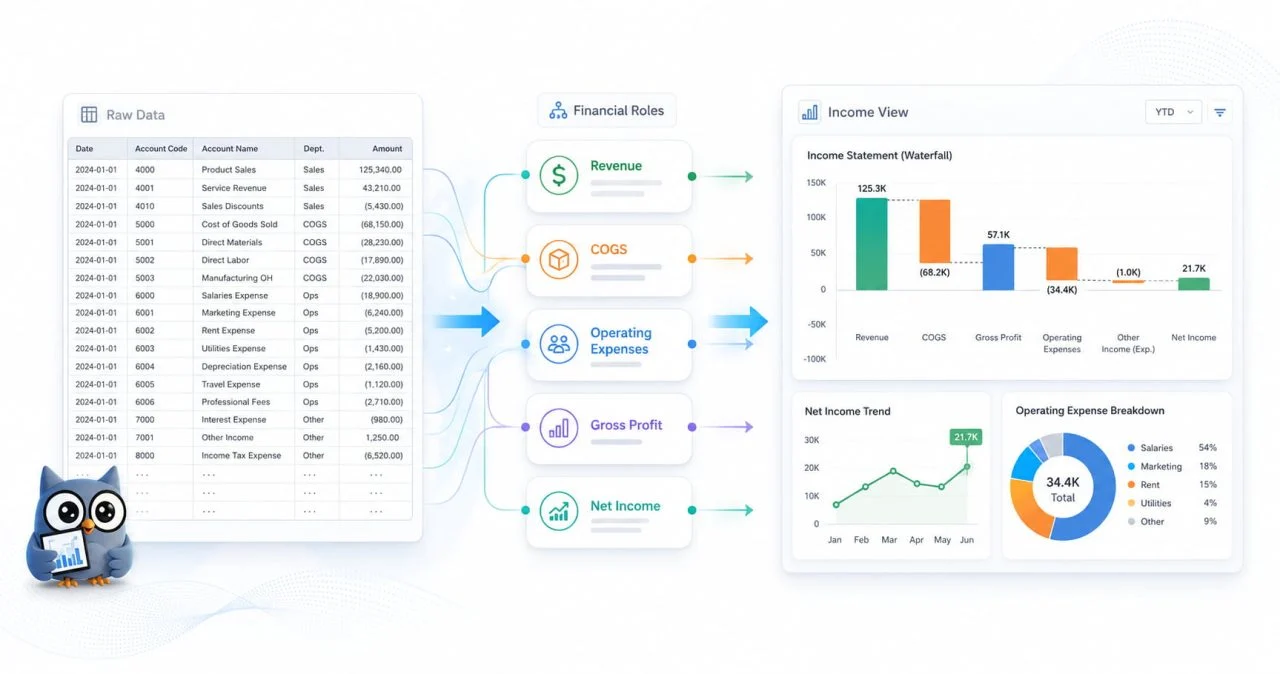
An income statement may contain all the figures needed to evaluate business performance and still be difficult to understand quickly. Revenue appears near the top, operating expenses may extend across many rows, and profit figures only become meaningful after several subtotals have been compared.
The problem is not a lack of information. A traditional accounting table is designed to preserve complete financial records, not necessarily to explain why profit rose or fell.
An income statement visualization makes the relationship between revenue, costs, expenses, and profit easier to see. It does not replace the original report or change the accounting calculations. Instead, it gives readers a clearer way to interpret financial performance.
Why Is an Income Statement Difficult to Read as a Plain Table?
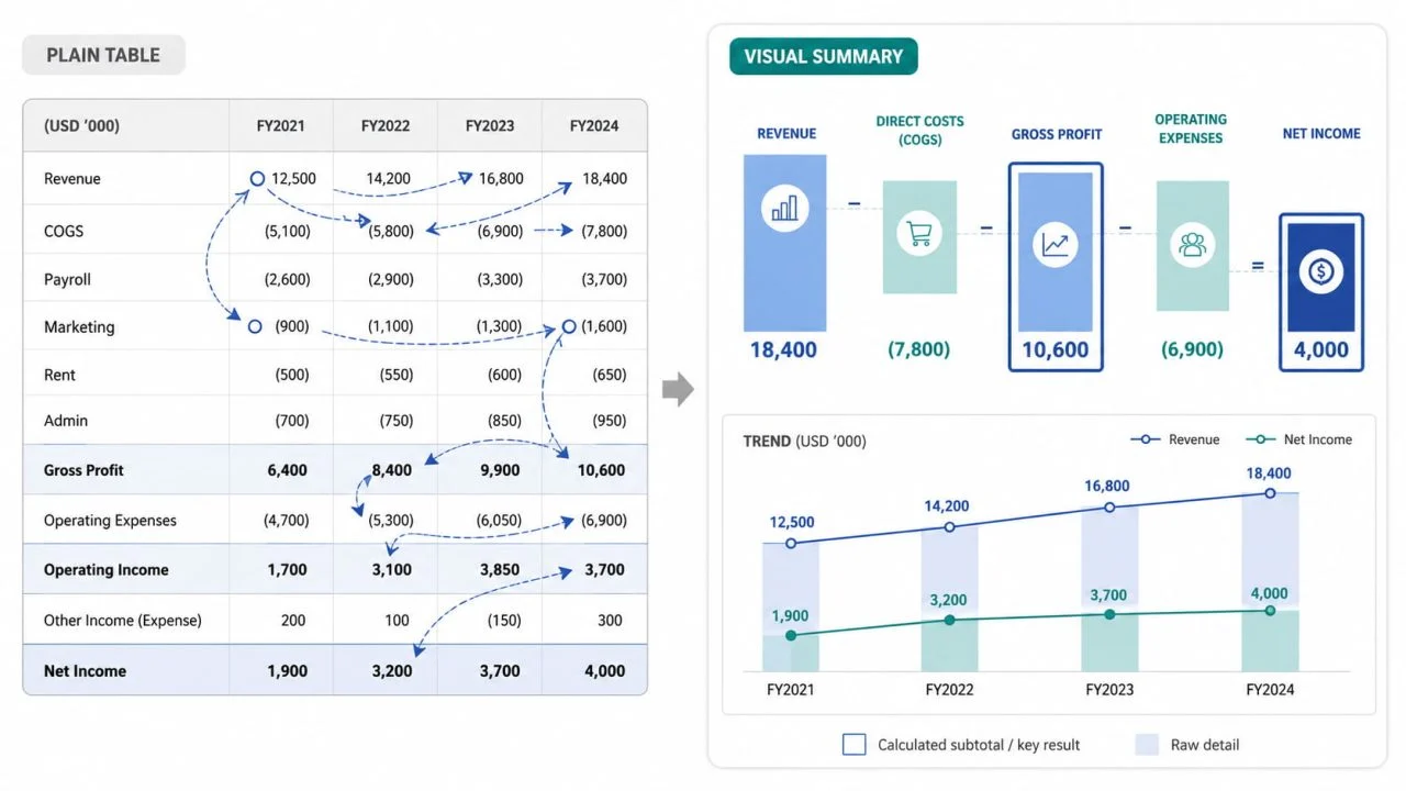
A standard income statement follows a logical accounting structure, but readers may still need to move repeatedly between rows, periods, and subtotals before they understand the overall result.
Revenue and Expenses Are Separated Across Many Rows
Revenue, cost of goods sold, payroll, marketing, rent, administrative costs, and other operating expenses often appear in different sections of the report.
To understand profitability, the reader must compare values that are not positioned close together. This becomes more difficult when the statement contains many expense categories or several reporting periods.
A visual summary can bring the main financial categories into one view. Readers can then see more clearly how revenue is reduced by direct costs and operating expenses before the business reaches its final profit figure.
Subtotals Can Be Confused with Raw Values
Gross profit, operating income, and net income are calculated results. They do not serve the same purpose as revenue, payroll, rent, or other underlying values.
If calculated subtotals and raw figures receive the same visual treatment, readers may assume that they can be combined or compared in the same way.
A clear visualization should preserve the hierarchy of the income statement. Gross profit is calculated by subtracting the cost of goods sold from revenue. Operating income and net income appear only after further costs and deductions have been considered.
Changes Between Periods Are Easy to Miss
When several months, quarters, or years appear as columns in a table, important changes can be hidden among many figures.
Revenue may increase from one period to the next, but that does not automatically mean profitability has improved. Production costs or operating expenses may have increased at the same time.
An income statement visualization can make this relationship easier to identify by showing whether profit is growing alongside revenue or being reduced by faster-growing costs.
What to Prepare Before Creating an Income Statement Visualization?
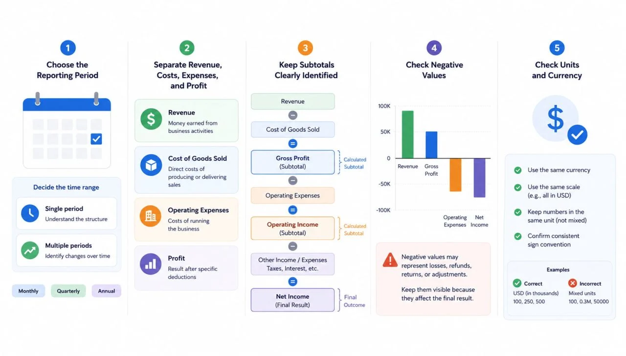
The quality of the visualization depends on the structure of the source data. Before creating any charts, the reporting periods, financial categories, subtotals, negative values, and units should be reviewed.
Choose the Reporting Period
First, decide whether the visualization will explain one month, one quarter, one year, or several consecutive periods.
A single-period view is useful for examining the relationship between revenue, costs, and profit. A multi-period view is more suitable when the goal is to understand change over time.
Monthly, quarterly, and annual figures should not be mixed without clear labels. Inconsistent time periods can make one value appear more significant simply because it covers a longer reporting range.
Separate Revenue, Costs, Expenses, and Profit
Each field should have a clear financial role.
Revenue represents money earned through business activity. Cost of goods sold reflects the direct cost of producing or delivering those sales. Operating expenses cover the wider costs of running the business, while profit figures show the result after specific deductions.
Separating these roles prevents the visualization from treating every numerical field as the same type of metric.
Keep Subtotals Clearly Identified
Gross profit, operating income, and net income should be clearly marked as calculated values.
Without clear labels, a chart tool may treat them as additional categories alongside revenue and expenses. This can duplicate information or create comparisons that do not reflect the original accounting structure.
Consistent field names help preserve the relationship between underlying values, intermediate subtotals, and outcomes.
Check Negative Values and Units
Negative values may represent losses, refunds, returns, or expense adjustments. They should remain visible when they affect the financial result.
Currency and scale must also stay consistent. A file that mixes individual dollars, thousands, and millions can produce a chart that appears accurate while presenting the wrong proportions.
Before creating the visualization, confirm that all values use the same currency, scale, and sign convention.
How to Structure the Visualization Around the Main Financial Question?
A useful visualization should be designed around the question the reader needs to answer. The chart format should support that question rather than being selected only for appearance.
Compare Revenue, Cost, and Profit
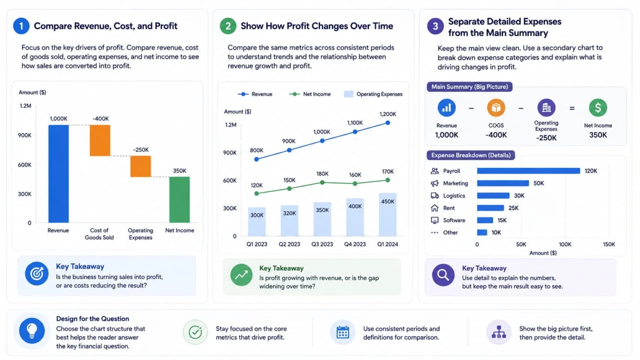
When the goal is to understand overall performance, the main view should focus on revenue, cost of goods sold, operating expenses, and net income.
This makes it easier to see whether strong sales are producing stronger profit or being offset by higher costs.
The comparison should remain selective. Adding every individual expense line to the primary chart can make the final result harder to understand.
Show How Profit Changes Over Time
When the question is about financial trends, the visualization should compare the same metrics across consistent periods.
For example, showing quarterly revenue and net income together can reveal whether profit is keeping pace with sales. A widening gap may indicate that direct costs or operating expenses are growing more quickly.
The visualization should not combine unrelated time ranges or change the meaning of a metric from one period to the next.
Separate Detailed Expenses from the Main Summary
Detailed expense categories are useful when readers need to understand what is driving a change in profit. However, they should not overwhelm the main financial view.
A clearer structure is to use one primary visualization for revenue, major costs, and profit, followed by a supporting chart for categories such as payroll, marketing, logistics, rent, and software.
This keeps the main result visible while still allowing readers to investigate the expenses behind it.
How an Accounting Report Chart Maker Can Help Organize the Data?
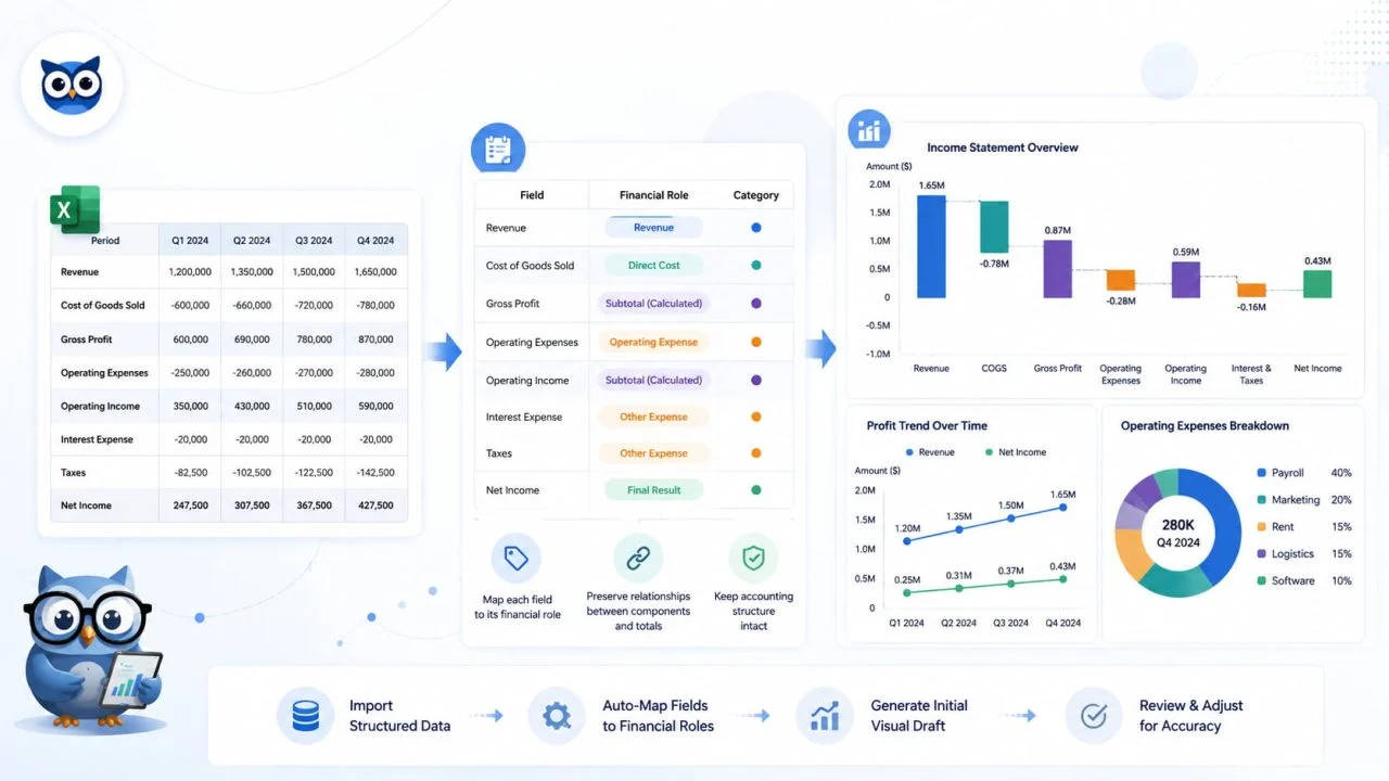
An accounting report chart maker can help convert structured financial data into an initial visual format. A useful tool should preserve the different roles and relationships contained in the original report rather than treating every number as an independent metric.
It Helps Map Each Field to a Financial Role
The source data needs to distinguish reporting periods, revenue fields, cost categories, operating expenses, and profit figures.
A column labeled “Q2 Revenue” has a different role from one labeled “Net Income” or “Marketing Expense.” These fields should not be treated as interchangeable simply because they all contain numerical values.
Clear headers make it easier to place each field in the correct part of the visualization.
It Preserves the Relationship Between Totals and Components
An income statement contains both detailed values and calculated outcomes.
Gross profit is calculated by subtracting the cost of goods sold from revenue. Operating expenses affect operating income, while taxes, interest, and other items may influence net income.
The visualization should preserve these relationships rather than presenting every figure as a separate contribution to one total. Otherwise, values may be repeated or compared in ways that do not match the accounting structure.
It Creates an Initial Visual Draft
An accounting report chart maker can reduce the manual work involved in selecting data ranges, arranging categories, and preparing an initial chart.
The first result should still be treated as a draft. It needs to be compared with the source statement to confirm that the correct periods, units, categories, and subtotals have been used.
The accounting meaning of the data remains more important than the appearance of the chart.
Common Mistakes in Income Statement Charts
One common mistake is placing every row from the income statement into a single visualization. Although this preserves all the figures, it usually creates a crowded chart in which major totals and small expense categories compete for attention.
Another problem is presenting calculated subtotals and underlying values as though they were separate parts of the same total. Revenue, gross profit, operating income, and net income represent different stages of the financial calculation and should not be added together.
A chart can also become misleading when it emphasizes revenue growth without showing the costs required to produce it. Sales may rise while profit remains unchanged because production or operating expenses have increased at a similar rate.
Negative values, losses, and adjustments should remain visible when they affect the result. The purpose of the visualization is to explain financial performance accurately, not to make the report appear more positive.
How an AI Charts Generator Supports Financial Reporting?
An AI charts generator can reduce repetitive work when structured accounting data needs to be converted into an initial visual draft.
Once reporting periods, categories, values, and subtotals are clearly labeled, the tool can help arrange the information into a more readable chart structure. This can be useful for monthly or quarterly reporting, where similar financial relationships need to be reviewed repeatedly.
The generated result still requires financial verification. Revenue, costs, expenses, and profit fields need to be mapped correctly, while currencies, units, negative values, time ranges, and calculated totals should remain consistent with the source report.
AI can make the chart creation process faster, but it cannot confirm whether the source calculations or accounting treatment are correct.
A Clear Income Statement Visualization Explains Financial Performance
A clear income statement visualization helps readers understand whether revenue is being converted into profit, which costs are increasing most quickly, and how financial performance changes between reporting periods.
It shows whether higher sales are improving the final result or being absorbed by direct costs and operating expenses. It also makes it easier to identify whether a change in profitability is mainly connected to revenue, production costs, or wider business spending.
The original income statement remains the complete accounting record, while the visualization provides a clearer way to interpret that information. Used together, the table preserves financial detail, and the visual view explains what changed and how it affected the final result.