


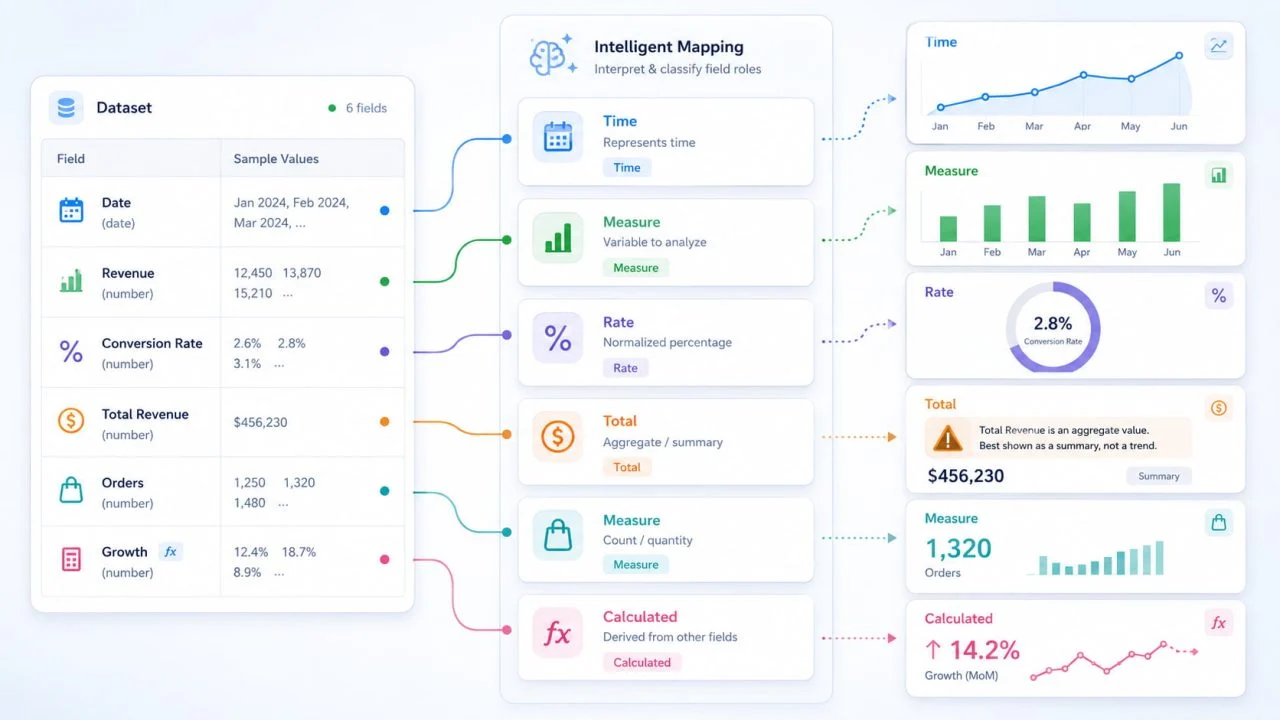
A statistical graph generator must handle different types of numbers differently because numerical values do not always perform the same role in a dataset. Some numbers represent quantities that can be added or compared. Others define time order, express proportions, summarize previous records, or result from an existing calculation.
Treating all of these values as ordinary measures can create incorrect totals, misleading comparisons, and unsuitable graph structures. A year such as 2025 should not be added as a quantity. A conversion rate of 18% should not be interpreted as 18 completed orders. A row labeled “Total Revenue” should not be counted again alongside the categories already included in that total.
The challenge is therefore not simply to find numerical cells. A useful graphing process must preserve the meaning suggested by field names, units, sequence, aggregation methods, and relationships between columns.
A Statistical Graph Generator Must Read the Role Behind Each Number
Numerical formatting tells a tool that a cell contains a number, but it does not fully explain what that number represents. Before selecting an axis, calculation, or graph type, the role of each field needs to be considered.
Dates Define Order Rather Than Magnitude
Years, months, dates, and timestamps are often stored as numbers. Their main purpose, however, is usually to establish sequence.
A year such as 2024 belongs on a chronological axis. Adding several year values together would not answer a useful analytical question. Sorting months from the highest number to the lowest would also destroy the sequence needed to read a trend.
Time fields differ from ordinary categories because their order carries meaning. January must come before February, while products or regions may be rearranged according to sales, profit, or another measure.
A graph may still render when a date is treated as a normal value, but the resulting structure may communicate the wrong relationship.
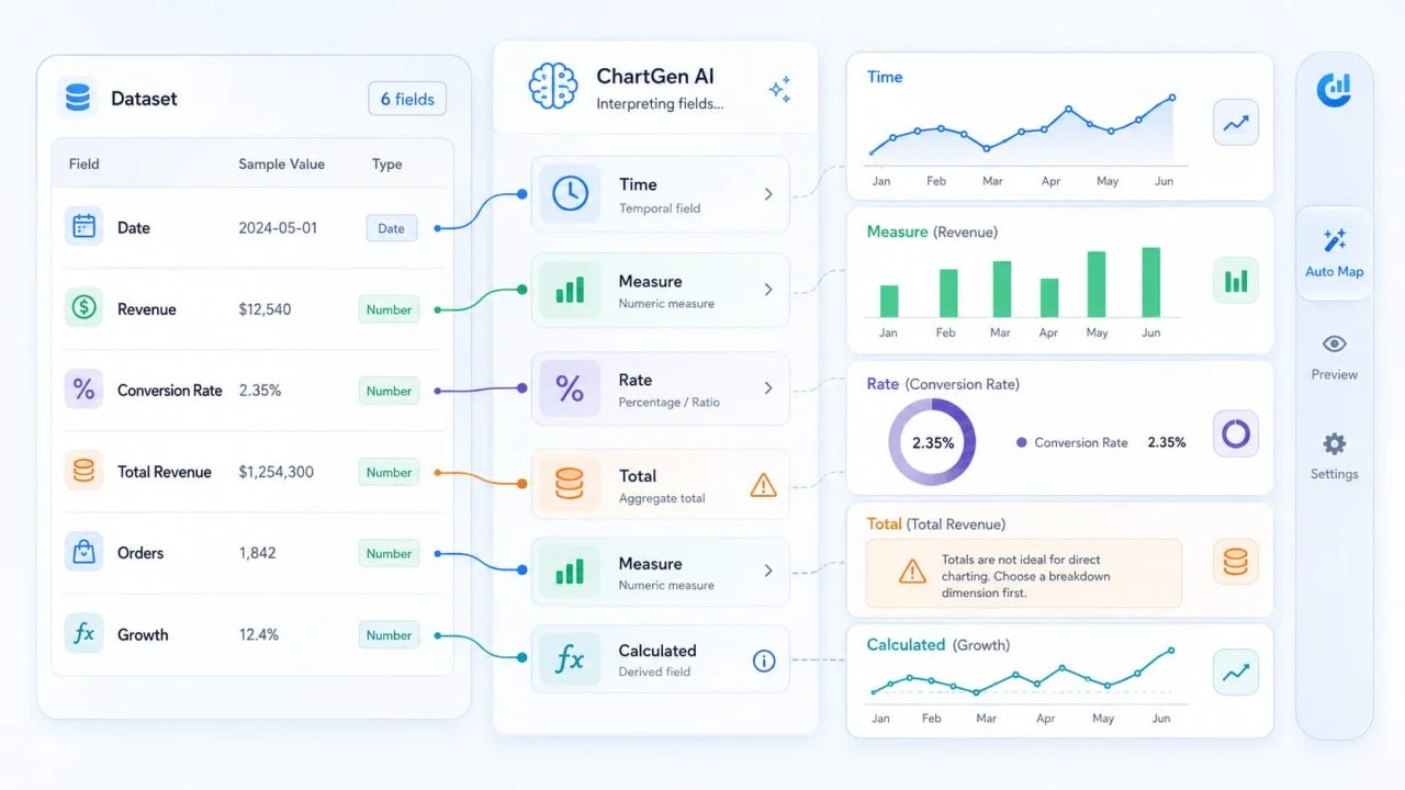
Measures Represent Quantities
Revenue, order volume, visitors, operating costs, and production output are measures. These values can often be summed, averaged, counted, or compared.
The correct operation depends on the question.
Total revenue shows overall scale, while average revenue per customer describes typical customer value. Order counts may be added across stores, but delivery time may be more useful as an average or median.
A statistical graph generator should therefore distinguish between identifying a numerical field and deciding how that field should be summarized.
Percentages Express Proportion
Conversion rates, profit margins, completion rates, and market shares describe proportions rather than absolute volume.
A 20% conversion rate and 20 purchases contain the same visible number, but they represent different information. Placing both on the same scale without explanation may confuse the reader.
Percentages also require care during aggregation. The average of several store conversion rates may not equal the conversion rate calculated from the combined number of visitors and purchases. The original denominators affect the result.
A graph should preserve the difference between a rate and the volume used to calculate it.
Totals and Calculated Fields Need Separate Treatment
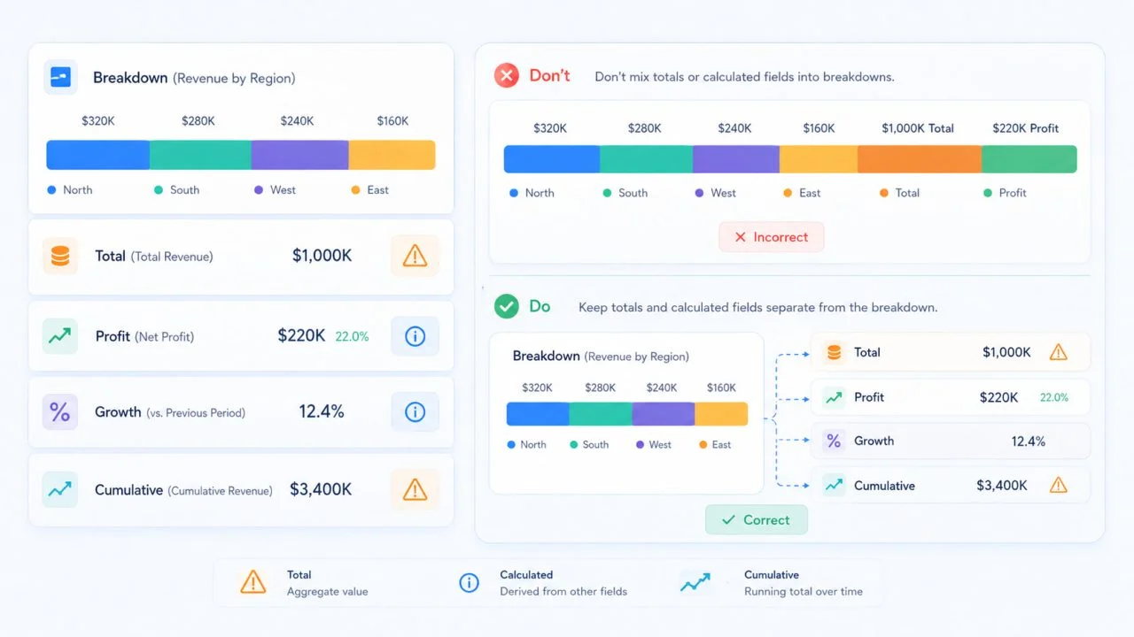
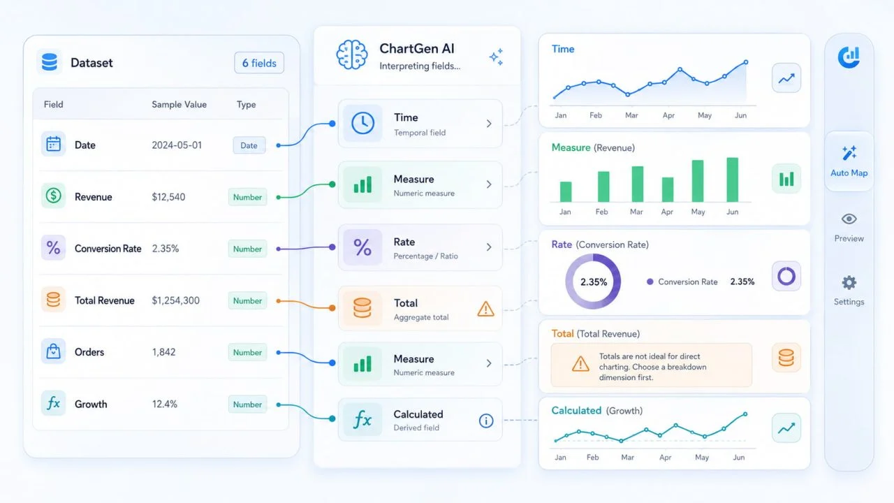
Totals, cumulative values, profit, growth rates, and averages may already be calculated from other records.
If regional revenue and total revenue are included as separate parts of the same stacked bar, the total may be counted twice. Net profit should not be treated as an additional revenue category when it has already been calculated from revenue and expenses.
Cumulative values require clear treatment as well. “Revenue in June” measures one period, while “revenue accumulated through June” includes several periods. Both may use the same currency format, but they do not represent the same type of measure.
The Same Data Can Answer Different Questions
A numerical column does not have one universally correct calculation. The analytical question determines whether the values should be added, averaged, counted, ranked, or displayed individually.
A Sum Is Different from an Average or Count
Suppose a dataset contains the value of every customer order.
Adding those values shows total sales. Averaging them shows typical order size. Counting the rows shows the number of transactions.
All three results come from the same column, but each answers a different question. A statistical graph generator that applies the wrong aggregation may create a polished graph with an incorrect message.
This is why users should specify whether they want to compare total performance, understand typical values, or measure activity volume.
A Total Does Not Explain Distribution
A region with the highest total sales may simply contain more stores than other regions. That does not necessarily mean its individual stores perform better.
To evaluate store-level performance, the reader may need an average, median, range, or view of individual observations. Two regions may have similar totals while showing very different internal distributions.
Totals explain overall scale, but they can hide variation within a group.
A Trend Is Different from a Ranking
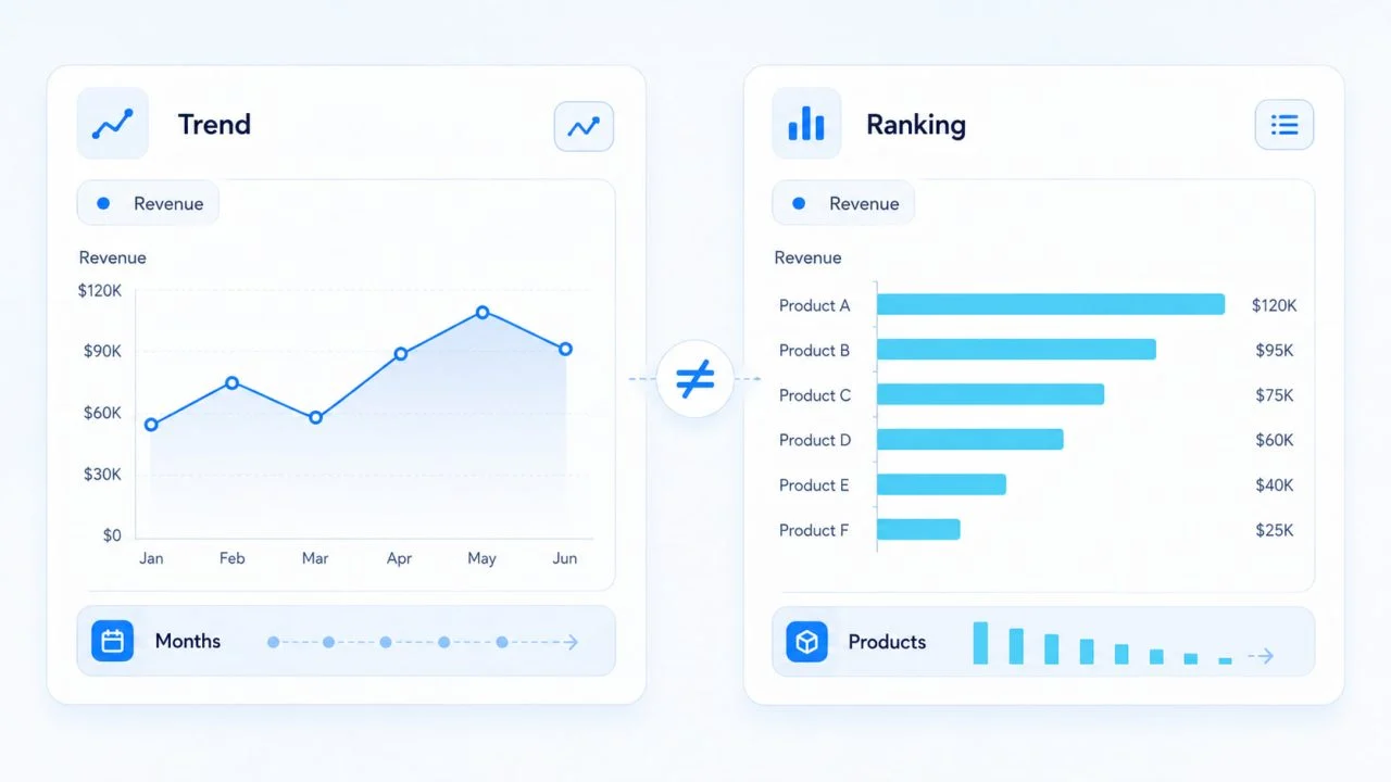
Monthly revenue and product revenue may both contain labels and values, but they require different visual structures.
Months form a sequence, so rearranging them changes the trend. Products are independent categories and may be sorted from highest to lowest to support comparison.
A statistical graph generator should recognize whether labels represent a continuous timeline or a collection of separate groups before determining their order.
Field Roles Determine the Graph Structure
The relationship between fields affects the type of graph that can communicate the data clearly. The Office for National Statistics recommends choosing a chart type based on the data and the relationship being communicated, rather than selecting a format merely because the source contains numbers.
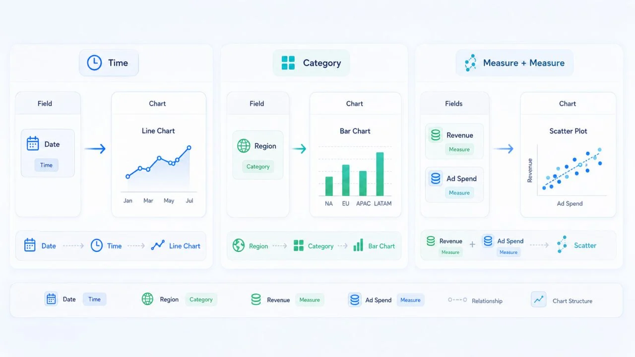
Time and Category Fields Create Different Axes
A time field normally creates a continuous sequence. Records should remain in chronological order, and missing periods may need to remain visible when they affect the interpretation of a trend.
Category fields such as products, departments, regions, or sales channels create independent groups. These categories may be ranked by value or arranged according to a fixed organizational structure.
The graph should not imply that one category naturally follows another unless that relationship exists in the data.
Two Numerical Fields May Show a Relationship
When a dataset contains two continuous numerical fields, the objective may be to examine how they change together.
Advertising spend and revenue, delivery distance and cost, or temperature and energy use are examples of paired measures. Adding these values would not reveal their relationship.
Instead, each observation may need to remain visible so readers can examine whether changes in one variable are associated with changes in the other.
What a Smart Graph Tool Should Check Before Creating a Draft?
A smart graph tool can reduce manual setup, but its first result still depends on the quality and clarity of the source data.
Field Names and Data Types
Headers such as Date, Region, Revenue, Units Sold, and Conversion Rate provide useful clues about how fields should be interpreted.
Generic labels such as Value, Result, or Column 3 provide much less context. A tool may recognize the data format without knowing whether the field represents revenue, percentage growth, a score, or a previously calculated result.
Clear headers make it easier to distinguish time fields, categories, measures, rates, and totals.
Units and Aggregation Methods
Dollars, percentages, people, hours, and kilograms should not be treated as interchangeable values.
Aggregation also matters. Sum, average, count, minimum, and maximum create different summaries. An automatic choice may offer a useful starting point, but the user should confirm that the method matches the intended question.
This is especially important for rates, averages, and data that has already been summarized before upload.
Missing, Zero, and Negative Values
A blank value, zero, and a negative number do not mean the same thing.
A blank may indicate missing information. Zero may be a genuine result. A negative value may represent a loss, refund, decline, or accounting adjustment.
Treating all three as equivalent can change the apparent pattern. A smart graph tool may assist with the initial structure, but the dataset still needs to explain what these values mean.
How a Graph Visualization Generator Can Create a Better First View?
A graph visualization generator is more useful when it organizes fields around the main analytical question instead of placing every available column into one visual.
It Can Map Fields to Visual Roles
A time field may define the horizontal axis, a category field may create groups, and a measure may control the height or position of visual marks.
This mapping can reduce the work required to begin with an empty graph. However, the result still needs review when headers are unclear, units are mixed, or columns contain inconsistent formats.
A focused graph visualization generator should help users examine one primary comparison, trend, proportion, distribution, or numerical relationship at a time.
It Can Keep the Main Question Visible
If the question is about sales by region, the graph should prioritize regions and sales.
Adding dates, profit margins, order counts, customer totals, and cumulative revenue may create a more detailed visual, but it may also hide the original question.
An AI Graph Generator can support the creation of an initial graph when the source file has clear headers, consistent units, and a specific request. Users should explain whether they want to compare categories, show change over time, examine proportions, study a distribution, or explore a relationship between variables.
Used this way, an AI Graph Generator can reduce repetitive setup without removing the need to verify aggregation, units, sorting, labels, and field roles.
Automated Interpretation Still Has Limits
Automation cannot resolve every ambiguity from formatting alone. A field labeled Rate may refer to conversion rate, growth rate, interest rate, or error rate. Its intended meaning depends on context that may not be present in the file.
Mixed reporting levels can also cause errors. Daily records may appear beside monthly totals, causing summarized values to be counted together with the records used to calculate them.
Derived fields present a similar risk. Profit, growth, averages, and cumulative totals may be treated as independent measures when their relationship to the original fields is unclear.
Even a statistical graph generator needs reliable headers, consistent reporting levels, and a clearly defined analytical goal. A smart graph tool can accelerate the first draft, but it cannot replace business context or careful review.
A Statistical Graph Generator Should Preserve Meaning
A useful statistical graph generator does more than locate numbers and place them on a graph. It should preserve the differences between dates, categories, quantities, percentages, totals, and calculated metrics.
The resulting graph becomes more useful when field mapping, aggregation choices, and visual structure remain consistent with the original data.
The goal is not to display as many numbers as possible. It is to show the correct relationship without changing what those numbers represent.