


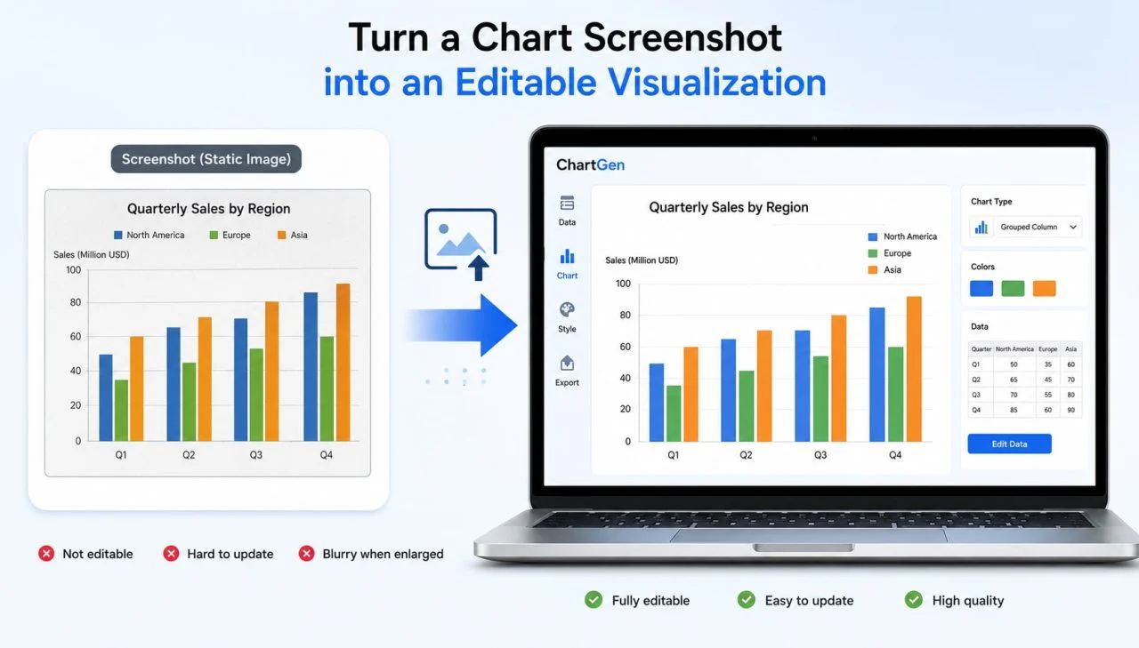
A picture to chart tool can turn a static chart screenshot into an editable visualization that users can update, restyle, and reuse. This is useful when the original chart contains valuable information, but its source file, data table, or editable design is no longer available.
The goal is not simply to reproduce the screenshot. A better workflow preserves the original values, units, categories, and message while improving unclear titles, crowded labels, outdated colors, and unsuitable dimensions.
Why Static Chart Screenshots Often Need Redesign?
A screenshot may work inside its original report, but it rarely fits perfectly into a new document. The image may use an old brand style, small text, an unsuitable aspect ratio, or colors that conflict with the surrounding content.
Users also cannot easily update a fixed image when data changes. Enlarging the screenshot may make it blurry, while cropping it may remove important context such as the legend, scale, source, or reporting period.
Rebuilding the chart creates an opportunity to improve its presentation without changing the meaning of the original data.
Decide What the New Chart Must Preserve
Before changing the visual style, users should identify which elements carry the original meaning. These details must remain accurate throughout the redesign.
Preserve Values, Units, and Axis Scales
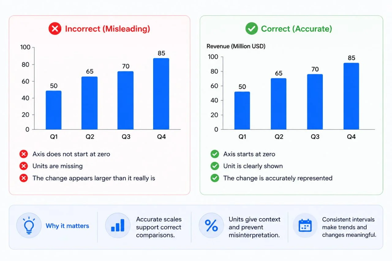
The rebuilt chart should retain the visible values, measurement units, axis range, and reporting interval.
A value of 25 may represent 25%, $25 million, 25 users, or 25 thousand units. Removing the unit can make an otherwise accurate chart misleading.
Users should also check whether the original axis starts at zero or uses a shortened range. The Office for National Statistics provides useful guidance on axes and gridlines, including how numeric reference points and zero lines affect interpretation.
Preserve Category and Time Order
Months, years, ranking positions, and process stages should remain in a logical sequence.
A chart can contain the correct values but communicate the wrong pattern when a tool rearranges dates alphabetically or changes the intended category order.
Preserve the Main Comparison
Users should identify what the original chart was designed to show.
It may compare regions, track a trend, show market composition, or highlight the difference between actual and target results. The redesigned version should continue to support that main comparison instead of adding unnecessary metrics.
Avoid Copying Weak Design Choices
Rebuilding a chart does not mean copying every visual decision from the screenshot. Some elements may have been unclear even in the original version.
Replace Vague Titles
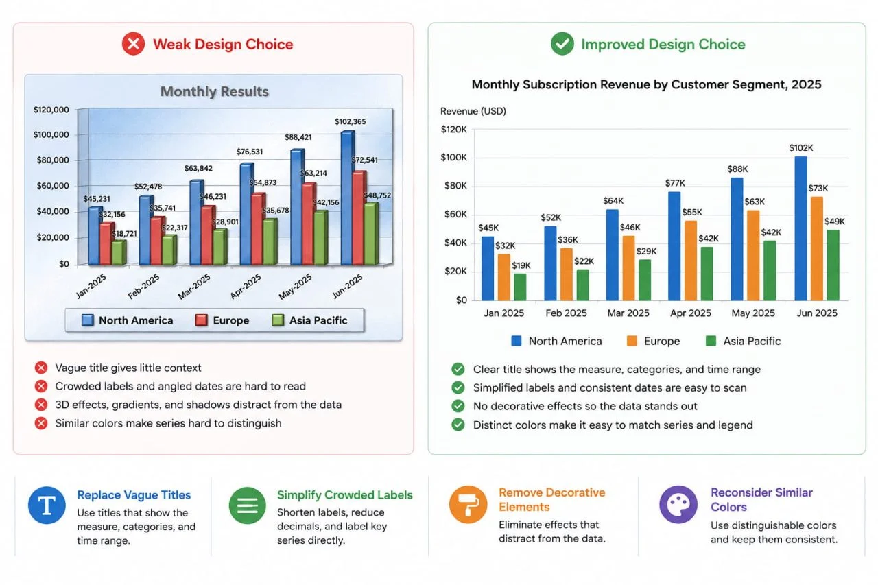
A title such as “Monthly Results” gives readers little useful context.
A clearer title should identify the measure, categories, and time range, such as “Monthly Subscription Revenue by Customer Segment, 2025.”
Simplify Crowded Labels
Long category names, overlapping dates, and repeated data labels can make the chart difficult to scan.
Users can shorten labels, reduce unnecessary decimal places, or directly label important series instead of reproducing an oversized legend.
Remove Decorative Elements That Hide the Data
Heavy backgrounds, gradients, shadows, 3D effects, and unnecessary icons may compete with the values.
The redesigned chart should make the data easier to read rather than recreate decoration that no longer serves a purpose.
Reconsider Similar Colors
Several nearly identical colors can make it difficult to match categories with their legends.
The new version should use distinguishable series styling and maintain the same color-category relationship throughout the chart.
Use an Image Chart Converter to Rebuild the Structure
An image chart converter can provide an editable starting point when users only have a chart screenshot.
Upload a Complete and Clear Image
The source image should include the complete plotting area, axes, units, category labels, legend, and title where available.
Users should avoid uploading an image that cuts off the scale or hides part of a line, bar, or label. A direct screenshot is usually more reliable than a photograph taken from an angle.
Reconstruct the Visible Chart Information
AI Image to Chart can recognize chart types, labels, axes, legends, and visible values, then rebuild the result as an editable visualization.
Users should treat this result as a working draft rather than an unquestioned final chart. When the screenshot does not display exact data labels, some reconstructed values may still require verification.
Compare the Draft with the Original
Users should place the reconstructed chart beside the screenshot and check the categories, values, time order, scale, legend, and series matching.
This comparison is especially important when the original uses overlapping lines, small text, similar colors, or partially visible labels.
Redesign the Chart for Its New Context
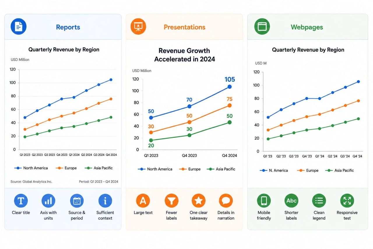
A chart that works in a printed report may need a different layout for a presentation or webpage. The final design should reflect where readers will see it.
Prepare Charts for Reports
Charts in reports should use descriptive titles, readable axis labels, clear units, and enough surrounding context for readers who may not see the original source.
The source name and reporting period should remain visible when they help readers understand where the data came from.
Prepare Charts for Presentations
Presentation charts usually need larger text, fewer labels, and one clear takeaway.
Instead of reproducing every data label, users can emphasize the most important period, category, or change and explain the details verbally or in accompanying notes.
Prepare Charts for Webpages
Charts used online need dimensions that remain readable on smaller screens.
Users may need to shorten category names, reduce the number of visible labels, and test whether the legend remains understandable when the chart becomes narrower.
Review the Meaning Before Reusing the Chart
Visual improvements should never change what the original data says.
Check Data Accuracy
Confirm important values against the original report, nearby text, or another reliable source whenever possible.
Users should treat visually estimated values carefully when the screenshot does not provide exact labels.
Check the Visual Comparison
Make sure the redesigned axis, category order, and chart type still support the intended comparison.
Changing a chart from one format to another may improve readability, but it can also shift the emphasis from total movement to individual categories or from composition to ranking.
Add a Clear Source Note
A reused chart should identify the original data source when that information is available.
When users estimate values from visible marks rather than copy them from exact labels, the final document should not present those values as verified original data.
Common Mistakes in Chart Redesign
One common mistake is copying the screenshot too literally. This preserves crowded labels, confusing legends, weak titles, and outdated styling even though the chart is now editable.
Another mistake is focusing on appearance before checking the values. A polished design cannot correct an inaccurate scale, missing category, incorrect time order, or mismatched data series.
Users should also avoid changing colors, axes, or chart types in ways that alter the original message. Redesign should improve clarity while keeping the underlying comparison accurate.
A Picture to Chart Workflow Makes Old Visuals Easier to Reuse
A picture to chart workflow helps users move beyond pasting static screenshots into new reports. It allows them to preserve important data, rebuild an editable structure, improve the visual design, and adapt the chart for a new audience or format.
The strongest result is not an exact visual copy. It is a clearer version that retains the original values, units, order, context, and intended comparison while removing design choices that made the old chart difficult to reuse.