
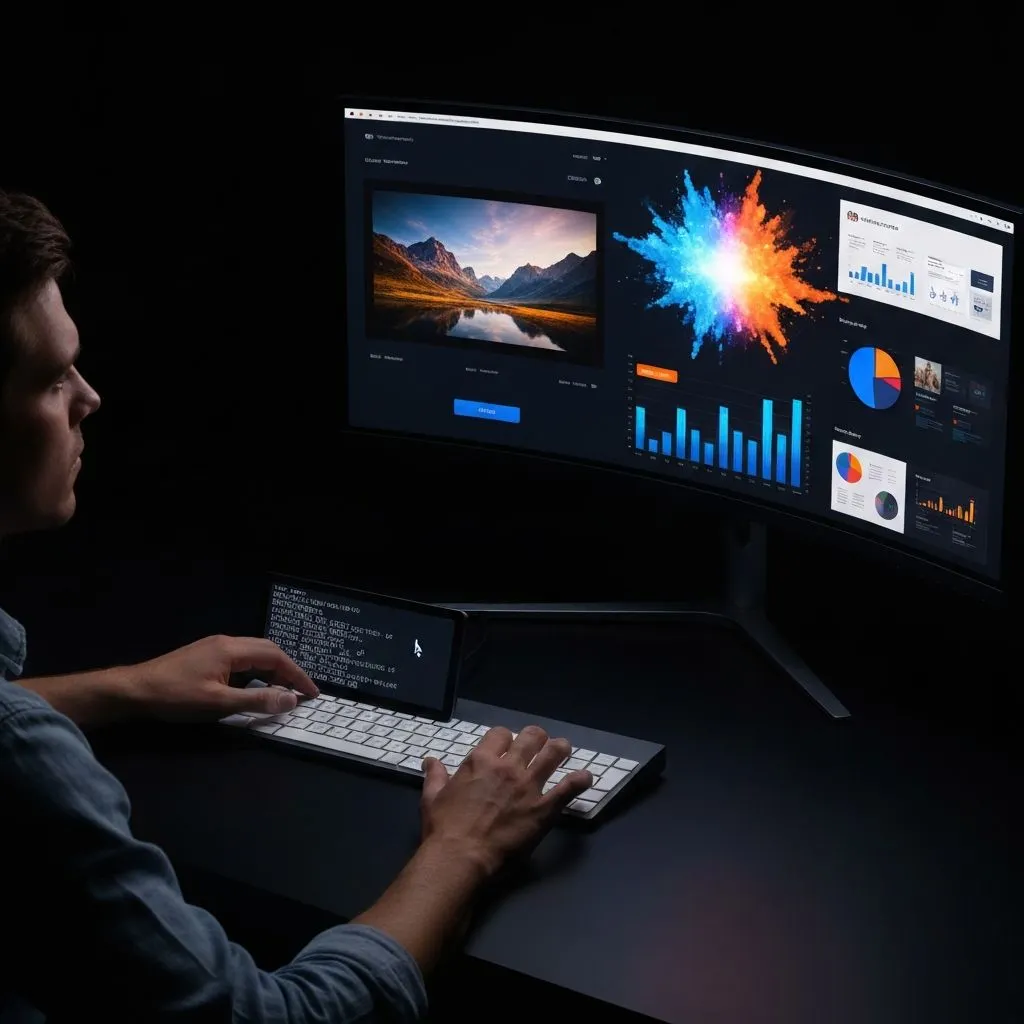
The output modality is shifting: from text you read to visuals you experience.
Figures and layout match the [original essay on Medium](https://medium.com/@cenrunzhe/2026-the-year-ai-stopped-talking-and-started-showing-82baee365cba).
The Moment I Knew Everything Changed
I watched an AI generate a cinematic video with synchronized dialogue. Then it clicked: text-based AI was already yesterday.
This week, ByteDance released Seedance 2.0: 1080p cinematic video, natively synchronized audio with multilingual lip-sync, multi-shot storytelling with character consistency across scenes, up to nine image inputs and three video and three audio inputs at once, and 15-second clips that can look production-grade.
Last week, Claude Opus 4.6 launched with a one-million-token context window and strong agentic coding. Not just writing code — shipping production-ready UIs from a short prompt. GitHub Copilot integrated it quickly. Developers started shipping full-stack apps in minutes.
Meanwhile, on pure text tasks, GPT-5 versus Claude 4 Sonnet can feel interchangeable to many users.
2026 is not the year AI gets marginally better at writing text. It is the year AI gets dramatically better at showing you things: video, UI, charts, dashboards, presentations. The output modality is moving from text to visuals — and that changes which products win.
The Text Plateau: Why “Better Text” No Longer Moves the Needle
GPT-5 versus Claude 4: the differences are real. The everyday perception gap? Often near zero.

Frontier models in 2026 are objectively stronger than their 2025 predecessors. GPT-5 introduced adaptive reasoning — switching between fast and deep modes. Claude Opus 4.6 shipped a 1M-token context window and strong benchmark results. Reasoning, factual precision, and speed all moved.
But on text output, the user-perception gap is converging toward zero.
DataStudios (2026) put it plainly: both are powerhouses; philosophy differs, but discerning outputs matters less. People report “AI chatbot fatigue” — major assistants can sound the same.
Research on LLM scaling reinforces the ceiling. An OpenReview PDF notes that for knowledge-intensive tasks, more compute time does not reliably improve accuracy — and can increase hallucinations. Returns on text polish are diminishing.
The “wow” moved. Few people gasp at a polished email. A 15-second cinematic clip from a prompt, a production UI in half a minute, or a ten-slide data deck from an Excel upload still stops the room.
The next wave of standout AI companies will not be defined only by who writes the best paragraphs. They will be defined by who generates the best visuals.

The Visual Explosion: Four Categories Redefining AI Output
Text-to-video. Text-to-UI. Text-to-chart. Text-to-presentation. The experience layer is being rebuilt.

Category 1: AI Video Generation
Seedance 2.0 is not a small step. It reframes the category: 1080p, audio generated in parallel with video, multi-shot narrative with consistent characters, multilingual lip-sync, and heavy multi-modal inputs — closer to a pipeline than a toy. See also this WaveSpeed.ai comparison of Seedance 2.0 versus Kling 3.0, Sora 2, and Veo 3.1.
The field is crowded: Sora 2 (physics-focused, ~12s), Veo 3.1 (cinematic, ~8s), Kling 3.0 (strong in China). Seedance 2.0’s multi-modal input architecture sets a new bar. Coverage of market reaction: Silicon Republic on China tech stocks.
Market sizing context: MarketsandMarkets on AI image and video generation (projection through 2030, CAGR in the high thirties).
Category 2: AI-to-UI Generation
v0 by Vercel turns language into production-grade React and Tailwind. Bolt, Lovable, and Forge push full-stack apps from prompts. a16z on the “prompt-to-product” era captures why the idea-to-ship loop collapsed.
Claude Opus 4.6 amplifies this: a 1M-token context lets an assistant hold whole codebases while generating UI with architectural awareness. Development speed changes when the model sees the entire project.
Category 3: AI Data Visualization
Traditional BI stacks demand manual configuration, query languages, and design skill. AI-native visualization tools compress the path: upload data, describe the view, get charts and dashboards quickly.
The hard differentiator is traceability. Text hallucinations hide easily; a wrong chart is obvious. That forces higher engineering bars and a natural quality moat. Speed is not enough — the numbers have to be right.
Category 4: AI Presentation Generation
The AI presentation market was roughly $1.5B in 2025, with projections toward ~$4.0B by 2033 at ~14% CAGR. Gamma scaled users fast; Tome exited the category. The market is splitting between speed-first tools and depth-first tools.
The frontier is multi-agent pipelines that research, analyze, design, and verify — not a single LLM pass that decorates bullets. Decks are the universal business format; making them AI-native is a massive unlock.
Across all four categories, output moves from “text you read” to “visuals you experience.” The industry spent 2023–2025 sharpening the text channel. In 2026, it is building the visual channel — where defensibility often lives.
Why Visual AI Is Harder (and More Defensible) Than Text AI

Anyone can wrap an LLM. Few teams can ship a real visual engine.
Text products commoditized quickly: call GPT or Claude, format strings, ship. Thousands of writing assistants blurred together. Thin moats — same models, same APIs, similar quality.
Visual AI resists that pattern:
- Rendering infrastructure — video decoders, chart engines, UI systems, slide layout engines.
- Domain knowledge — which chart fits which data shape, how narratives flow across slides, how components compose.
- Multi-step pipelines — planning, retrieval, analysis, rendering, and verification; rarely one API call.

By late 2026, the most valuable AI startups skew visual-output-first. The API-wrapper era thins out; the visual-engine era accelerates.
The Visual AI Stack: What’s Emerging
A four-layer pattern shows up across categories:

- Foundation model
- Domain pipeline (planning, tools, retrieval)
- Visual rendering
- Interactive editing
Layer 1 alone is a commodity wrapper. Layers 1–2 are powerful but often invisible. Layers 1–3 feel like a real product. Layers 1–4 let users generate and iterate in one environment — the durable shape.

Case Study: How ChartGen AI Embodies the Visual AI Shift
We did not start ChartGen AI to chase a trend. We started with a narrow thesis: data professionals should not need to be designers to build compelling visuals. As the product grew, the broader pattern became obvious — an AI-to-visual-output platform.
ChartGen AI behaves like an “AI to UI” agent: natural language plus data in; charts, dashboards, Gantt views, and full presentations out. Every turn produces something you can see, edit, and share — not a wall of text.

Three Visual Output Modes
Mode 1 — Data visualization. Upload data, ask in plain language, get charts and dashboards on an infinite canvas with traceability to source rows.

Mode 2 — Gantt diagrams. Describe a project or upload a sheet; get an interactive Gantt with dependencies, owners, and progress, with inline edits.

Mode 3 — AI presentations. One prompt can drive a multi-agent pipeline (plan, research, analyze, design, reflect). Tables and charts stay tied to source data; editing is element-level in a dedicated deck editor.

This is the visual-AI shift in practice: an agent that shows your data — in artifacts you can trust, refine, and present.
What’s Next: Five Predictions for the Visual AI Wave

- Video and data visualization converge — animated data stories, video-shaped quarterly reports, dashboards that play like presentations; the line between chart and motion blurs.
- “AI to UI” becomes the default dev workflow — v0-class tools join the daily kit; million-token contexts make whole-repo UI generation normal.
- AI presentations eat most internal decks — one-prompt artifacts for updates and reviews; human polish concentrates on the highest-stakes external moments.
- “Visual AI agent” becomes a category — analyst, product, and marketing tools that default to visual deliverables, not scrollback.
- Model competition shifts to visual quality — benchmarks for charts, slides, UI, and video matter as much as prose leaderboards.
The move from text AI to visual AI is not a feature bump. It is a platform shift — closer to CLI-to-GUI or desktop-to-mobile than to a model refresh. Builders who prioritize visual output shape the next decade.
Show, Don’t Tell
Seedance 2.0 does not merely describe a scene — it shows it, with synchronized audio.
Claude Opus 4.6 does not only describe a UI — it can ship production-ready interfaces quickly.
v0 does not stop at a spec — it ships working UI from a prompt.
ChartGen AI does not stop at describing your data — it visualizes it in charts, dashboards, and decks you can edit and defend.
The through-line for 2026’s most impactful products: fewer paragraphs to read, more artifacts to experience.
We spent 2023–2024 amazed at what AI could say. In 2026, we are amazed at what it can show. The visual channel is wider and richer than text ever was — and the companies building for it will define the landscape ahead.
References
Source essay (figures and original layout): medium.com — 2026: The Year AI Stopped Talking and Started Showing
- seedance.io — Seedance 2.0 product page
- wavespeed.ai — Seedance 2.0 vs Kling 3.0, Sora 2, Veo 3.1
- anthropic.com — Claude Opus 4.6 announcement
- datastudios.org — GPT-5 vs Claude 4 comparison
- openreview.net — LLM scaling PDF (knowledge tasks, diminishing returns)
- marketsandmarkets.com — AI image and video generator market
- htfmarketinsights.com — AI presentation generators market report
- a16z.com — AI web app builders / prompt-to-product
- siliconrepublic.com — Seedance 2.0 and China tech stocks
- neurocanvas.net — AI image generation 2026 preview
- lordofthewix.com — Progress of AI image/video 2020–early 2026