


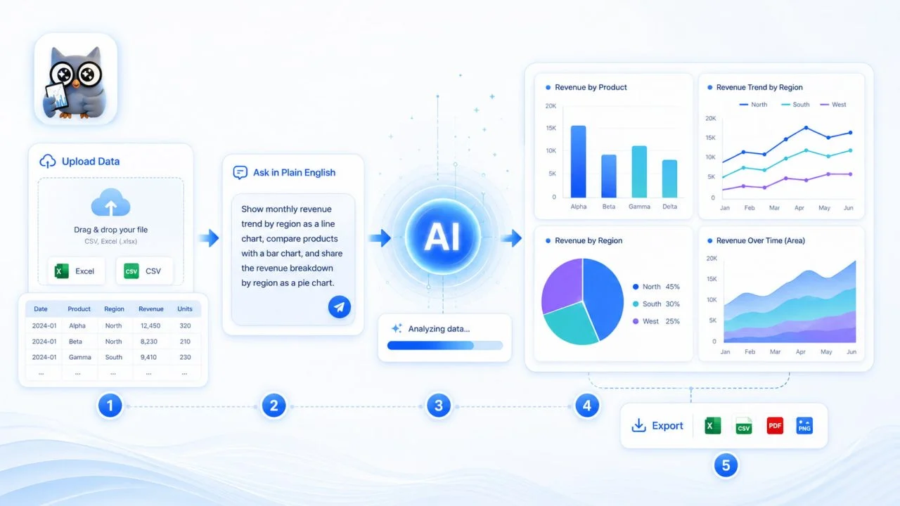
Many tools can create bar charts, line graphs, or pie charts. The real difference is how much work the user must complete before the visualization becomes useful.
Some platforms focus on detailed visual editing. Others are designed for programming, statistical analysis, graphic design, or enterprise business intelligence. These capabilities can be valuable, but they may be more complex than necessary for someone who simply wants to turn an Excel or CSV file into a clear chart.
The best AI chart generator is therefore not always the tool with the longest feature list. It is the one that removes unnecessary steps from the user’s actual workflow.
For everyday reporting, ChartGen AI follows a focused process: upload structured data, describe the required visualization in natural language, generate an initial chart, review the result, and adjust it when necessary. This makes it relevant to users who need clear charts without writing code or manually constructing every visual element.
The Right Tool Should Reduce the Complete Chart-Making Process
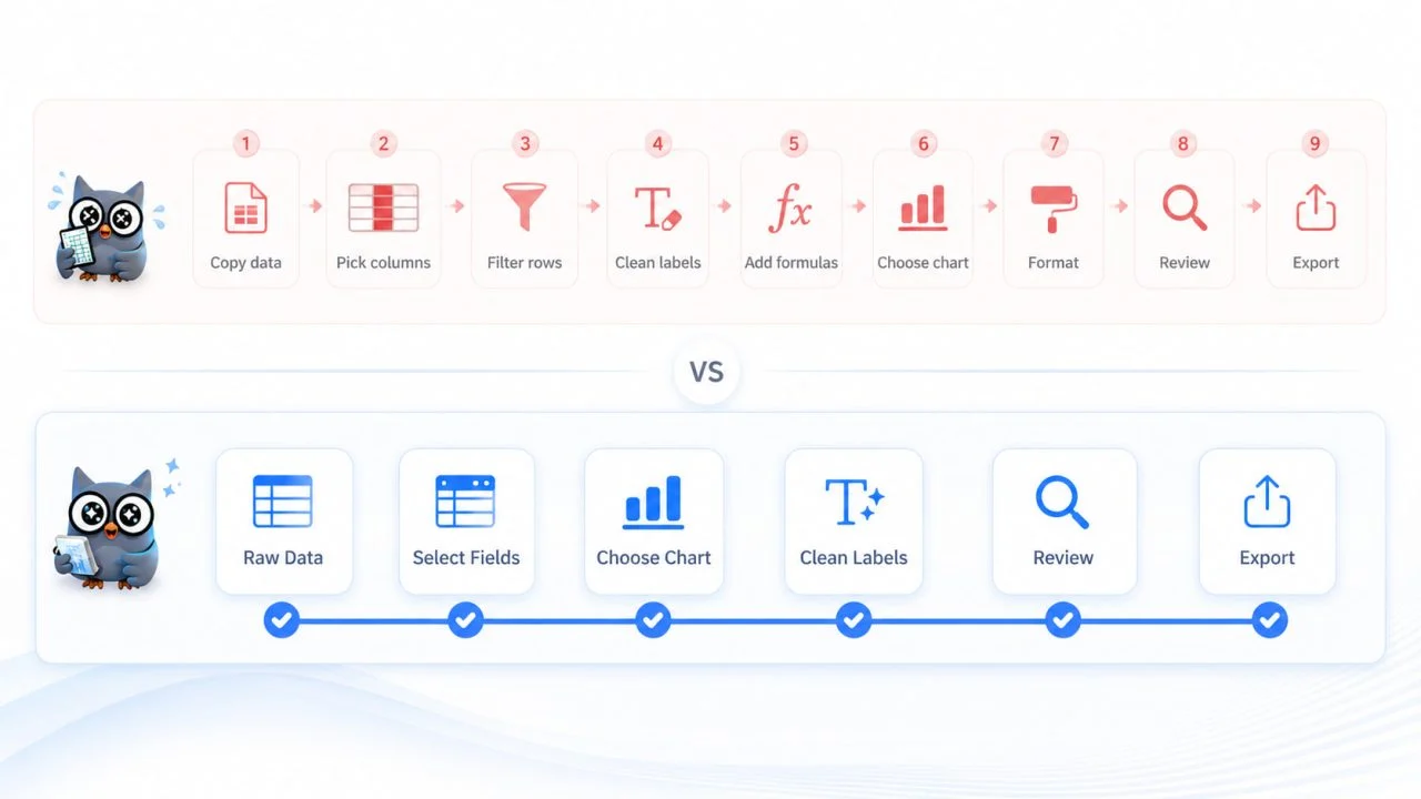
Creating a chart involves more than placing numbers into a visual format. Users may need to select fields, choose a suitable chart type, determine how values should be calculated, arrange categories, edit labels, and prepare the result for a report or presentation.
A useful AI chart tool should reduce the work across this entire process rather than helping with only one step.
Some Tools Still Require Manual Chart Setup
A traditional chart maker may provide extensive control, but the user is usually responsible for configuring the visualization from the beginning.
They may need to select the category and value fields, choose an aggregation method, correct the axes, sort the data, and adjust the labels before the chart communicates the intended message.
This approach is suitable when detailed manual control is the priority. However, it can slow down routine tasks such as presenting monthly sales, comparing campaign performance, reviewing survey results, or showing operating expenses.
General AI Tools May Not Provide a Complete Chart Workflow
General AI tools can help explain a dataset, recommend a chart type, or generate visualization code.
These capabilities are useful for data exploration and programming tasks, but the result may still need to be copied into a coding environment, spreadsheet application, or separate chart editor before it can be reviewed and exported.
The AI may assist with one stage of the process without providing a complete route from the uploaded file to a usable chart.
ChartGen AI Keeps the Main Steps in One Process
ChartGen AI is more focused on the journey from structured data to a finished visual draft.
Users can upload Excel or CSV data, describe the chart they need in plain English, and generate an initial visualization within the same chart-making workflow. The result can then be reviewed and configured without first rebuilding it in another application.
The main advantage is not that users lose control. It is that they begin with a generated chart rather than an empty canvas.
ChartGen AI Starts with the Data and the User’s Question
Many design-first platforms begin with a blank page or visual template. The user must already know which chart to create, which fields to select, and how the information should be arranged.
ChartGen AI begins with an existing dataset and a description of what the user wants to understand. A request might ask to compare revenue by region, show website visits over time, or display market share by product category.
This data-first approach provides a clearer starting point without requiring the complete visualization to be configured in advance.
The Data Structure Guides the First Chart
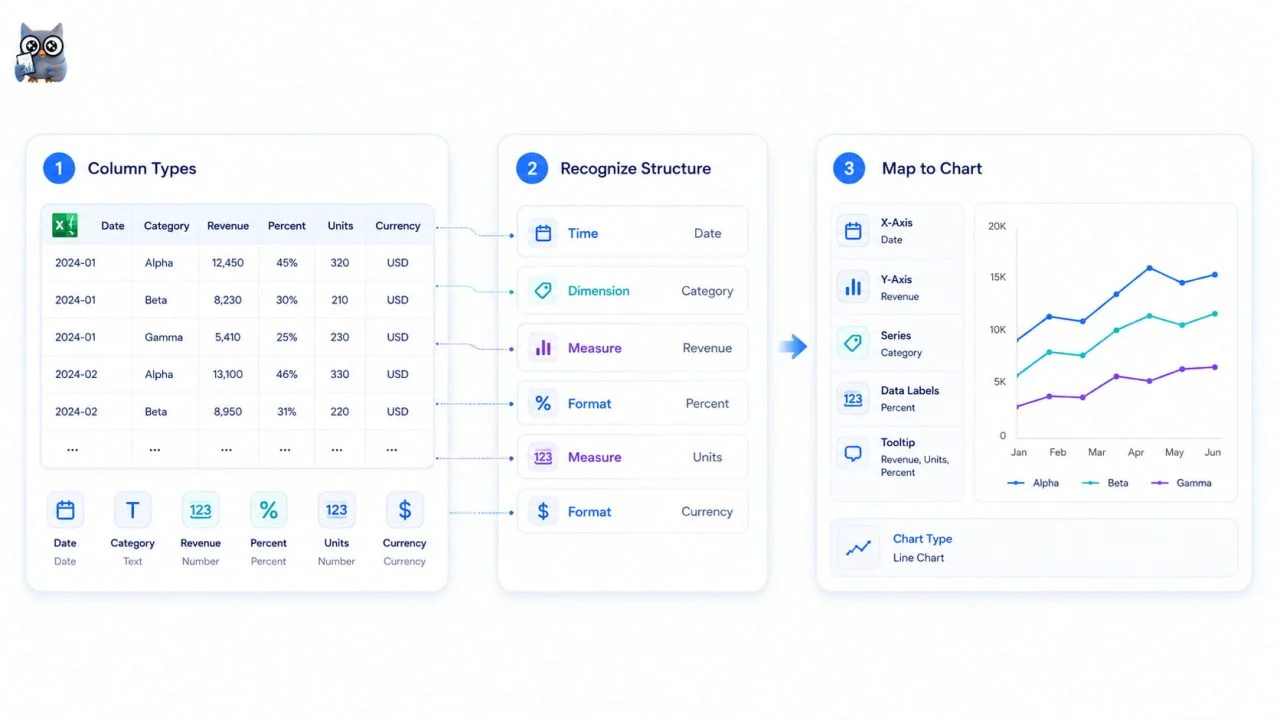
A dataset may contain text categories, dates, currencies, percentages, and numerical values. These fields do not all perform the same function in a chart.
ChartGen AI states that it can identify common column types and consider the structure of the data when creating the initial visualization.
Clear source data still matters. Ambiguous column names, mixed units, inconsistent dates, or incorrect values can affect the final result. AI can assist with chart creation, but it cannot make unclear data reliable.
Natural Language Reduces Technical Setup
Users can describe the intended comparison in ordinary language rather than writing code or learning specialized chart commands.
For example, a request such as “compare quarterly revenue by region” communicates the business question directly. The user does not need to translate that request into a long series of technical settings before seeing the first chart.
This makes the AI graph workflow more accessible to people who understand their data but do not have advanced programming or visualization experience.
Common Business Chart Questions Can Be Handled in One Tool
Different questions require different visual structures, so users should choose a chart type that matches the data question. A chart that works well for category comparison may not be suitable for showing a trend or explaining how several changes lead to a final value.
Using one platform for several common chart formats can reduce the need to move between separate tools.
Different Questions Need Different Charts
Bar charts are commonly used to compare categories, while line and area charts are more suitable for changes over time. Scatter plots can show relationships between numerical variables, and waterfall charts can explain how increases and decreases contribute to a final result.
ChartGen AI currently lists bar, line, pie, area, scatter, heatmap, combo, waterfall, and funnel charts among its supported formats.
The value of these options is not simply visual variety. It allows the chart type to follow the analytical question instead of forcing every dataset into the same format.

Users Can Adjust the First Result
An AI-generated chart should be treated as an initial visual draft rather than an unquestionable final answer.
Users may need to change the chart type, aggregation method, sorting order, data range, labels, or display settings. ChartGen AI’s product page lists controls for aggregation, sorting, data limits, axis labels, color themes, and other display choices.
The ability to correct the first result is just as important as the speed of generating it.
ChartGen AI Fits Everyday Reporting Workflows
ChartGen AI is most relevant when structured data needs to become a clear visualization for a routine report, presentation, article, or business review.
Its purpose is not to replace every analytical or design platform. It is to shorten the path between an organized file and a usable chart.
It Fits Users Who Do Not Want to Code
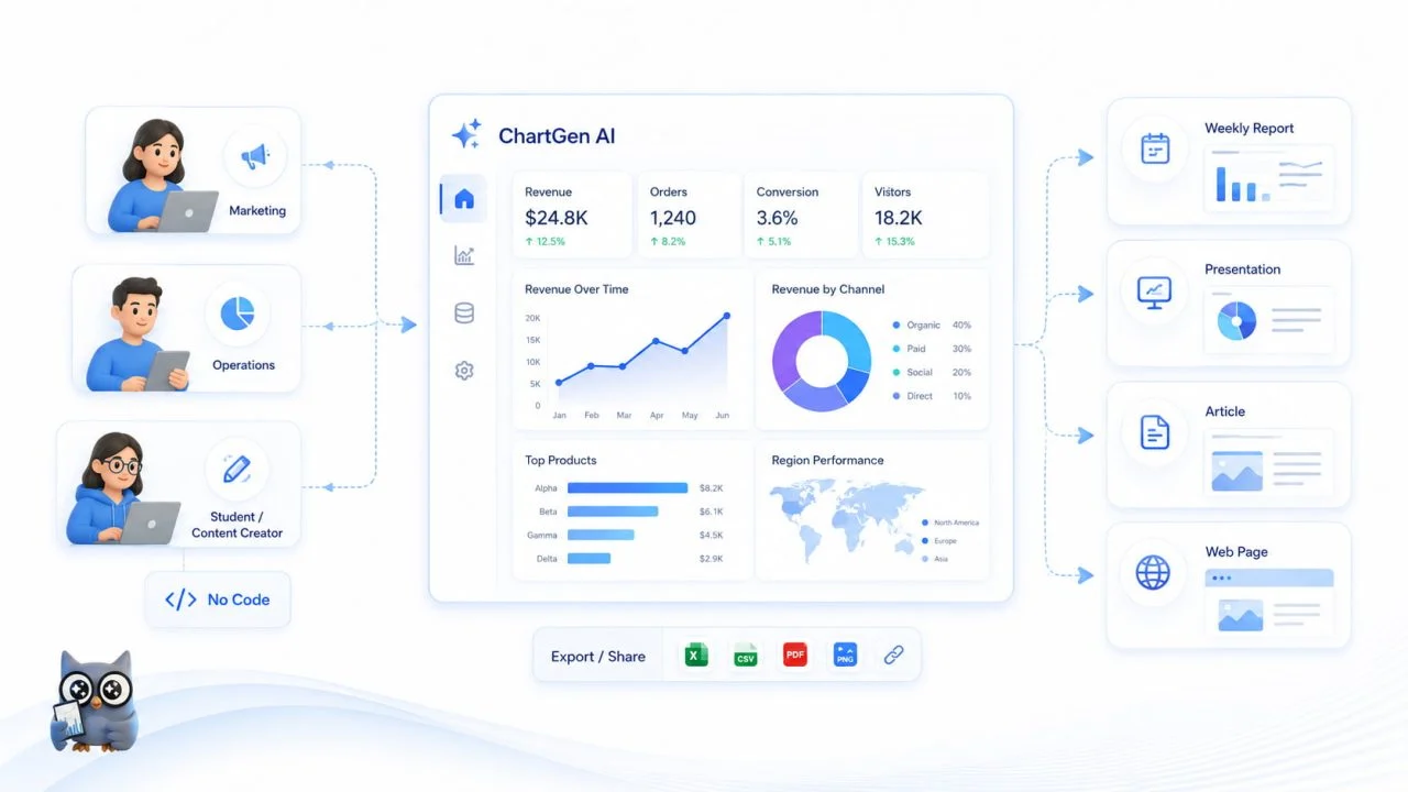
Marketing teams, operations staff, content creators, students, and general business users may need to present data without learning a charting library or programming language.
For these users, natural-language instructions can reduce the technical work involved in turning a clear data question into a visualization.
ChartGen AI allows users to upload Excel or CSV data, describe the chart they need in plain English, and generate an initial visual draft without coding or design skills. The result should still be reviewed to confirm that the correct fields, calculations, and chart type have been used.
It Fits Repeated Reporting Tasks
Many reports use a similar structure every week or month. The values change, but the main comparison remains the same.
A team may repeatedly compare sales by region, monitor website traffic, or review spending by category. ChartGen AI can be useful for these tasks when users upload updated files that follow a consistent structure.
This does not mean the reports update automatically. Users still need to provide the new data and verify that column names, units, currencies, and time periods remain comparable.
It Fits Reports, Presentations, and Articles
A chart only becomes useful when it can be placed in its final destination.
ChartGen AI supports direct PNG downloads. Its product page also explains that additional PDF, SVG, and embedding options are available through the broader Ada.im platform.
This makes the workflow relevant to users who need visual content for documents, presentations, websites, or reporting materials.
Specialized Projects May Require a Broader Workflow
ChartGen AI is designed to make everyday chart creation faster, but some projects may require a broader set of tools.
Programming environments may still be useful when analysts need fully customized statistical models, specialized calculations, or code-based control over every stage of data processing.
Professional design software may also be preferable when a project requires detailed control over typography, layout, spacing, and complex brand specifications.
For more advanced data workflows, the wider Ada.im platform extends ChartGen AI with database connections, real-time data synchronization, interactive dashboards, collaboration tools, permission controls, and automated reporting.
The right choice therefore depends on the scope of the task. ChartGen AI is well suited to focused chart generation, while Ada.im supports broader data analysis and business reporting workflows.
What to Check Before Choosing an AI Chart Generator
Before choosing the best AI chart generator for a particular workflow, users should check whether the tool reads the source data correctly, creates a chart that answers the intended question, and allows mistakes to be corrected without rebuilding the entire visualization.
The final output should also be suitable for its destination, whether it will appear in a report, presentation, article, or web page.
A tool described as free chart AI is not automatically useful simply because it creates a chart without payment. The output must also be accurate, editable, and practical to use elsewhere.
These criteria matter more than the total number of features listed on a product page. A focused workflow helps users move from structured Excel or CSV data to a chart draft that can be reviewed and configured.
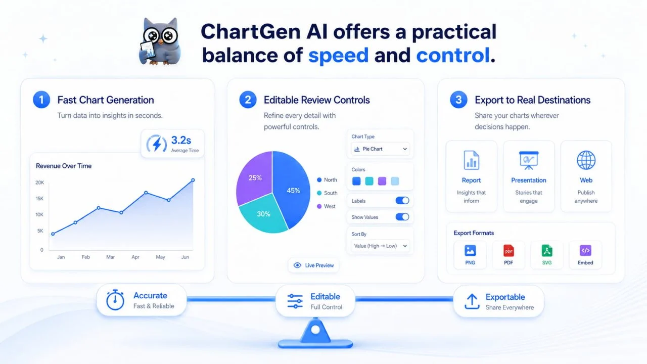
ChartGen AI Offers a Practical Balance of Speed and Control
Within one focused process, ChartGen AI combines data upload, natural-language instructions, chart generation, configuration, and export.
It supports several chart types commonly used in sales, marketing, finance, operations, research, and general reporting. It is particularly suitable for users who want to create charts without coding or manually configuring every element from the beginning.
More specialized tools may remain the better choice for advanced analysis, detailed design work, or enterprise dashboard management.
For everyday data visualization, however, ChartGen AI provides a practical balance. It reduces repetitive setup while still allowing users to review and adjust the first result.
This makes it a strong choice for turning structured Excel or CSV data into clear visualizations without adding unnecessary technical complexity.