



Two homes can have similar square footage, bedroom counts, and property types yet sell at different prices.
A scatterplot maker helps real estate teams examine these differences without relying only on averages. Each property remains visible as an individual point, making relationships, unusual transactions, and market groups easier to inspect.
Similar Homes Can Still Sell at Different Prices
Average sale price describes a market but does not explain the variation within it. A renovated home near public transportation may sell differently from an unrenovated property of the same size farther away.
A scatter plot does not identify one guaranteed cause. It shows where price differences occur and which properties deserve closer investigation.

What Real Estate Data Should Be Compared
A useful scatter plot compares two numeric variables while retaining fields such as neighborhood or property type for grouping.
Home Size and Sale Price
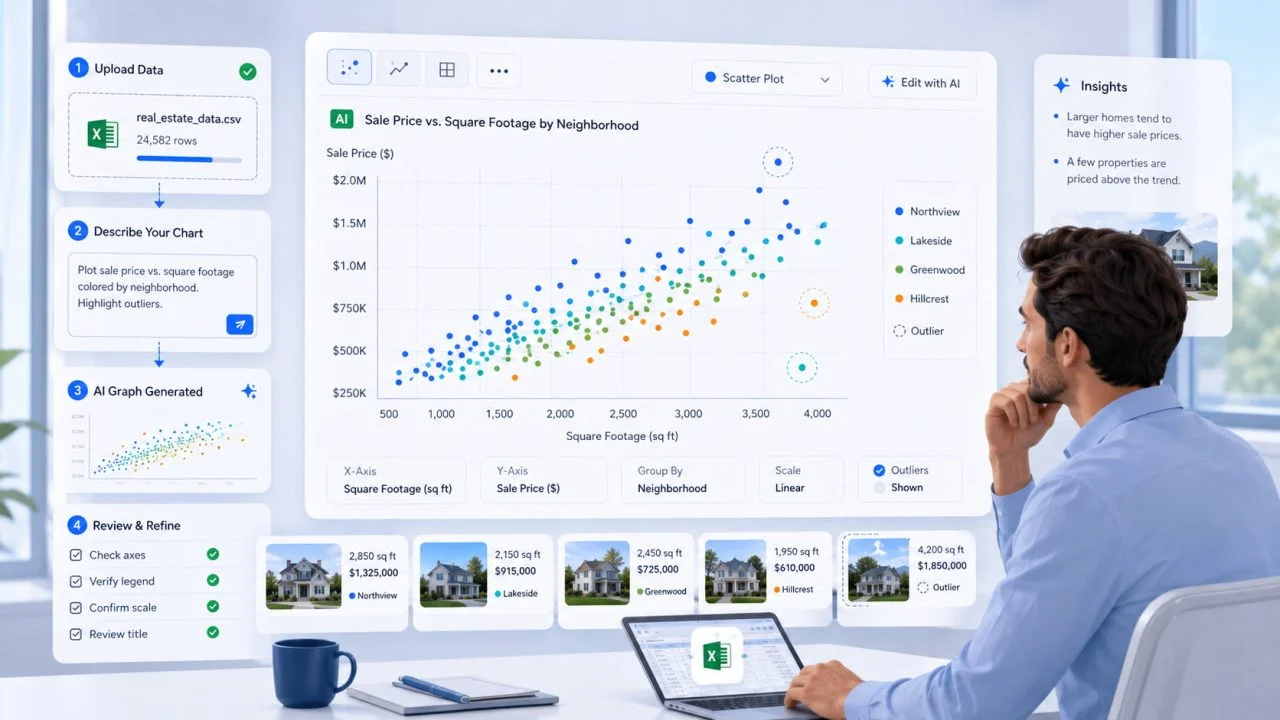
Place square footage on the horizontal axis and sale price on the vertical axis. An upward pattern may suggest that larger homes generally sell for more.
Properties far above or below nearby homes may have premium locations, major renovations, unusual conditions, or incorrect records.
Days on Market and Price Reduction
Compare days on market with the price reduction percentage. This can show whether homes listed for longer periods tend to receive larger price cuts.
Time on market does not automatically cause a reduction. Overpricing, weak demand, property condition, and seller decisions may influence both values.
Property Age and Sale Price
Property age can be compared with sale price or price per square foot. Older homes may appear lower, remain similar, or form separate groups within the chart.
Keep this comparison within the same neighborhood and property type. Mixing different markets can create a misleading pattern.
How a Scatterplot Maker Reveals Price Patterns
A scatter plot shows the overall direction of a relationship while keeping variation between individual properties visible.
Show the General Relationship
A rising pattern suggests that the vertical value generally increases with the horizontal value. A widely scattered group of points may indicate that the selected variable explains little of the price variation.
According to the National Institute of Standards and Technology, an association between two variables does not prove causation. That distinction matters when discussing property prices with clients.
Identify Unusual Properties
Points far from the main group may represent exceptional homes, distressed sales, recording errors, or unusual buyer behavior.
Do not remove them simply to make the chart cleaner. They may reveal why normal market expectations did not apply.
Compare Different Neighborhoods
Grouping points by neighborhood can show whether several local markets have been mixed together.
Use only a small number of clear groups so the chart remains readable.

How to Prepare Real Estate Data
Each row should represent one property transaction. Useful fields include sale price, square footage, days on market, property age, neighborhood, bedroom count, property type, and sale date.
Check for duplicate listings, missing prices, impossible floor areas, inconsistent units, and unrelated time periods. Do not replace missing values with zero because zero can distort the chart.
Also decide whether the question requires total sale price or price per square foot. These measures answer different questions.
Create the Chart with AI Graph Creator
Once the data is ready, a scatter graph maker can turn exported property records into a visual starting point.
Upload the Property Data
ChartGen’s AI Graph Creator supports scatter plots and accepts CSV and Excel files. Users can describe the required graph in natural language and adjust the axes, labels, legends, and styling afterward.
The MLS or internal property system remains the source of the data. ChartGen visualizes exported records for reports and presentations rather than replacing professional databases, valuation models, or comparative market analyses.
Describe the Required Comparison
Name the two variables and any grouping field clearly.
For example:
Create a scatter plot comparing square footage with sale price. Separate the results by neighborhood and keep unusual properties visible.
A scatter plot creator works best when column names are clear, and the requested relationship is specific.
Review the Generated Chart
Confirm that the correct fields appear on each axis, prices use the right scale, neighborhood groups match the data, and no properties disappear because of filters or missing values.
The title should identify the location, property type, and period. “Sale Price vs. Square Footage for Detached Homes in North District, January–June 2026” is clearer than “Property Analysis.”
Common Mistakes in Real Estate Scatter Plot Analysis
Do not combine unrelated cities, property types, or market periods without grouping them. The visible pattern may reflect several separate markets rather than one useful relationship.
Do not describe correlation as proof that one feature caused the sale price. Avoid deleting outliers before checking the source record, and do not overload the chart with too many colors or labels.
Start with one relationship and one grouping variable. Explore additional questions in separate charts.
Scatter Plots Make Property Price Differences Easier to Investigate
A scatter plot cannot determine the only correct value of a home or replace a comparative market analysis. It can show whether similar properties follow a broad pattern, where neighborhoods differ, and which transactions sit outside normal expectations.
With clean records, careful grouping, and verification, real estate teams can move beyond averages and investigate price differences property by property. The result is a clearer basis for further investigation, client discussions, and market presentations.