


A/B tests often end with two percentages: one for the control version and one for the variant. A variant may show a higher conversion rate, but the visible difference alone does not explain whether the improvement is large, stable, or reliable enough to support a decision.
Using graphing ai can make experiment results easier to present, but the chart must preserve important context. Sample size, absolute change, relative lift, test period, and statistical uncertainty should not disappear behind a polished visual.
A/B Test Charts Need More Than Two Percentages
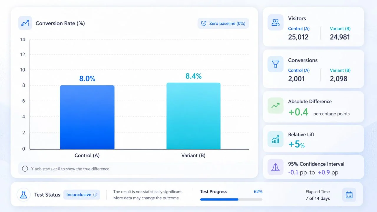
Suppose the control version converts at 8.0% and the variant converts at 8.4%. A chart can show that the variant is higher, but it does not automatically prove that the change is meaningful.
The difference may be based on thousands of visitors or only a small number of sessions. It may remain consistent throughout the test or appear because of one unusually strong day. The chart should therefore summarize the experiment without pretending to replace the statistical analysis.
A/B testing platforms or analytics systems should remain responsible for experiment assignment, sample calculations, confidence intervals, and significance testing. A charting tool is most useful after those results have been exported for review, reporting, or presentation.
Prepare the Experiment Results Before Charting
Each row should represent one test version, audience segment, or reporting period. The data should retain both the result and the information needed to interpret it.
Visitors and Conversions
Record the number of visitors or eligible users assigned to each version, along with the number who completed the intended action.
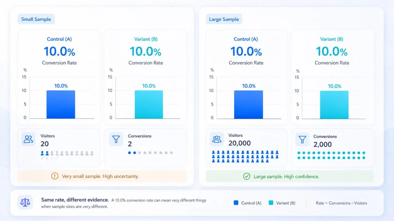
A conversion rate without its sample size can be misleading. A 10% rate based on 20 users does not provide the same level of evidence as a 10% rate based on 20,000 users.
Conversion Rate
Calculate the conversion rate consistently:
Conversion Rate = Conversions ÷ Visitors × 100
Both versions must use the same conversion definition. One version should not count completed purchases while another counts clicks on the checkout button.
Absolute Difference
Absolute difference shows the percentage-point change between the variant and control:
Absolute Difference = Variant Rate − Control Rate
When the control converts at 8.0%, and the variant converts at 8.4%, the absolute improvement is 0.4 percentage points.
Relative Lift
Relative lift compares the improvement with the original control rate:
Relative Lift = \(Variant Rate − Control Rate\) ÷ Control Rate × 100
The same change from 8.0% to 8.4% represents a relative lift of 5%. Reports should not describe this only as a “5% increase” without also showing the 0.4-point absolute difference.
When the control conversion rate is zero, relative lift is undefined. In that case, report the absolute difference instead of calculating a percentage lift.
Statistical Test Results
Keep the confidence interval, significance result, or decision status produced by the experiment platform.
The National Institute of Standards and Technology documents confidence intervals for differences between proportions. This is a useful reminder that two conversion rates should be evaluated with uncertainty, not only by the visible gap between them.
Choose a Chart That Matches the Review Question
Different charts answer different questions. The format should be chosen according to what the team needs to review.
Grouped Bars Compare Final Conversion Rates
A grouped bar chart can place the control and variant conversion rates side by side.
This works well for a final experiment summary, especially when the report also displays visitors, conversions, absolute difference, and relative lift nearby.
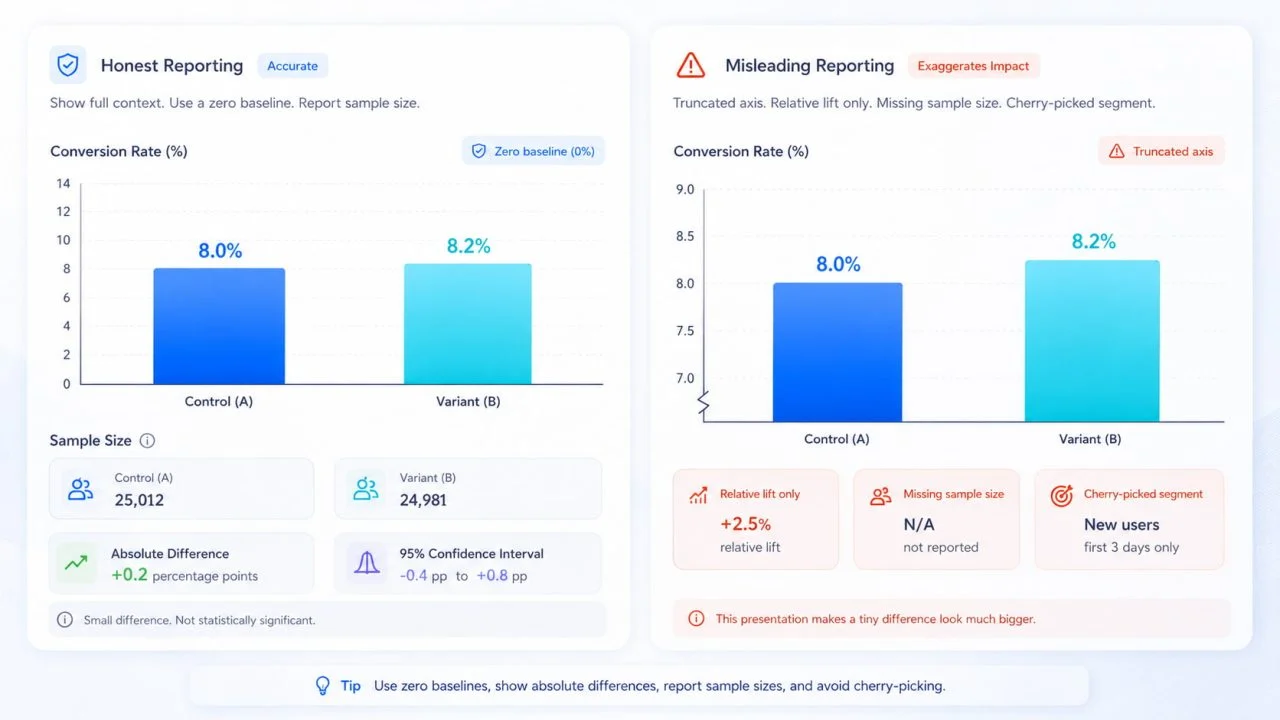
Avoid shortening the vertical axis simply to make a small improvement look dramatic. When bars represent magnitude, a zero baseline provides the most honest comparison.
When confidence intervals are available from the experiment platform, include them in the chart or accompanying notes instead of presenting the conversion rates alone.
Line Charts Show Stability During the Test
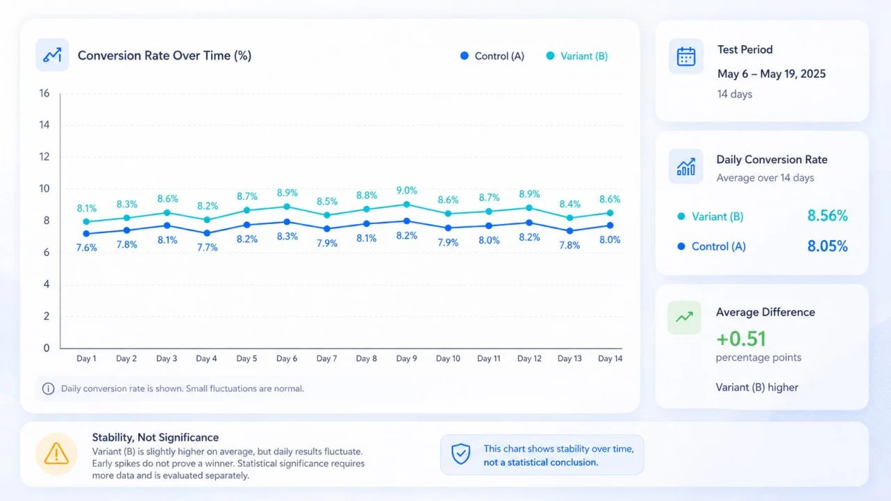
A line chart can show daily or weekly conversion rates for both versions.
This helps reviewers see whether the variant remained consistently stronger or whether the final result depended on one temporary spike. However, daily fluctuations should not be treated as separate conclusions.
Time-series charts are descriptive. Teams should not declare a winner from daily fluctuations before the planned test period and sample requirements are complete.
Separate Charts Clarify Audience Segments
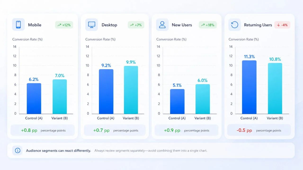
Results may differ between new and returning users, desktop and mobile visitors, or different traffic sources.
Create separate charts when segment results matter. Adding too many audience groups to one visualization can make the experiment harder to interpret.
Segment analysis should also be planned carefully. Selecting only the strongest group after reviewing the results may create a misleading conclusion about the test as a whole.
Build the Reporting Chart with AI Graph Generator
Once the experiment platform has produced the final data, an ai graph workflow can turn the exported results into a clearer reporting visual.
Organize the Exported Data
Useful columns include:
- Version
- Visitors
- Conversions
- Conversion Rate
- Absolute Difference
- Relative Lift
- Confidence Interval
- Test Status
Keep percentage-point values and percentage changes in separate columns. They describe different types of change and should not share an unclear label such as “Improvement.”
Describe the Required Comparison
A clear prompt could be:
Create a grouped bar chart comparing the control and variant conversion rates. Display the visitor count and absolute percentage-point difference, and do not exaggerate the vertical scale.
A chart maker can create the visual structure, but the prompt should not ask it to invent statistical significance, confidence intervals, or missing sample information.
Review the Generated Result
ChartGen’s AI Graph Generator supports CSV and Excel uploads, natural-language graph requests, multiple graph types, and adjustments to titles, axes, labels, legends, and styling.
After generation, confirm that:
- the control and variant have not been reversed;
- sample sizes match the source report;
- percentage points and relative percentages are labeled correctly;
- the axis does not exaggerate a minor difference;
- the test period and audience are identified;
- confidence intervals match the original analysis;
- the chart does not claim statistical certainty that the source analysis did not establish.
Common Charting Choices Exaggerate Test Results
A truncated axis can make a small conversion-rate difference appear much larger than it is. Showing only relative lift can create the same problem when the absolute change is small.
Removing sample size also hides whether the comparison is based on enough observations. A chart that labels one version as the “winner” before the experiment platform reaches a valid decision can turn an early fluctuation into a false conclusion.
Another mistake is selecting only the strongest audience segment. When the variant improves mobile conversions but reduces desktop conversions, the report should not present the mobile result as the outcome for the entire test.
Teams should also avoid treating the reporting chart as the statistical test itself. The chart communicates the result; it does not determine whether the experiment design, sample allocation, test duration, or significance calculation was valid.
Small Conversion Changes Need Honest Context
Imagine a signup-page test in which the control converts at 8.0%, and the variant converts at 8.4%.
The variant has a 5% relative lift, which may sound substantial. However, the absolute improvement is only 0.4 percentage points. The team still needs to consider the number of users included, the confidence interval, the test duration, and whether the change remained stable across important segments.
A clear chart displays both rates without overstating their visual difference. Supporting labels then provide the absolute change, relative lift, sample size, confidence interval, and test status.
Clear A/B Test Charts Support Review Rather Than Replace It
A/B test charts should help teams understand the size, direction, and consistency of a result without presenting a small visible difference as automatic proof of success.
Graphing AI can reduce the manual work required to turn exported experiment results into a report. The final interpretation still depends on correct calculations, adequate samples, reliable experiment methods, and careful review.
A strong chart therefore shows what changed while remaining honest about what the available evidence can—and cannot—prove.