
I used to spend most of my analytics time building dashboards.
Not interpreting trends. Not deciding actions. Just building.
After repeating the same process across reviews, stakeholder updates, and monthly reports, one thing became obvious:
Dashboard work is often slowed down by production steps, not thinking steps.
The Real Cost of "Just Making a Chart"
The expected flow sounds clean:
Export data -> visualize -> share.
The real flow is usually messier:
- Clean fragmented CSV files
- Choose one perspective among many possible cuts
- Reformat labels, legends, and axes repeatedly
- Rebuild after each "can we also see this?" request
- Interpret the chart only after all the polishing work is done
By then, decision windows are often already shrinking.
Why Traditional Visualization Feels Incomplete
Most tools excel at rendering charts.
They are weaker at helping you explore the next layer:
- What changed the most?
- What is an anomaly vs. normal variance?
- Which segment needs action first?
- Is this signal durable or temporary?
That is where teams lose time. Drawing bars is quick. Interpreting relevance is not.
The Workflow Shift: From Chart Creation to Insight Flow
The biggest change is not prettier charts. It is sequence.
Instead of opening tools and configuring visuals first, start with a decision-oriented prompt:
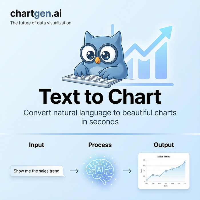
"Show revenue by region in a bar chart and compare Q1 vs Q2."
One prompt can produce a usable first view, but the real leverage appears in what comes next.

Follow-Up Questions Are the Highest ROI Step
Once the chart is generated, ask focused follow-ups immediately:
- Which region grew fastest?
- Where did performance dip unexpectedly?
- Which segment is below baseline despite stable volume?
This turns static output into iterative analysis.

One Dataset, Multiple Angles, Minimal Friction
With an AI-first flow, one dataset can quickly produce:
- Category comparisons
- Trend overlays
- Contribution breakdowns
- Exception views
You get perspective switching without rebuilding dashboards from scratch each time.
That matters most when:
- A meeting starts in 20 minutes
- Stakeholders ask unplanned questions
- You need clarity now, not visual perfection later
Where Bar Charts Still Work Best
Bar charts remain excellent when the goal is comparison:
- Rank categories
- Highlight gaps between segments
- Show relative contribution clearly
They are less effective for long, dense time-series or subtle pattern shifts where other chart types communicate better.
The issue is usually not chart literacy. It is workflow pressure.
Real Business Impact
This approach is especially useful in:
- Sales reviews where teams need fast directional calls
- Marketing analysis where one dataset must answer many questions
- Product and ops reporting where stakeholders want patterns, risks, and priorities
Speed helps, but decision confidence is the outcome that matters.
Final Thoughts
AI does not replace judgment. It reduces mechanical friction.
When repetitive dashboard work is compressed, attention moves to higher-value questions:
- What matters now?
- What changed materially?
- What should we do next?
That is the real productivity gain: not faster clicks, but faster understanding.
If your team works with data every week, aim for fewer dashboard chores and more decision cycles.