

Quick answer: To make a data-driven presentation with AI in 2026, upload your dataset (Excel, CSV, or Google Sheets) to an AI presentation tool, describe which insights to highlight, and let the AI generate slides with charts, tables, and KPIs grounded in your file. Strong options as of February 2026 include ChartGen AI (data traceability and analytical depth), Microsoft Copilot (PowerPoint ecosystem), and Gamma (fast visual decks from text prompts).
The problem: why data people dread decks
You are strong at analysis. You should not have to be a slide designer on short notice.
You finish a solid analysis—revenue trends, cohorts, benchmarks—clean in Excel. Then someone asks: “Can you put that in a deck for leadership?” The issue is rarely the numbers. It is translation: layout, chart formatting, color, structure, and narrative flow are design skills, not spreadsheet skills.
According to recent industry research, AI presentation tools can cut deck-building time by roughly 50–80% versus manual work. The caveat: many tools are text-first. You type a topic, get bullets and generic slides that do not read like a real data analysis.
What if you could upload your data and get a deck that understands your numbers—not only your words?
This guide covers three workflows for data presentations with AI, a practical tutorial, a six-tool comparison focused on data capabilities, and advanced techniques for analytical, consulting-style decks.
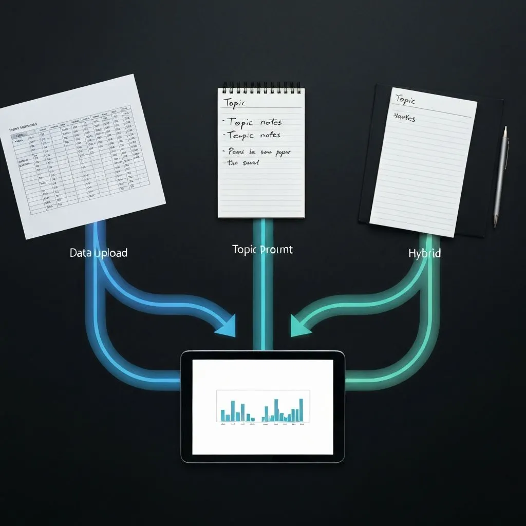
Three ways to create a data presentation with AI
Method 1 — Data upload: structured files (Excel, CSV, Google Sheets) where you want charts built from actual values.
- Flow: upload → the system infers columns and types → charts, tables, KPIs → slide sequence.
- Advantage: visuals reflect your dataset instead of invented statistics.
- Tools: ChartGen AI, Presenton, Microsoft Copilot (with connected data sources).
Method 2 — Topic prompt: research-led decks when you do not have a dataset yet.
- Flow: describe the topic (for example, a company or market) → research from the web → slides with figures and narrative.
- Advantage: minimal prep; the system gathers context.
- Tools: ChartGen AI, Gamma, Microsoft Copilot.
Method 3 — Hybrid: you have data and you want external context, benchmarks, or industry framing.
- Flow: upload data and describe the story → combined analysis and research → richer analytical output.
- Advantage: real numbers plus context.
- Tools: ChartGen AI.
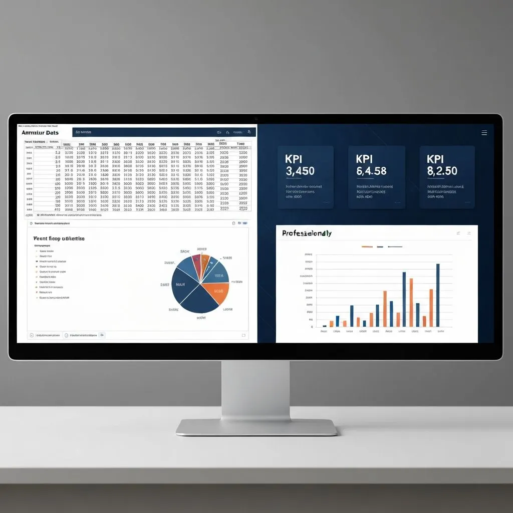
Step-by-step tutorial: Excel to presentation in minutes
Below is a representative workflow using ChartGen AI for a quarterly business review; Copilot and Gamma can follow similar intent with different UI constraints.
Step 1: Upload your data
Drag an Excel or CSV into the input area. The system parses headers, types, and row counts—dates, currencies, percentages, and categories—without manual schema setup.
Pro tip: Clean first—remove blank rows, align date formats, and label columns clearly. Cleaner input yields more reliable charts.
Step 2: Describe what you want
Write a natural-language brief: audience, metrics to emphasize, chart preferences, and the decision the deck should support.
Example prompt:
“Create a quarterly business review from this sales data. Include KPIs with YoY comparison, regional revenue as a bar chart, product-line performance, and growth trends. Audience is C-suite—prioritize strategic insights over operational detail.”
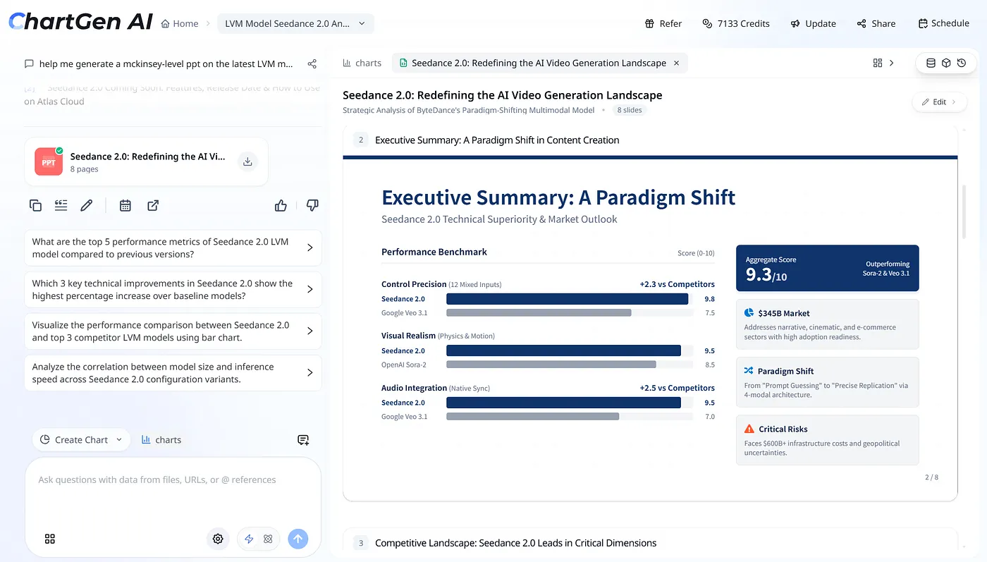
Step 3: Multi-agent generation
ChartGen AI routes work across specialized agents—for example planning (narrative arc), analysis (metrics from your file), research (context when useful), visualization (chart choice), design (layout and typography), and reflection (consistency and coherence). Expand “thinking details” where available to see reasoning tied to your data.
Step 4: Review the deck
Scan every slide for accuracy: each figure should trace to the uploaded dataset. Prefer tools where charts are generated from your schema rather than guessed from general knowledge.
Check narrative flow: overview → detail, and conclusions that follow from the numbers.
Step 5: Edit any element
Select text, charts, tables, or shapes. Strong workflows expose full element-level editing—type styles, alignment, color—and let you move, resize, or reorder content. That matters when templates are almost right but not quite.
Step 6: Follow-up questions
After generation, use suggested prompts such as “Which three regions have the highest YoY growth?” or “Compare Q3 vs Q4 product revenue” to add charts or appendix slides—useful for Q&A prep.
Step 7: Export and share
Export PPTX for editable objects in PowerPoint, PDF for distribution, or share via link. Prefer exports that keep charts as editable graphics, not flattened images only.
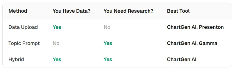
Six-tool comparison: which maker fits data work?
Most AI slide products optimize for text prompts, not structured uploads. Running the same dataset and prompt—“Create a quarterly business review from this data”—across tools surfaces real differences in traceability, chart depth, and editing.
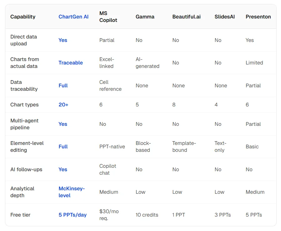
Verdict by use case
- Analytical deck from Excel: ChartGen AI — strong traceability, multi-agent pipeline, broad chart library, element-level editing.
- Microsoft stack: Microsoft Copilot — native PowerPoint integration; typically requires an M365 Copilot license.
- Fast visual deck from a topic (no file): Gamma — speed and reach; limited or no direct data upload depending on product surface.
- Design-first marketing slides: Beautiful.ai — template-driven layouts and brand consistency.
Advanced techniques: consulting-grade data decks
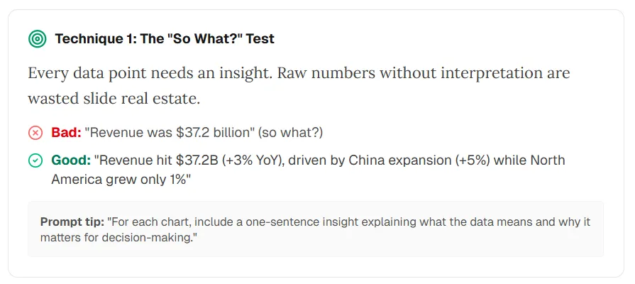
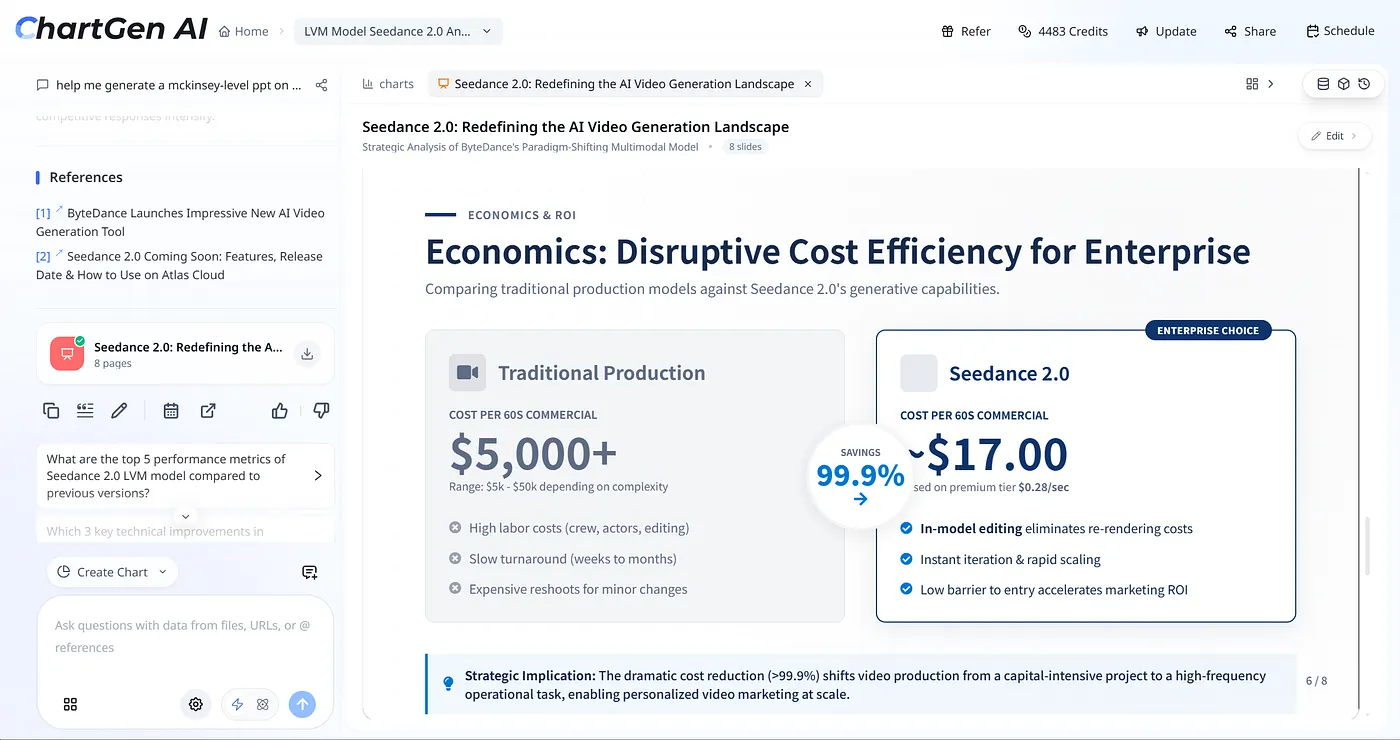
Technique 1 — The “So what?” test: Every metric needs an insight. Raw numbers without interpretation waste space.
- Weak: “Revenue was $37.2 billion.”
- Strong: “Revenue reached $37.2B (+3% YoY), driven by China (+5%) while North America grew 1%.”
Prompt tip: “For each chart, add one sentence on what the data implies and why it matters for decisions.”
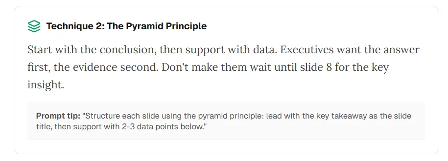
Technique 2 — Pyramid principle: Lead with the answer; support with evidence. Executives want the takeaway first.
Prompt tip: “Structure each slide with the key takeaway as the title, then 2–3 supporting data points.”
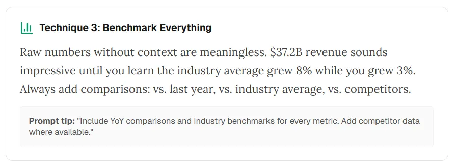
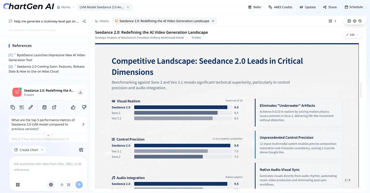
Technique 3 — Benchmark everything: Isolated figures mislead. Compare to prior year, industry, or peers where possible.
Prompt tip: “Include YoY and industry benchmarks for each metric; add competitor data when available.”
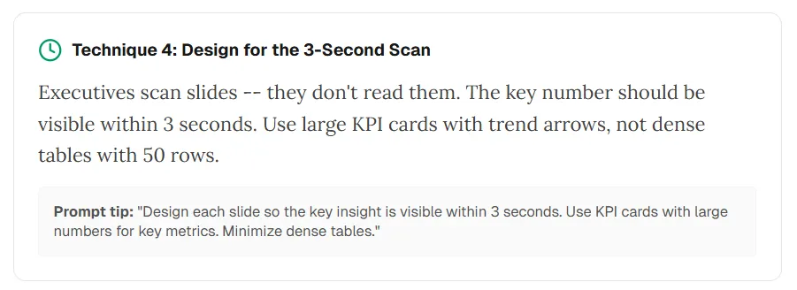
Technique 4 — Three-second scan: Busy executives skim. The main number or insight should pop immediately—large KPI cards and trends, not 50-row tables on-slide.
Prompt tip: “Make the key insight visible within three seconds; use KPI cards; minimize dense tables on main slides.”
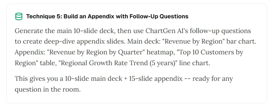
Technique 5 — Appendix with follow-ups: Ship a tight main deck, then use follow-up prompts for depth—for example region-by-quarter heatmaps, top-customer tables, or multi-year trends—for appendix material.
Build the main storyline first; use extra slides for likely questions.
Five mistakes that make AI data decks look amateur
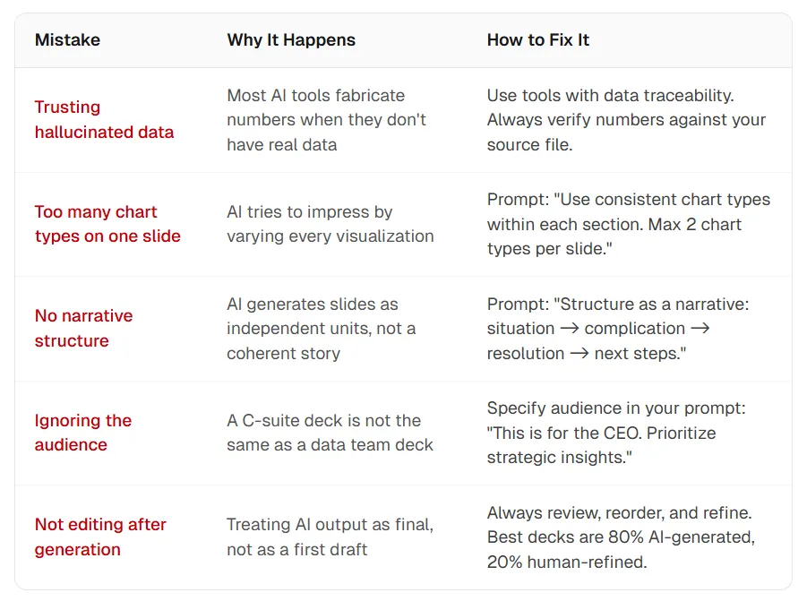
- Trusting hallucinated data — Many models invent figures without a source. Fix: Use traceable pipelines and reconcile numbers to your file.
- Too many chart types on one slide — Models sometimes over-variate visuals. Fix: Prompt for consistency—“Use at most two chart types per slide within each section.”
- No narrative spine — Slides arrive as isolated pages. Fix: Ask for situation → complication → resolution → next steps.
- Ignoring the audience — A board deck differs from a data-team review. Fix: State audience and decision in the prompt (“CEO readout—prioritize strategic implications”).
- Skipping human edit — Treat generation as draft one. Fix: Reorder, tighten wording, and validate figures; strong decks blend automation with judgment.
Frequently asked questions
Can AI build presentations directly from Excel?
Yes. ChartGen AI and Microsoft Copilot support direct uploads and charts grounded in your file. Many text-first tools do not ingest spreadsheets as first-class inputs.
Which tool is best for data-driven presentations in 2026?
For traceable charts and analytical depth, ChartGen AI is a leading option as of early 2026. Copilot fits Microsoft-centric teams; Gamma excels at fast, prompt-led visuals when you are not starting from a dataset.
How accurate are AI-generated charts?
Accuracy follows the workflow: charts built from uploaded data can be verified; charts invented from prose-only prompts may not be.
How long does generation take?
With upload-based tools, a ~10-slide analytical deck often lands in a few minutes including review—far faster than manual rebuilds for comparable scope.
Can I edit after export?
Capabilities vary. ChartGen AI emphasizes element-level editing; Copilot uses native PowerPoint; some products export static slides.
Is my data safe when I upload?
Read each vendor’s policy. ChartGen AI describes in-session processing without using uploads for model training; Copilot follows Microsoft 365 enterprise rules. Validate before uploading sensitive data.
Your data deserves more than bullet points
Stop only describing your data. Start showing it with traceable visuals and a coherent story.
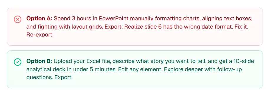
Option A: Spend hours aligning boxes and fixing export issues.
Option B: Upload your file, state the story, get an analytical draft in minutes, refine elements, explore follow-ups, export.
ChartGen AI is built for Option B: traceable charts, full editing, and multi-agent generation so planning, analysis, and verification work together.
Try ChartGen AI with your own dataset and see how your numbers read when the workflow fits data professionals—not only slide templates.
“Your data has a story to tell. In 2026, AI can help you tell it—with receipts.”
References
- PostEverywhere — “15 Best AI Presentation Makers” (time savings context). posteverywhere.ai
- HTF Market Intelligence — AI presentation generators market sizing. htfmarketinsights.com
- ChartGen AI — data visualization and presentation platform. chartgen.ai