

How to Create a Stacked Bar and Line Chart for Bakery Retail Sales
Build a combined stacked bar and line chart for bakery retail sales with ChartGen AI. Compare weekday vs weekend sales counts and visualize the sales gap per product category.
Retail demand often shifts between weekdays and weekends. For bakeries, coffee, bread, tea, and pastries can sell very differently by day type. In this tutorial we use ChartGen AI to build a combined chart: stacked bars for weekday vs weekend counts, plus a line showing the gap between them.
This chart answers questions such as:
- Which bakery products sell the most overall?
- Are certain categories more popular on weekdays or weekends?
- Which category has the largest weekday–weekend difference?
Dataset Overview
| File | Description |
|---|---|
| Bakery.csv | Original transaction-level bakery sales dataset (one row per purchased item). |
| bakery_sales_revised.csv | Cleaned version with clearer column names and standardized date-time / day-type values. |
We use bakery_sales_revised.csv because the columns are clearer and the day-type values are already standardized.
Step-by-Step Walkthrough
Step 1: Upload the Bakery Sales Dataset
Open ChartGen AI and upload Bakery.csv and bakery_sales_revised.csv.
Step 2: Define the Chart Goal
We want the chart to show three things at once: total volume per top category, the weekday/weekend split, and the gap per category. A plain bar chart shows volume but not the gap; a line chart shows the gap but not category size — so a combined stacked-bar-and-line chart is ideal.
Step 3: Write the Chart Prompt
Create a combined chart of stacked bar and line graph for bakery retail sales with a soft low-saturation & fresh color palette in muted, gentle tones. X-axis: Top 8 product categories by total sales volume. Primary Y-axis for stacked bars: Sales count, stack bars by Day Type, Weekday and Weekend, with clear, legible segment labels. Secondary Y-axis for line graph: the sales gap value between weekday and weekend for each category. Prominently highlight the category with the largest sales gap between weekday and weekend with a subtle yet distinct visual emphasis that aligns with the fresh low-saturation style.
| Dataset Field | How ChartGen AI Uses It |
|---|---|
| Items | Product categories on the X-axis |
| DayType | Stack groups: Weekday and Weekend |
| Transaction rows | Counted as sales volume |
| Weekday − Weekend | Used as the line-graph value |
| Top 8 categories | Selected by total sales count |
Step 4: Generate the Combined Chart
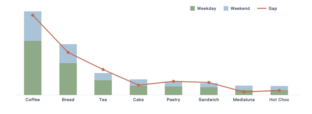
ChartGen AI generates the chart in a soft, low-saturation palette: weekday sales in dusty sage green, weekend sales in soft mist blue, and the gap line in warm terracotta.
Step 5: Interpret the Results
Coffee has the highest total volume and the largest weekday–weekend gap:
| Metric | Value |
|---|---|
| Weekday | 3,543 |
| Weekend | 1,928 |
| Total | 5,471 |
| Gap | 1,615 |
| Rank | Category | Total Sales | Gap |
|---|---|---|---|
| 1 | Coffee | 5,471 | 1,615 |
| 2 | Bread | 3,325 | 859 |
| 3 | Tea | 1,435 | 517 |
| 4 | Cake | 1,025 | 199 |
| 5 | Pastry | 856 | 276 |
| 6 | Sandwich | 771 | 253 |
| 7 | Medialuna | 616 | 62 |
| 8 | Hot Chocolate | 590 | 90 |
Coffee, Bread, and Tea are the strongest weekday-driven categories. Medialuna and Hot Chocolate have smaller gaps, so their demand is more balanced across day types.
Step 6: Refine and Export
If the chart is crowded: "Increase spacing between categories, keep segment labels readable, and make the gap line slightly thinner." If the highlight is too strong: "Make the Coffee highlight more subtle, using a light background tint or soft outline." Then export — PNG for reports, PPT for presenting to retail or operations teams.
Conclusion
We built a combined stacked bar and line chart from bakery sales data. The stacked bars compared weekday vs weekend counts across the top 8 categories, and the line showed the gap. Coffee had the largest gap (3,543 weekday vs 1,928 weekend, a 1,615-unit difference). This single chart shows both volume and behavioral differences, helping managers plan staffing, inventory, and promotions by day type.
Try it yourself
Upload your data and describe what you need — ChartGen AI builds it in seconds.
Try ChartGen AI free →