

How to Improve Date Labels in a Cloud Traffic Stacked Area Chart
Fix confusing date labels in a stacked area chart with ChartGen AI. Replace short 'Jan 24' labels with full-year anchors like Jan 2024 and Jul 2024 while keeping your chart's style.
Time-series charts show trends well, but unclear date labels hurt readability. A label like "Jan 24" is ambiguous — is 24 a year or a date? In this tutorial we use ChartGen AI to update a smooth stacked area chart so the X-axis uses full-year anchors like Jan 2024 and Jul 2024, without changing the rest of the design.
Dataset Overview
The dataset is cloud_traffic_trends.xlsx — monthly cloud traffic from 2024 to 2025 across four regions. Each row is one month; the regional columns hold traffic volume.
| Column | Role |
|---|---|
| Date | X-axis time series |
| North America | Stacked area layer |
| Europe | Stacked area layer |
| Asia Pacific | Stacked area layer |
| Latin America | Stacked area layer |
Step-by-Step Walkthrough
Step 1: Upload the Dataset
Open ChartGen AI and upload cloud_traffic_trends.xlsx. Preview it and confirm the five columns are recognized. The chart should use Date as the timeline and stack the four regional values to show total traffic over time.
Step 2: Identify the Chart Problem
The original chart uses compressed labels like Jan 24 Jul 24 Jan 25 Jul 25. Readers may not realize 24 and 25 are years. The critical moment is the year transition — the chart should make 2024→2025 obvious at a glance. The fix: full 4-digit years, showing only selected anchor labels.
Step 3: Enter the Update Prompt
Task: Update the Smooth Stacked Area Chart with a specific focus on Clearer Date Labels.
1. X-Axis (Date) Fix — CRITICAL:
   Problem: The current "Jan 24" format is confusing.
   Requirement: Use Full 4-Digit Years and specific spacing.
   Label Format: "Jan 2024", "Jul 2024", "Jan 2025", "Jul 2025".
   Spacing Strategy: Do NOT show every month. Only show Start of Year (Jan) and Middle of Year (Jul).
   Goal: A clean timeline where the 2024→2025 transition is obvious.
2. Maintain Existing Style (do not change):
   Chart Type: Smooth Stacked Area (Spline). Keep thick white borders between layers.
   Colors: Keep the Blue Gradient (dark bottom, light top).
   Layout: Keep the vertical dashed grid and hide the Y-axis numbers.
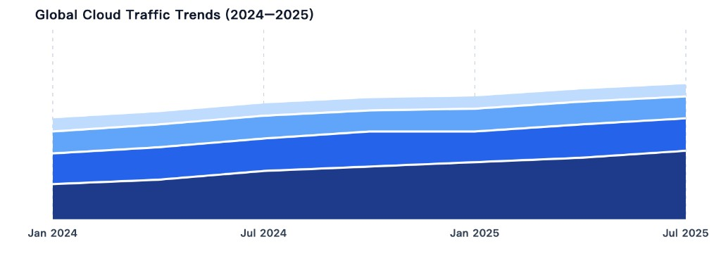
   Title: Global Cloud Traffic Trends (2024-2025).
This prompt is effective because it cleanly separates the required fix from the style elements that must not change.
Step 4: Generate the Updated Chart
| Position | Label |
|---|---|
| Start of 2024 | Jan 2024 |
| Middle of 2024 | Jul 2024 |
| Start of 2025 | Jan 2025 |
| Middle of 2025 | Jul 2025 |
The updated chart preserves the smooth spline areas, thick white borders, blue gradient (dark bottom, light top), vertical dashed grid aligned to key ticks, hidden Y-axis numbers, and the original title.
Step 5: Interpret the Updated Chart
With clearer labels, the timeline is easy to read and the Jul 2024 → Jan 2025 transition is obvious. The chart shows North America as the largest contributor, followed by Europe, Asia Pacific, and Latin America, while the blue gradient keeps the layers distinct yet cohesive.
Conclusion
We updated a smooth stacked area chart for cloud_traffic_trends.xlsx with a focus on clearer date labels. Instead of confusing abbreviations like "Jan 24," the chart now uses "Jan 2024," "Jul 2024," "Jan 2025," and "Jul 2025." We preserved the original style — smooth areas, white borders, blue gradient, dashed grid, hidden Y-axis, and title. The result is cleaner, more professional, and better for comparing trends across years.
Try it yourself
Upload your data and describe what you need — ChartGen AI builds it in seconds.
Try ChartGen AI free →