

How to Run an Attribution Analysis to Explain a Revenue Drop
Use ChartGen AI to explain why a metric like GMV or revenue changed. Break the change down by dimension, quantify each driver's contribution, and find the primary cause.
When a metric like GMV or revenue moves, "what" changed is easy — "why" is hard. ChartGen AI's Attribution feature breaks a fluctuation down across its components and dimensions, quantifies how much each factor contributed, and surfaces the primary drivers. This tutorial shows how to go from a chart to a clear root-cause answer.
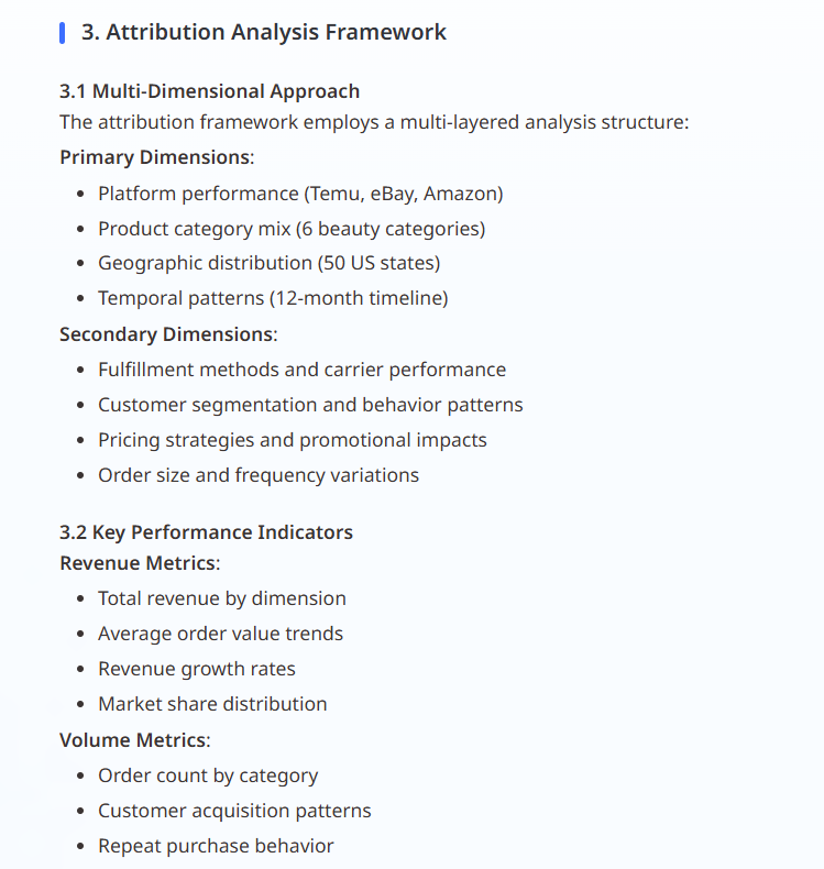
When to Use Attribution
Reach for attribution whenever a KPI changes and you need to explain it to stakeholders:
- "Why did GMV decline last week?"
- "Which channel or campaign caused the drop in conversion?"
- "What is driving the change in gross profit margin?"
ℹ️ Attribution needs structured data. If your file is a raw spreadsheet, run Smart Semantic first (inside a Project) so ChartGen AI understands your metrics and dimensions. Flat, unstructured text cannot be attributed reliably.
Step-by-Step Walkthrough
Step 1: Create a Project and Add Your Data
Attribution is a deep-analysis capability, so work inside a Project rather than a Quick Chat. Click + Create Project, upload your sales or finance dataset, and let ChartGen AI build the semantic model (metrics like GMV, revenue, CAC; dimensions like channel, campaign, product, region).
Step 2: Generate the Metric Chart
Ask the question that surfaces the change in natural language, for example:
Show weekly GMV for the last 8 weeks and highlight the largest week-over-week decline.
ChartGen AI renders a trend chart and identifies the period with the biggest movement.
Step 3: Open Advanced Analysis on the Chart
Click Advanced Analysis below the chart to explore what's driving the change. ChartGen AI decomposes the fluctuation across key components and dimensions — for example, splitting a GMV change by its formula structure (traffic × conversion × average order value) and by channel, campaign, and product.
Step 4: Read the Contribution Ranking
The result quantifies each factor's contribution and ranks the primary drivers. A typical output looks like:
| Driver (dimension) | Contribution to change | Direction |
|---|---|---|
| Paid Search — Campaign A | −42% | Main negative driver |
| Conversion rate (Mobile) | −28% | Secondary negative driver |
| Average order value | +11% | Partial offset |
| Organic traffic | +6% | Partial offset |
Now you can say precisely why GMV fell: most of the decline came from one paid-search campaign and a mobile conversion dip, partly offset by higher order value.
Step 5: Turn the Finding into a Report or Prediction
Click Interpretation to generate a structured insight report, or continue to [Prediction](revenue-forecast-prediction.html) to project revenue under different budget scenarios. Export as PDF or add the chart to a dashboard to share with marketing and finance.
Conclusion
Attribution analysis turns "revenue dropped" into "here is exactly what caused it and by how much." By creating a Project, generating the metric chart, and opening Advanced Analysis, ChartGen AI decomposes the change by dimension and ranks the drivers — so you spend less time diagnosing and more time acting. Pair it with scheduling to get an attribution summary pushed to your inbox every week.
Try it yourself
Upload your data and describe what you need — ChartGen AI builds it in seconds.
Try ChartGen AI free →