



A business presentation may contain revenue trends, target comparisons, regional results, product contribution, and next-step priorities. Each chart can be correct on its own and still make the presentation feel inconsistent when colors, periods, units, and title styles change between slides.
An automatic chart maker can speed up production, but consistency still requires a plan. The aim is to create charts from one verified dataset while keeping their definitions, visual rules, and narrative aligned.
A Business Presentation Needs More Than Several Individual Charts
A presentation is not a folder of unrelated visuals. Its charts should work together to explain the result, the main causes, the areas requiring attention, and the decision that follows.
A strong sequence moves from the overall outcome to supporting detail. Repeating the same conclusion through several chart types adds slides without adding meaning.
The Office for National Statistics also recommends focusing each visualization on the most important comparison and using multiple simple charts instead of one overloaded visual.

Define the Presentation Story Before Creating Charts
Decide what the audience should understand before generating any visual. This prevents the slide order from following spreadsheet columns instead of a business narrative.
Give Each Slide One Main Question
One slide may ask whether revenue increased. Another may show which region missed its target, while the next explains which product caused the change.
Keeping one main question per slide makes it easier for the audience to understand why each chart is included.
Assign a Clear Role to Each Chart
Use an overview chart for the headline result, a trend chart for movement over time, a comparison chart for differences, and a decision-support chart for priorities.
Each chart should add a new step to the story rather than repeat an earlier slide.
Place the Most Important Result First
Open with the business outcome, not the first field in the source file. Later slides can then explain causes, exceptions, and actions.
This order gives the audience a clear reason to examine the more detailed charts that follow.

Keep the Data Rules Consistent Across Slides
Different charts can show different views of the data, but their measurement rules must remain stable.
Use the Same Reporting Period
Related visuals should use the same month, quarter, or year range. When another period is necessary, state it clearly in the title or subtitle.
A regional performance chart covering one quarter should not be compared directly with a product chart covering an entire year unless the difference is explained.
Keep Units and Calculations Stable
Do not show dollars on one slide and thousands of dollars on another without clear labels. Revenue, growth rate, and target gap should also use the same calculation method throughout the deck.
A percentage-point change should not be presented as a percentage increase on another slide without clarification.
Preserve Category Definitions
Regions, customer segments, and product groups should keep the same names. Combining categories on one slide while separating them elsewhere requires an explanation.
Stable category definitions help viewers compare results without repeatedly learning a new grouping system.

Create Visual Rules for the Entire Presentation
Set shared visual rules before styling individual slides. Consistency does not require every chart to look identical, but related visual elements should retain the same meaning.
Keep Category Colors Consistent
The same region, product, or metric should keep the same color across the chart set. Reserve strong accent colors for the value or exception that needs attention.
When North America is blue on one slide, changing it to orange on another can make viewers assume that the color represents a different category.
Standardize Titles and Labels
Choose either conclusion-led or descriptive titles and apply that style throughout. Dates, currency symbols, percentages, legends, and data labels should follow the same format.
A presentation becomes harder to scan when one slide uses short descriptive titles while another uses long explanatory sentences.
Use Comparable Axis Scales
Charts showing the same metric should use comparable scales whenever practical. Major changes in scale can make similar movements appear very different.
Any necessary scale change should be visible and clearly labeled.
Limit Decorative Variation
Constantly changing backgrounds, palettes, legend positions, and chart types creates visual noise.
Visual variation should clarify a new type of information, not simply make each slide look different.
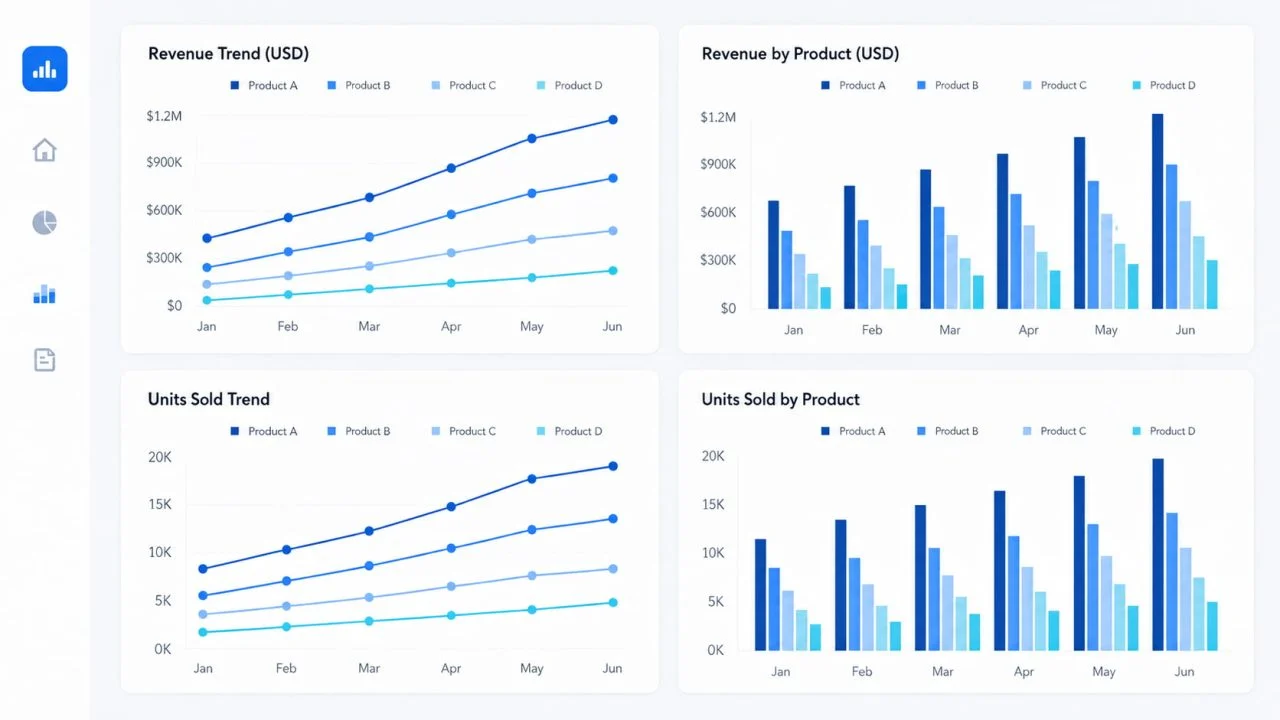
Use an Automatic Chart Maker to Build the Chart Set
Once the story, data rules, and visual system are defined, generate the charts from one verified CSV or Excel file. Reusing one source reduces the risk of conflicting numbers.
Prepare One Verified Source File
Use clear column names for dates, categories, actual values, targets, and calculated metrics. Check missing values, duplicate records, units, and reporting periods before generating charts.
Calculated fields should also be verified before they appear in multiple presentation slides.
List the Charts Required
Plan the set before generating individual visuals. It may include an overall revenue trend, regional performance, actual versus target, product contribution, and next-quarter priorities.
Use a business chart generator only for visuals that advance this sequence. A chart that does not answer a new question may not need to appear in the presentation.
Reuse Consistent Instructions
Repeat the same rules for colors, titles, dates, units, labels, and sorting. Change only the question and selected fields for each chart.
A chart maker from data can accelerate production, but prompts should refer to values already available in the dataset rather than request unsupported conclusions.
Refine the Results with AI Chart Generator
ChartGen’s AI Chart Generator supports CSV and Excel uploads, natural-language requests, professional color themes, flexible aggregation, sorting, data limits, and data labels.
After generating each chart, review whether its colors, units, categories, and title style remain consistent with the rest of the presentation.

Arrange the Charts into a Clear Presentation Flow
The final order should follow the audience’s reasoning process, not the order in which the charts were created.
Start with the Business Outcome
Begin with the result that frames the discussion, such as growth, decline, or a missed target.
The first chart should make the purpose of the presentation clear without requiring the audience to interpret several supporting slides first.
Explain the Main Drivers
Use the next slides to show which regions, products, customer groups, or periods produced that result.
Each supporting chart should explain one part of the outcome introduced at the beginning.

End with Decisions and Actions
Finish with the gap, priority, or scenario that supports the next decision. The presentation should move beyond describing data and show what requires attention.
The final chart should connect the analysis to a practical action rather than introduce an unrelated metric.
Common Problems Make the Chart Set Feel Inconsistent
Too many chart types, changing color meanings, unexplained time ranges, and repeated conclusions make a presentation harder to follow.
Copying data into separate files for individual slides creates another risk. Small manual edits can produce conflicting values. One verified source and shared instructions reduce that problem.
Teams should also avoid changing category definitions or axis scales simply to make one slide appear more dramatic than another.
Consistent Charts Make Business Presentations Easier to Follow
An effective chart set needs stable data definitions, recognizable color meanings, consistent units, clear titles, and a logical sequence from outcome to explanation to action.
An automatic chart maker can reduce the time required to create multiple visuals. The final review must still confirm that every chart supports the same business story without changing what the underlying data means.