


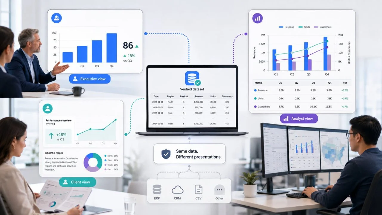
The same dataset may be used in a leadership meeting, a client report, and a technical review. However, sending the same chart to every audience often creates communication problems because each group needs a different level of detail.
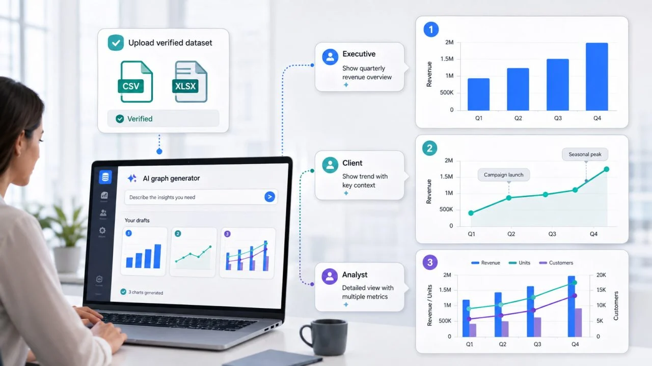
A graph visualization generator can help users create several versions from one verified dataset. The values and calculations remain consistent, while the title, annotations, detail, and visual emphasis change according to the audience.
One Chart Does Not Work for Every Audience
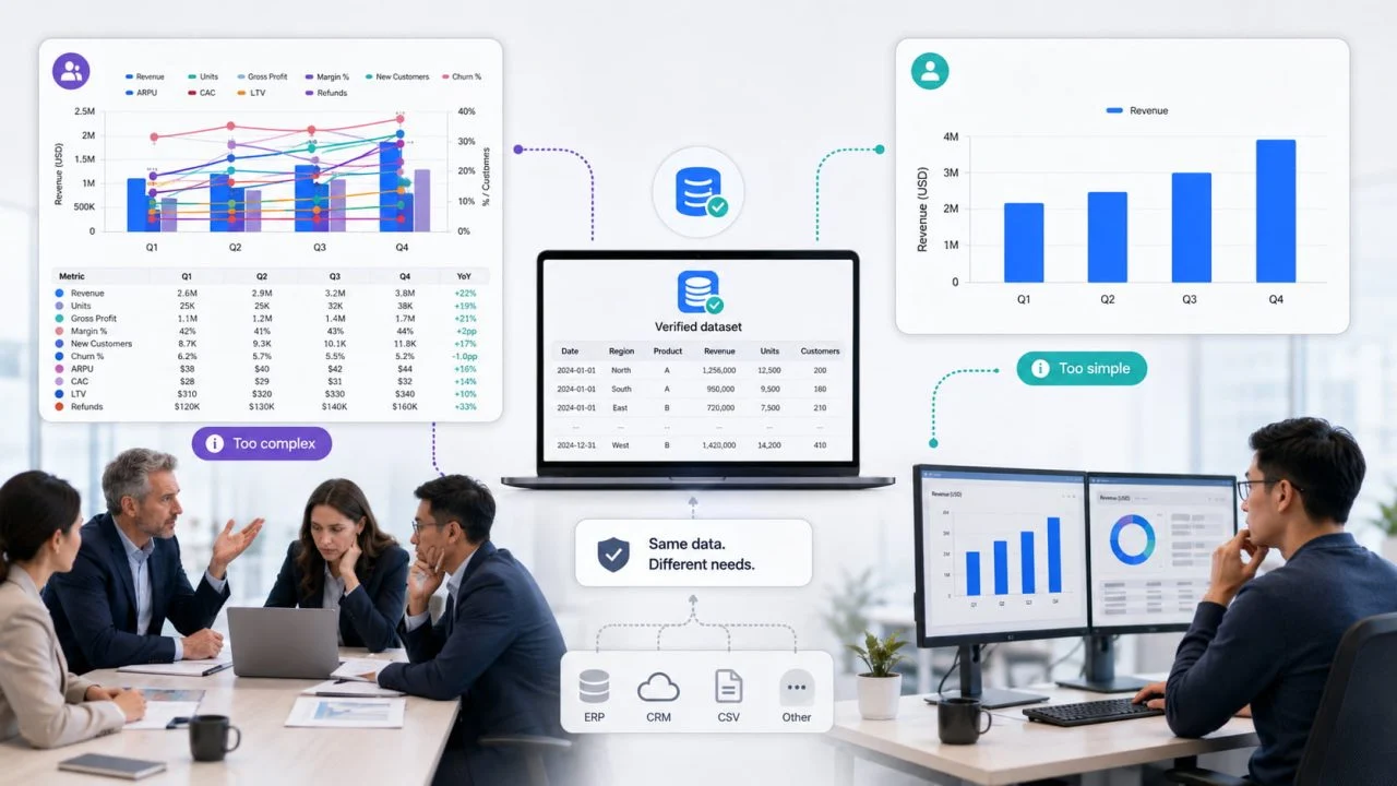
A chart can be accurate and still fail to communicate. An executive may struggle to find the main result in a visualization containing ten data series, while an analyst may find a simplified summary too limited to verify.
The solution is not to change the data. It is to identify what each audience needs to understand, what decision they need to make, and how much supporting information they require.
The Office for National Statistics recommends emphasizing the most important comparison and keeping communicative charts as simple as possible while retaining the context users need.
Define What Each Audience Needs to Decide
The same quarterly sales data can support several conversations. Each chart version should answer the question most relevant to its intended readers.
Executives Need the Main Result
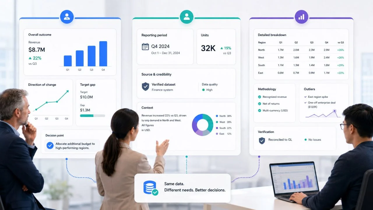
Executives usually need the overall outcome, direction of change, target gap, and any issue requiring a decision.
A leadership chart might show total revenue, year-over-year growth, and the two regions furthest below target. Detailed transactions and minor monthly fluctuations may distract from the main message.
The title should communicate the conclusion directly, such as “Revenue increased, but two regions remained below target.”
Clients Need Context and Trust
Clients need enough background to understand what the chart measures and why the result matters.
A client-facing version should identify the reporting period, units, data source, and calculation method where necessary. Internal abbreviations should be replaced with familiar language.
The chart should not assume that an external reader understands the company’s target definitions, reporting structure, or category names.
Analysts Need Detail and Methodology
Analysts need enough information to verify the result and investigate it further.
Their version may retain additional series, complete axis values, segment breakdowns, outliers, and calculation notes. Separate charts may still be necessary when several relationships need to be examined.
Adapt the Presentation Without Changing the Meaning
Audience-specific charts can differ in appearance and detail, but the source data, calculation rules, units, and reporting period must remain consistent.
Keep the Core Metric Consistent
Revenue should not be calculated as gross revenue for one audience and net revenue for another. A monthly growth rate should not become a quarterly comparison without explanation.
Changing the calculation between versions can create conflicting conclusions even when both charts look professional.
Change the Level of Detail
An executive chart may combine minor categories into “Other” and label only important values. An analyst version can retain every category and use more detailed time periods.
Simplifying a chart should reduce distraction, not hide information that would change the interpretation.
Rewrite the Title for the Audience
A title such as “Quarterly Performance” does not tell readers what to notice.
An executive title might say, “Enterprise sales drove growth while small-business revenue declined.”
A client title could be, “Campaign revenue increased during the April–June reporting period.”
An analyst title may remain more descriptive: “Monthly revenue by customer segment, January–June 2026.”
Use Annotations Carefully
Annotations can explain a target gap, product launch, unusual decline, or reporting change.
They should remain short and appear close to the relevant data. Too many annotations compete with the chart and weaken the central message.
Use a Graph Visualization Generator to Create Audience-Specific Versions
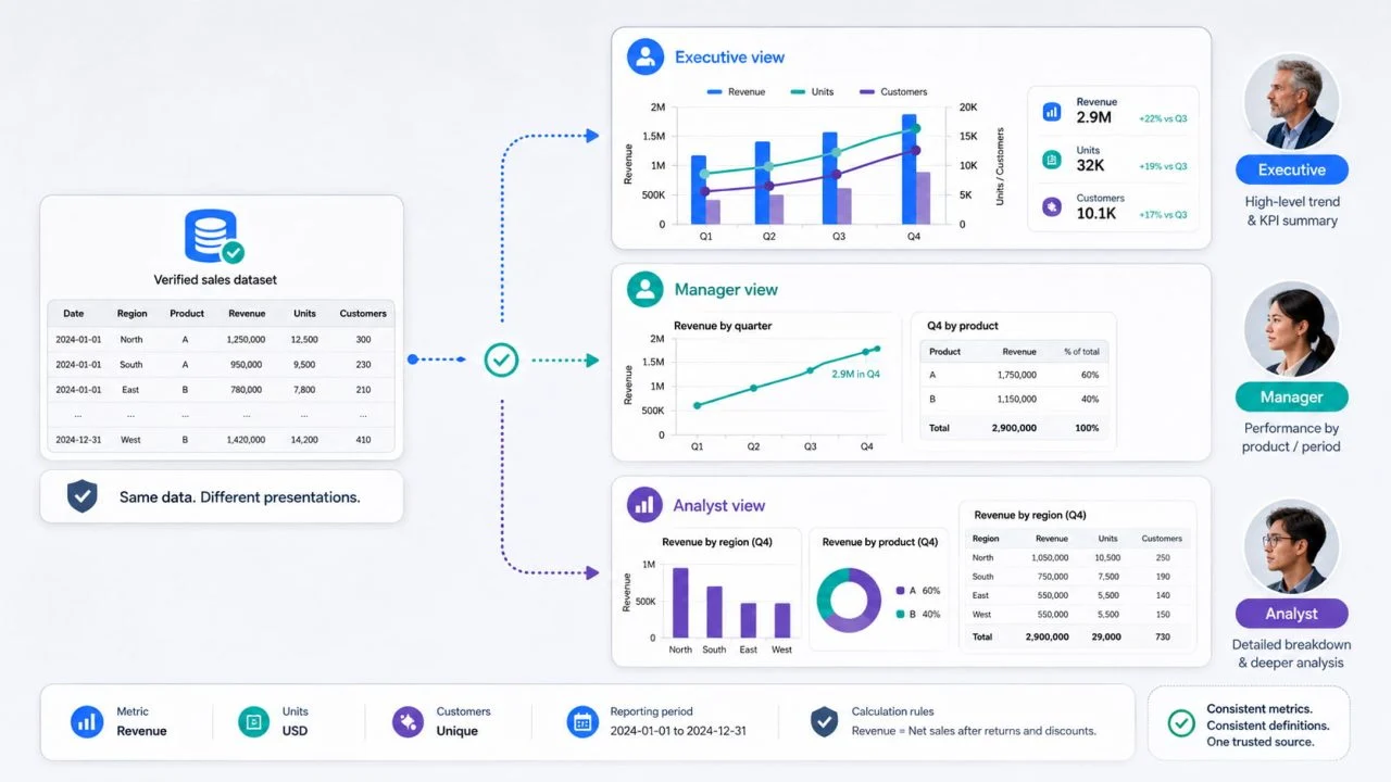
Begin with one verified dataset, then create separate chart versions by changing the instructions and presentation settings rather than editing the underlying values.
ChartGen’s AI Graph Generator supports CSV and Excel files, natural-language graph requests, and adjustments to titles, axis labels, legends, gridlines, and colors.
Prepare the Source Data Once
Use clear column names and consistent definitions. A quarterly sales file might contain Month, Region, Customer Segment, Revenue, Target, and Growth Rate.
Before generating different versions, check missing values, units, categories, and reporting periods.
Describe the Executive Version
A useful instruction is:
Create a bar chart showing quarterly revenue by region. Highlight the two regions below target, show the supplied overall growth rate, and keep supporting detail minimal.
This version directs attention toward the result and the decisions it may require.
Describe the Client Version
A client-focused instruction could be:
Create a line chart showing monthly campaign revenue from January to June. Use clear labels, identify the reporting period, and annotate the month when the new campaign launched.
The result should avoid internal terminology and include enough context to stand on its own.
Describe the Analyst Version
An analyst instruction may request more detail:
Create a line chart showing monthly revenue by region and customer segment. Keep all series visible, preserve the complete axis scale, and label unusual changes for further review.
A smart graph tool can accelerate the first visual draft, but users must still confirm that each version uses the same data and calculation rules.
Common Communication Mistakes Create Conflicting Stories
Sending a detailed analyst chart to executives can hide the main conclusion. Giving clients a simplified chart without units, sources, or a time range can make the result difficult to trust.
Teams should not change category definitions, reporting periods, or calculations between versions without clearly explaining the difference.
Visual design should also not be used to make one audience see a more favorable result. Truncated axes, hidden categories, selective annotations, and exaggerated color contrast can alter the perceived story even when the visible values are technically correct.
The Same Data Can Support Different Conversations
An executive chart should make the decision clear. A client chart should provide context and confidence. An analyst chart should preserve enough detail for verification and further investigation.
These versions can look different without contradicting one another. The presentation changes, but the data, calculations, units, and core conclusion remain stable.
A graph visualization generator helps users create those tailored versions more efficiently. The final responsibility is to adapt the communication without changing what the data actually means.